I took the Game of Thrones smartphone to a real castle to see if it could stick the (King's) landing
Meet the Realme 15 Pro Game of Thrones Limited Edition
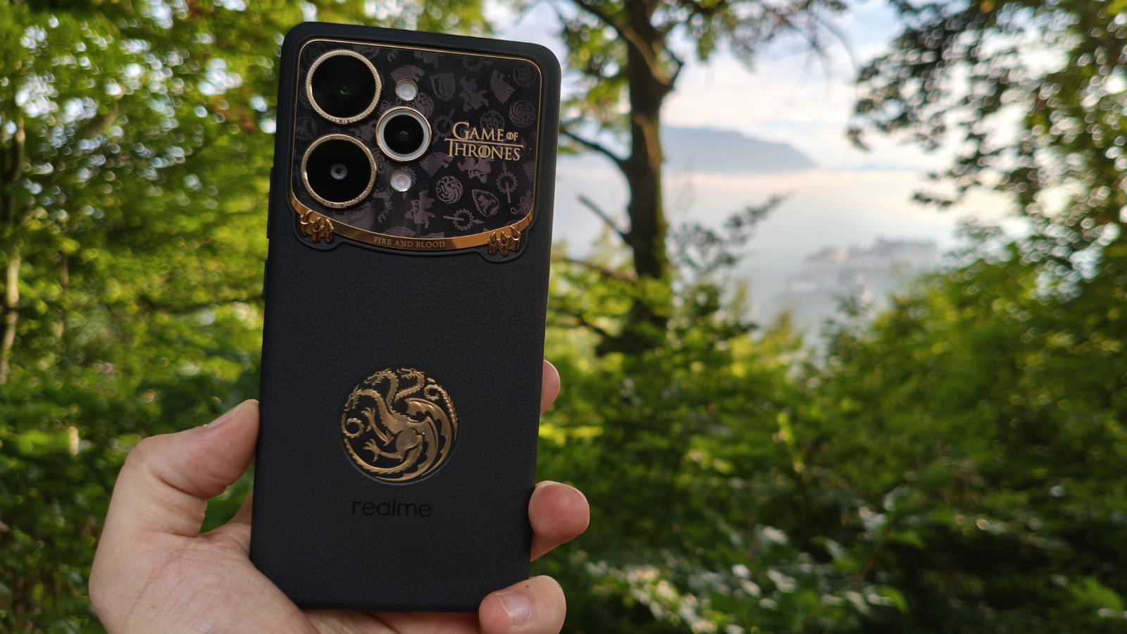
I’ve seen my fair share of pop culture special edition smartphones in my day: the Batman Rog Phone 6, an Iron Man Poco X7 Pro, and the Star Wars-themed Samsung Galaxy Note 10 Plus, to name a few. But recently, I was sent a device from a franchise whose universe has absolutely nothing to do with smartphones: meet the Realme 15 Pro Game of Thrones Limited Edition.
Perhaps I shouldn’t have been as surprised as I was to see a Game of Thrones smartphone appear at my door in 2025. Despite the mixed (read: furious) reaction to the show's final season in 2019, the fact that Game of Thrones spin-offs are still on our screens makes it clear that interest in the franchise is still high (House of the Dragon season 3 and A Knight of the Seven Kingdoms are both slated for a 2026 release).
This spin on the Realme 15 Pro maintains most of the specs of mid-July’s basic model, but with a few hardware and software changes that I’ll get into later. I’m sorry to say now that, as far as I can tell, neither the base model nor the Game of Thrones Limited Edition will go on sale in the US or UK, based on precedent from Realme.
Article continues belowI was sent the Realme 15 Pro Game of Thrones Limited Edition at an interesting time – that is to say, the day prior to my travelling to some medieval towns on a holiday. Admittedly, Game of Thrones wasn't filmed at any of these locations: Salzburg in Austria, with its imposing fortress and looming mountains, and then Munich in Germany, where everyone was dressed in traditional garb (for Oktoberfest, not in Lannister gold and red, unfortunately). But the timing gave me an idea, and so I took the phone with me to test out some of its new features.
A real twist on a Realme
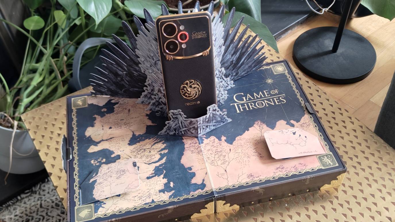
Before we get to the IRL performance of the Realme 15 Pro Game of Thrones Edition, let's take a closer look at its hardware.
Spec-wise, it’s the same as the base model: it has a 6.8-inch, 1280 x 2800, 144Hz display, a Snapdragon 7 Gen 4 chipset paired with 12GB RAM and 512GB storage (the base model has a few more variants), a 7,000mAh battery with 80W charging, and two rear 50MP cameras (one a wide-angle, the other an ultra-wide). Appearances suggest that there are actually three rear cameras, but one of these is presumably a light sensor or similar.
Before we even get into the Game of Thrones elements of the device, I want to flag two features of the phone that I really liked. First, around the ultra-wide camera lens, there’s a circular LED indicator, which will light up if you’ve got a notification, are receiving a call, are listening to music, or another customizable trigger is, well, triggered. I really liked this as a noninvasive notifier if I received a message while on silent mode, and I wish more phones had similar (it used to be more of a feature, but I haven’t seen it much recently).
Sign up for breaking news, reviews, opinion, top tech deals, and more.
Secondly, while most phones have a white flashlight on the back, the Realme has two, with a warmer red one joining the cool white one. This was fun for portrait photography as it let you play with the colors of a snap, adding a front-facing fill lighting as the camera app lets you vary the intensity of both lights. It also added a little bit of color when I was using the torch to look around in the dark.
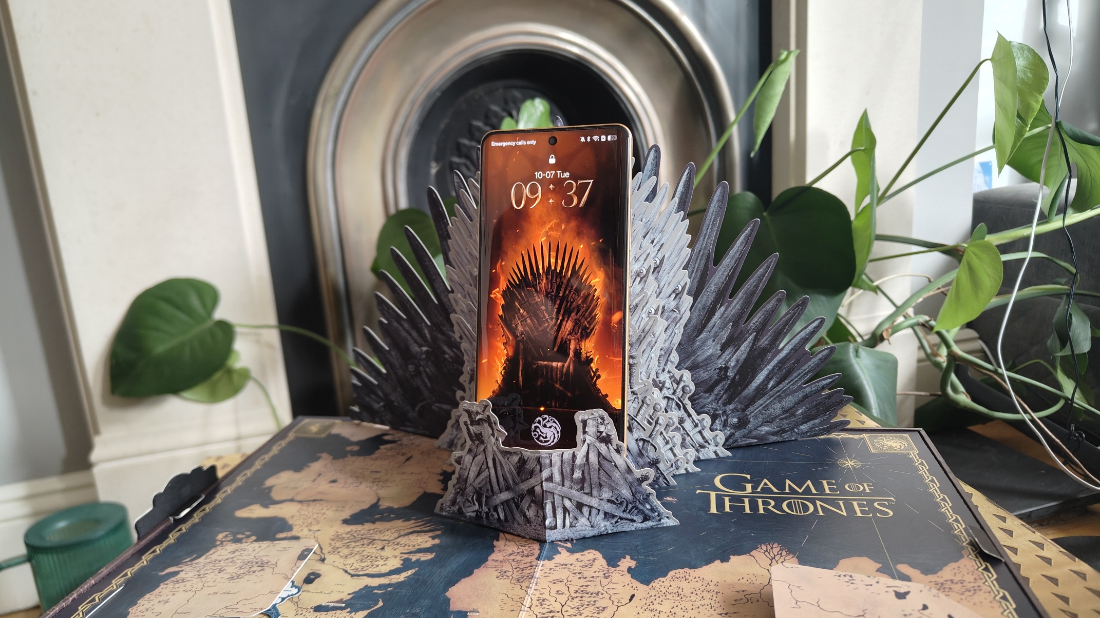
Now, onto the Game of Thrones additions. The phone comes in a pretty big box with some show-inspired extras like character postcards, a pop-up phone holder, and, perhaps my favorite of the lot, an ornate SIM card removal tool.
Perhaps the most noticeable design trait of the new Realme is the Targaryen dragon on the back, as well as the show’s logo on the back and the dragon claws on the raised camera section. Look closely and you can see the various House banners chequered on this section, and around the two larger camera mounts are sayings from the show (of course, ‘Winter is Coming’ is one).
According to Realme, the black-leather back of the phone is color-changing and will turn red if warm water is applied. My first instinct was to put the handset in a mug of warm water to see what happened, but despite the IP68/IP69 and MIL-STD-810H ratings, it didn’t feel that wise to dunk a smartphone in liquid as soon as I received it. Maybe once this article goes live…
There are software tweaks to the phone, too, thanks to the addition of some themes. You get Game of Thrones-inspired animations, a fingerprint scanner, backgrounds, and interface logos, which mostly affect the pre-installed apps, but occasionally I’d download an app logo that’d be fully Thrones-ified.
Another feature stood out to me when I was reading the review guide: Realme has added a few Game of Thrones-inspired camera filters, modeled after the color grade of certain locations of the show. And when I saw this, knowing that I was about to visit Austria the next day, the lightbulb in my head went off: I needed to take the phone with me.
Arming up
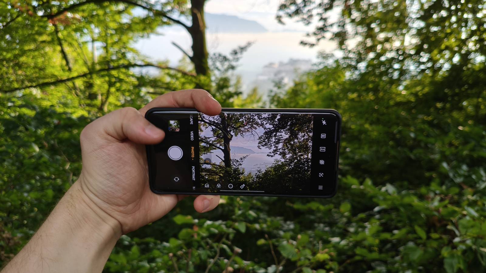
I know, I know, camera filters aren’t exactly the sexiest feature a phone can have, but I was curious after sample pictures provided by Realme showed them to have a more dramatic effect than most.
The filters are inspired by the looks of locations in Westeros and, more specifically, the color grades used in these settings. The first is called Northland, evidently inspired by Winterfell and the North, which has a cold, blue look. The other is called Kingdom, which evokes ideas of King’s Landing with its warmer appearance. In all honesty, the filters simply change the color balance of a snap, but from my testing, it was still enough to change their overall feel.
And what was that testing? Mostly, it was me taking pictures of Salzburg’s Fortress Hohensalzburg, and the Untersberg mountain outside town, as these felt like Game of Thrones-y subjects to me.
Most of the pictures you’re about to see were taken on the Realme’s main camera, simply because I don’t like the way ultra-wide snaps look (and I don’t imagine Game of Thrones’ cinematographers used such lenses anyway).
I played around with a few modes, so you’ll see some tilt shift and night mode in use below, and I also cropped a couple of the snaps to match the 16:9 aspect ratio of the show. However, beyond cropping, nothing below has seen the light of Photoshop. And because I’m not reviewing the phone itself – I'm just looking at the Game of Thrones elements – I’m not going to get bogged down with a full analysis of the snaps.
I took loads of pictures during my holiday, but given that half of the trip was to Oktoberfest, I’m too smart to share them all – instead, I’ve picked five. To best test the filters, I took almost every single vacation snap three times: in the default camera mode, with the Kingdom filter, and with the Northlands one. I know, I’m great fun on holidays.
Through the lens
I’m going to start with my favorite photo, partly because it looks great looking out over kilometers of land, and partly because it took me ages to get to the lookout vista and I want to brag about it. In the near ground you can see some trees while the middle distance has the Fortress Hohensalzburg and in the far distance, beyond some clouds and mist, you can see the peak of Untersberg.
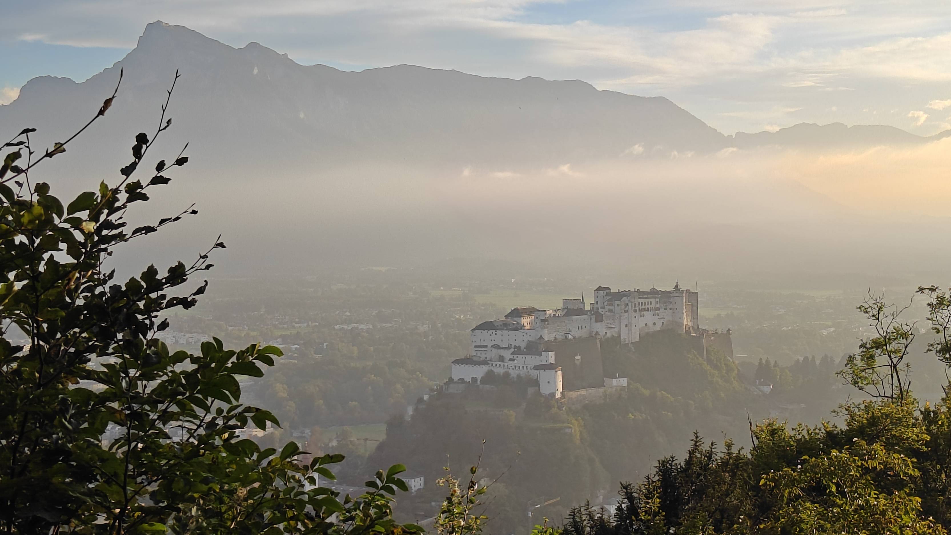
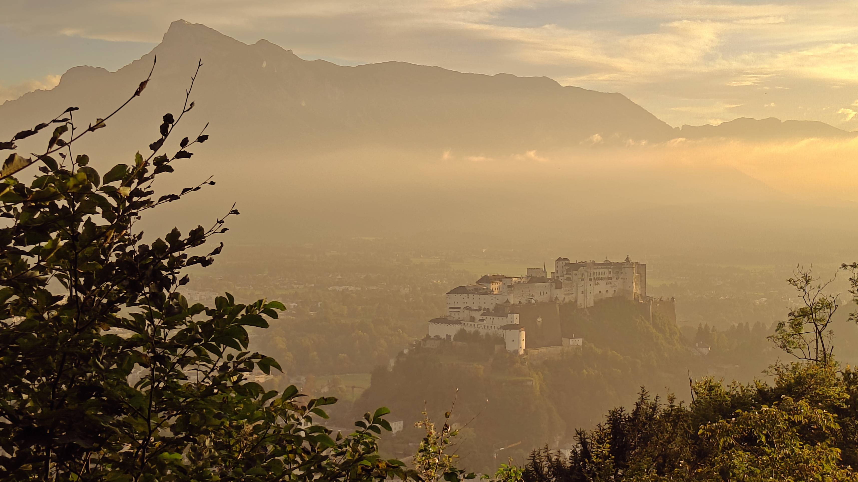
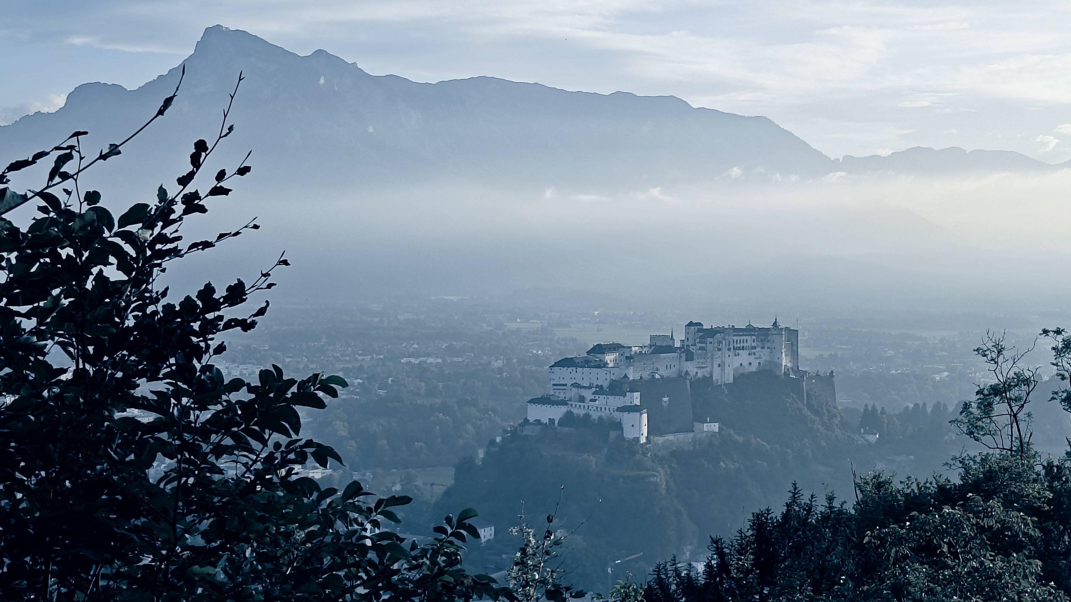
In the standard picture, there’s quite a warm color profile anyway, and that’s because I took the photo shortly before sunset – they call it the golden hour for a reason. Seeing those streaks of gold on the branches of the tree, and the citadel further away, I was curious to see what the warmer image would make of it.
So, we move to Kingdom, and the warm look adds a nostalgic hue, even if the yellower look leads to a reduced contrast with the sunny belts on the walls. It’s a great way to look at holiday snaps, reflecting the haze of time (and, given the second half of the trip, the haze of memory…) but I don’t remember Game of Thrones looking so cozy.
That’s where Northlands comes in, sapping out the warmth. However, in the show, these areas are bleak and unforgiving, which the Austria-Germany border here certainly isn’t, and so I can’t help but feel that the filter’s coloration is at odds with the subject.
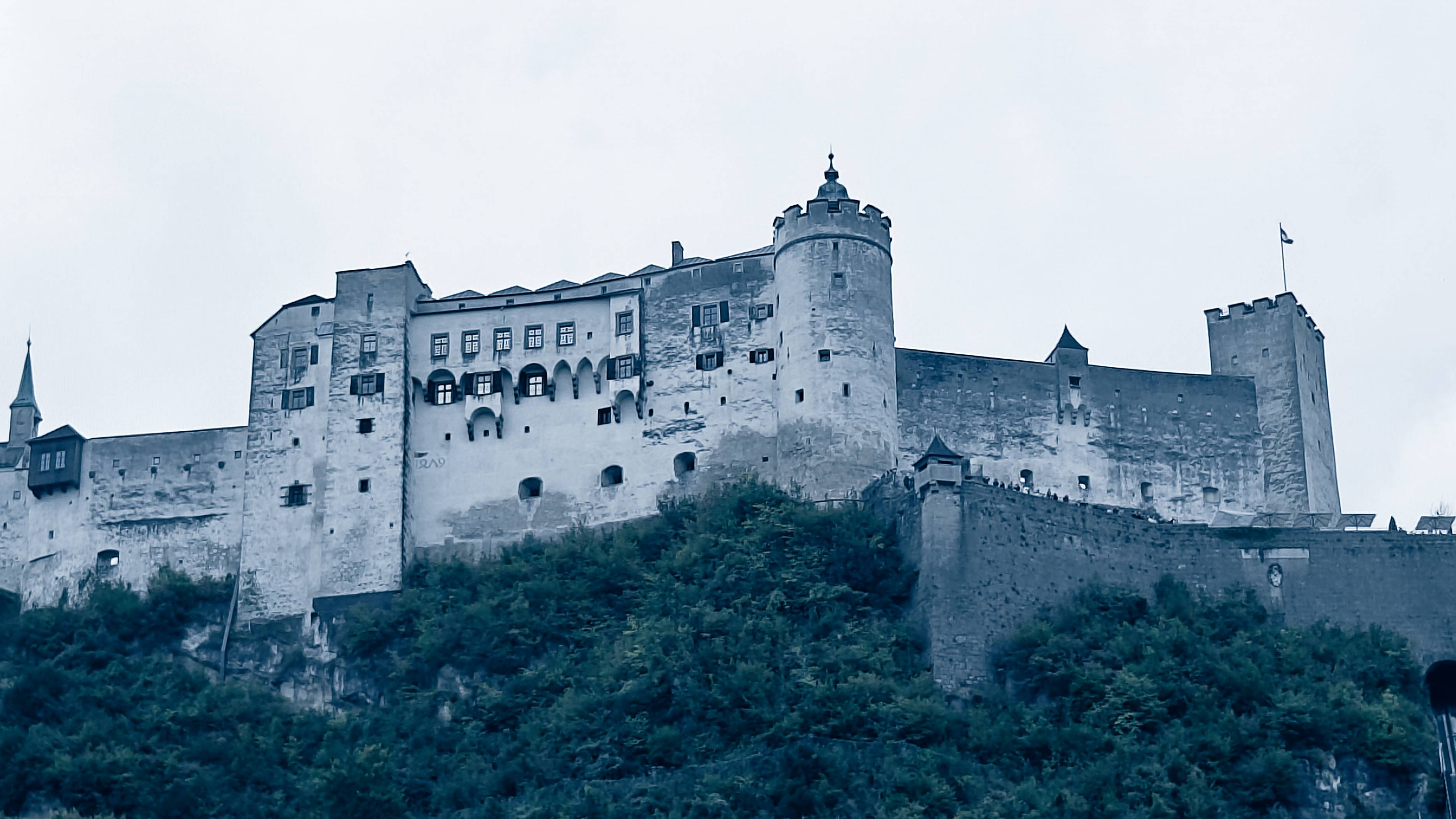
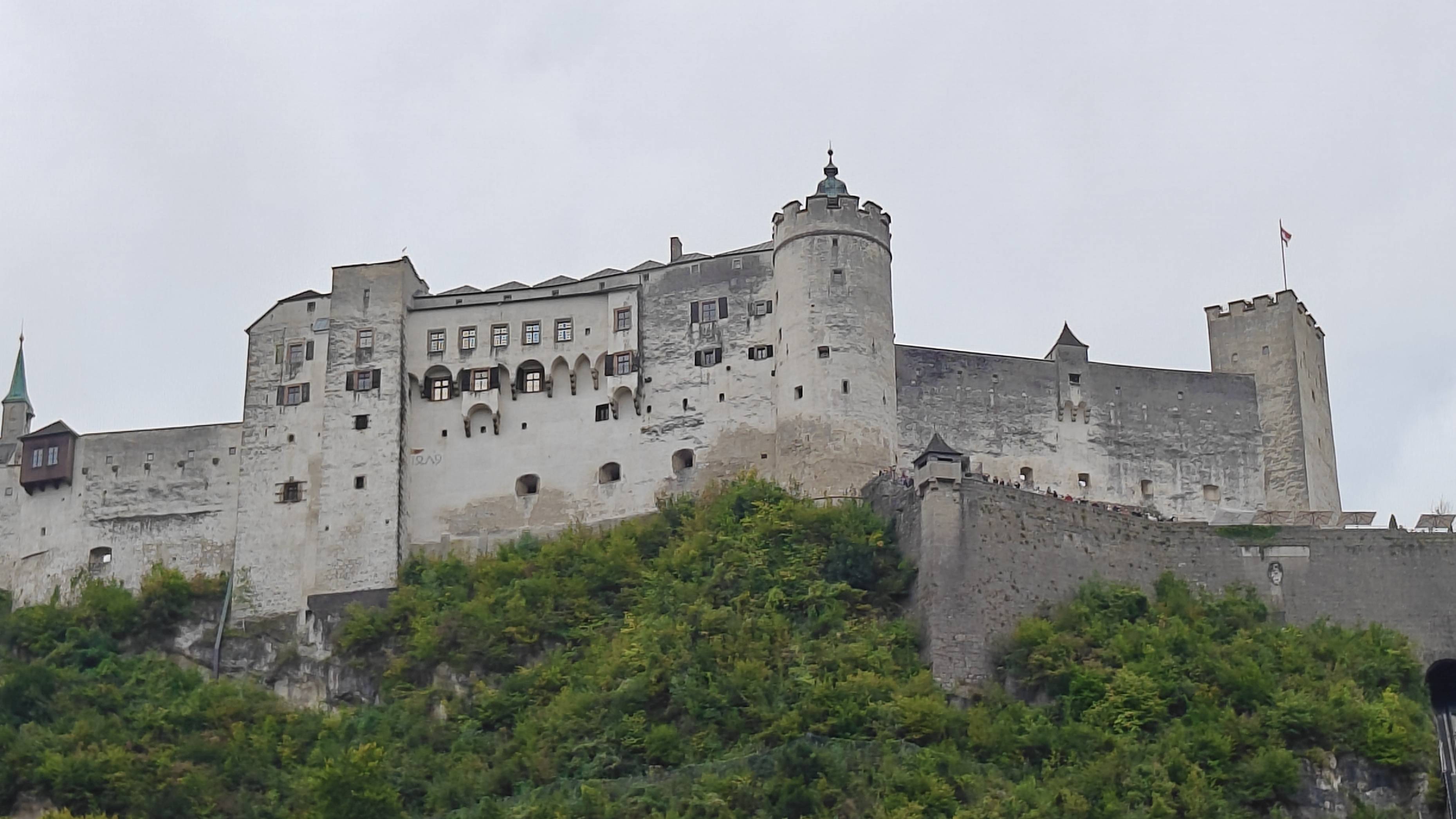
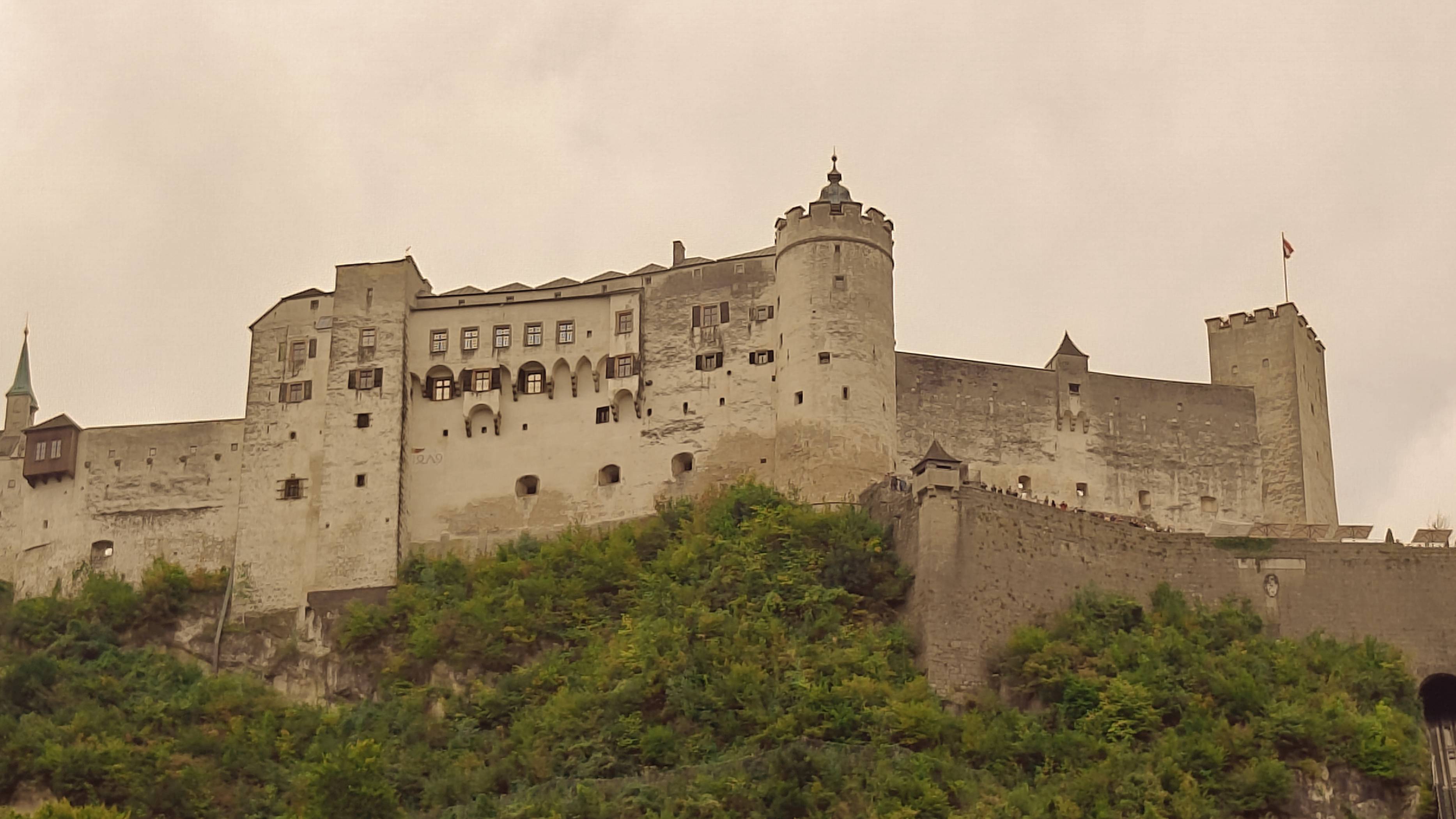
That dissonance isn’t the case when we get a little closer to the fortress, though, as my second test photo shows – this one was taken in the town of Salzburg itself, looking up at the castle on the hill. In the Northlands picture, its stark protrusion into the sky, combined with the color scheme, makes it look cold and imposing.
However, the gray of the castle and sky feels a little bit too similar to make the picture distinct, or add that much (possibly an issue with my own photography, as much as the subject). In fact, a problem I constantly found with Northlands is that it crushed the dynamic range to such a degree that pictures lost nuance, and sometimes so much color that they looked almost monochromatic.
The walls are clearly a different shade in both my standard and Kingdom pictures, but these images are also pretty similar to each other. That’s another thing I noticed during my testing – a picture taken at the right time of day didn’t benefit much from the warmer white balance.
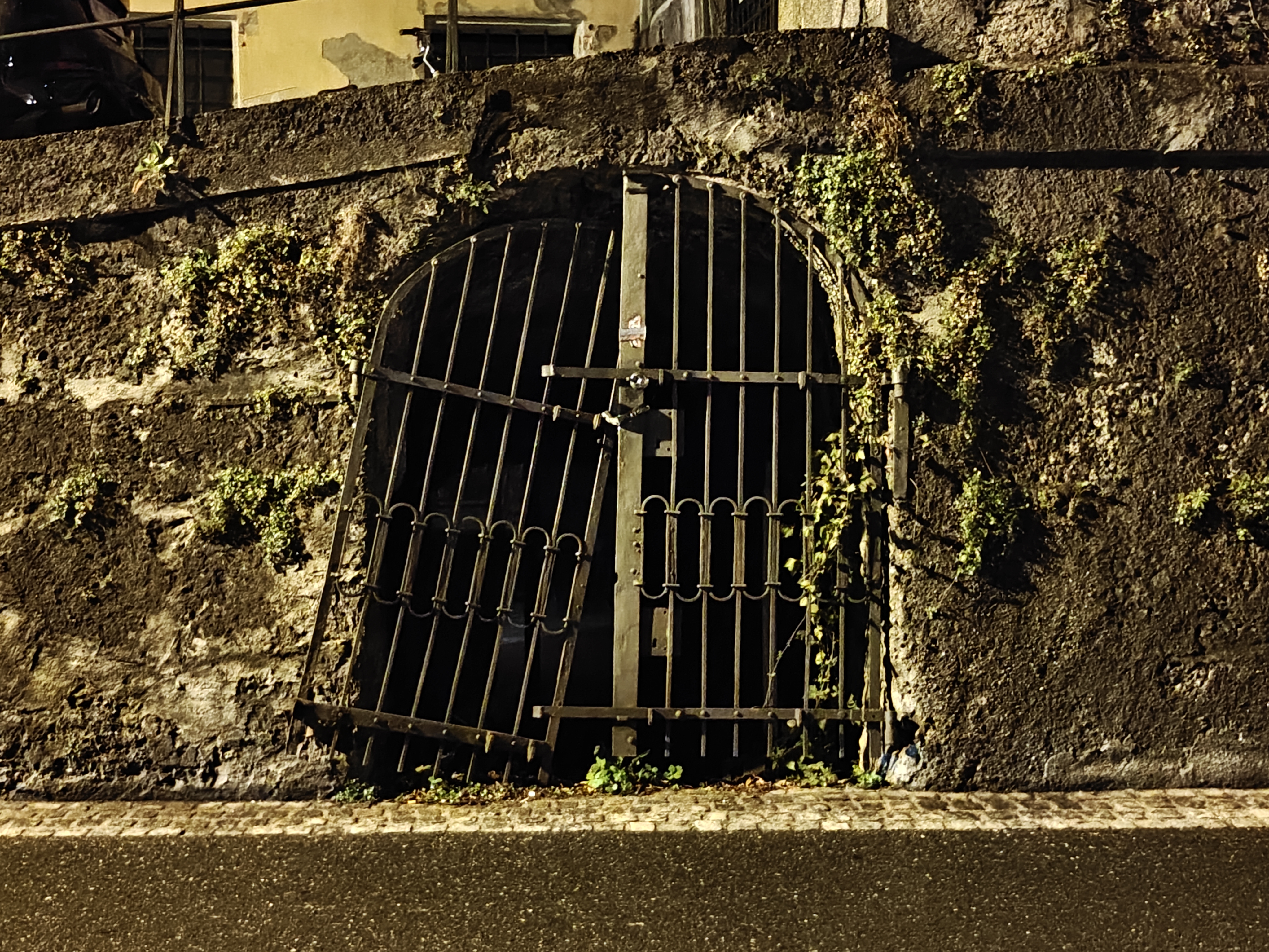
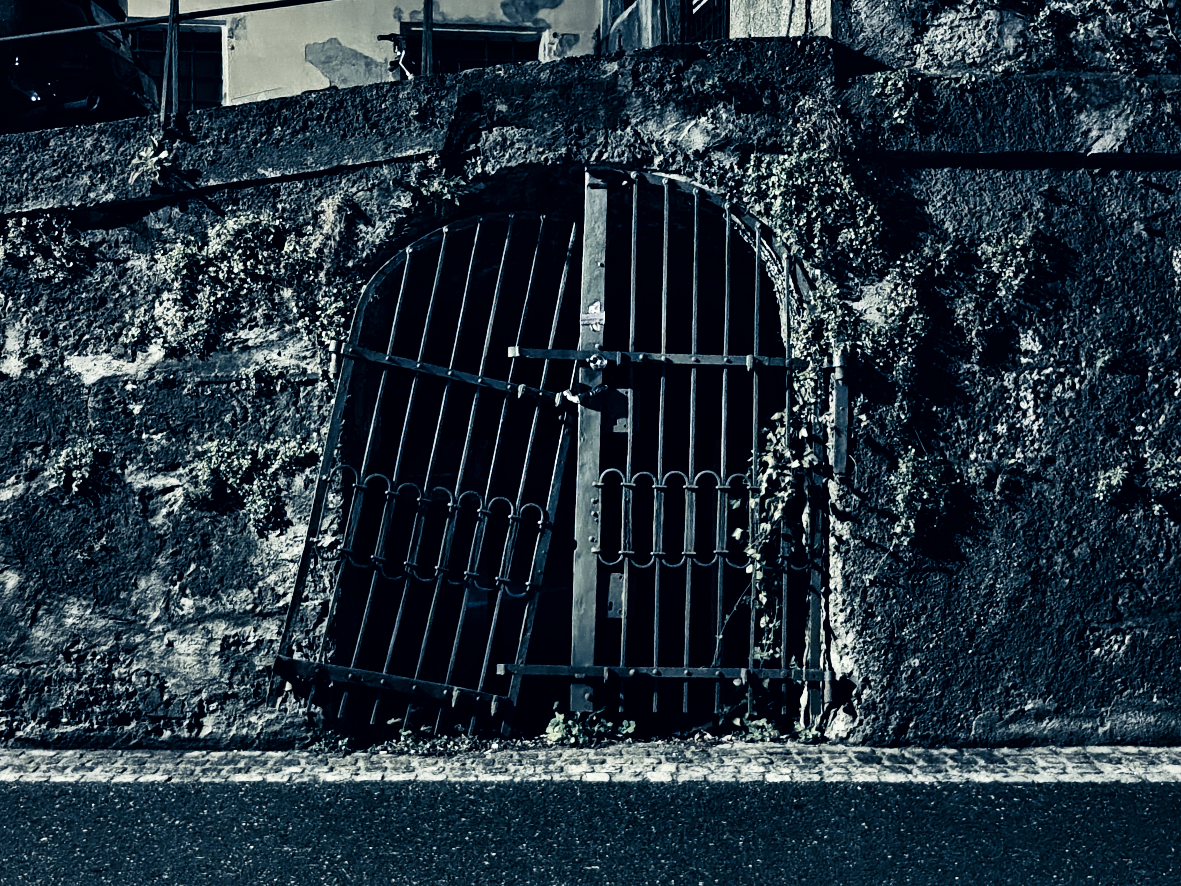
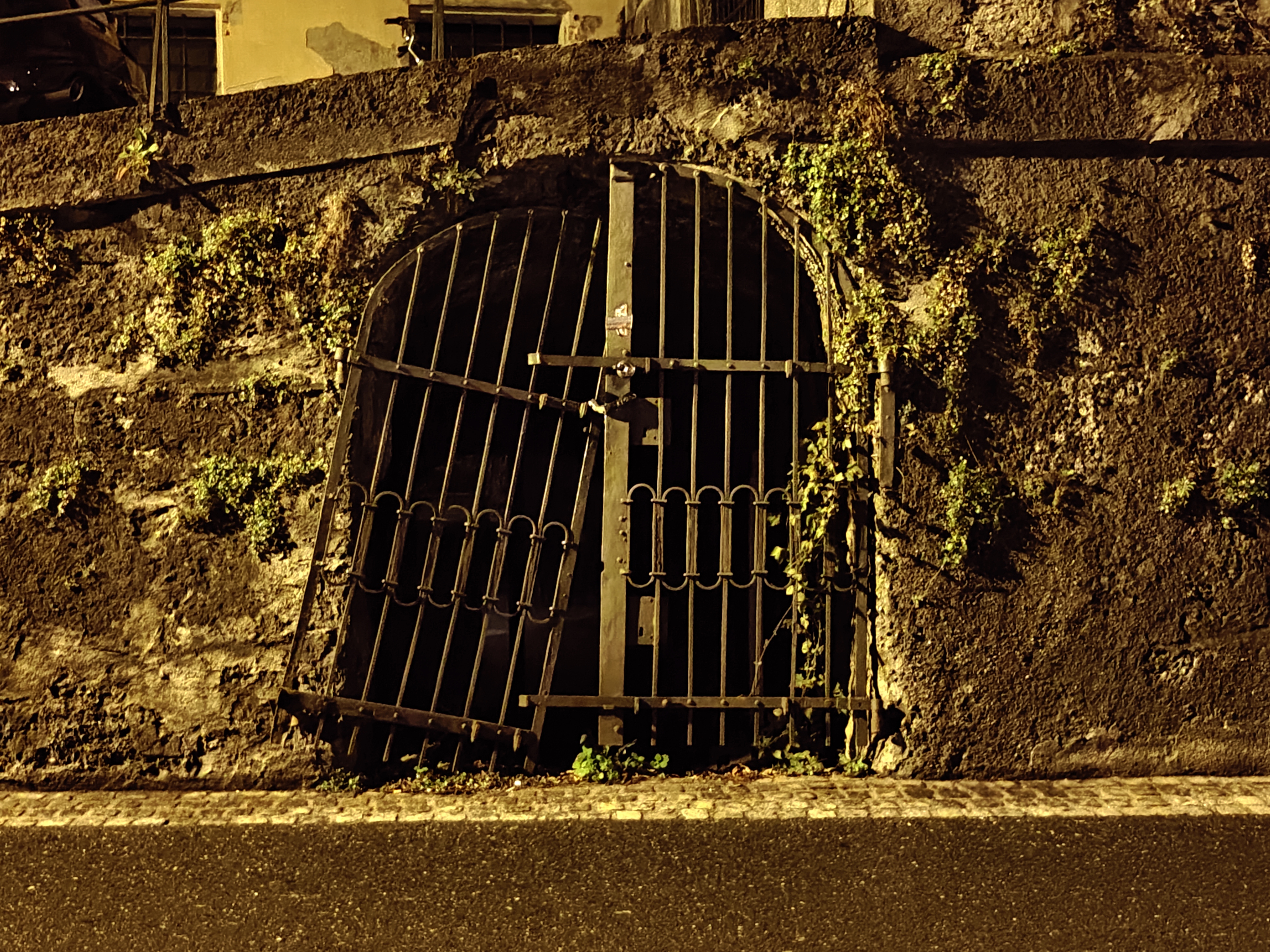
This picture shows that more than most. You’re seeing these snaps of a dark gate back-to-back, so you can easily tell which has the Kingdom filter on, but when I foolishly changed the order when preparing to upload these photos, I couldn’t tell at a glance which was which. This is largely true because this was taken with Night Mode, which often results in yellowy pictures on most phones.
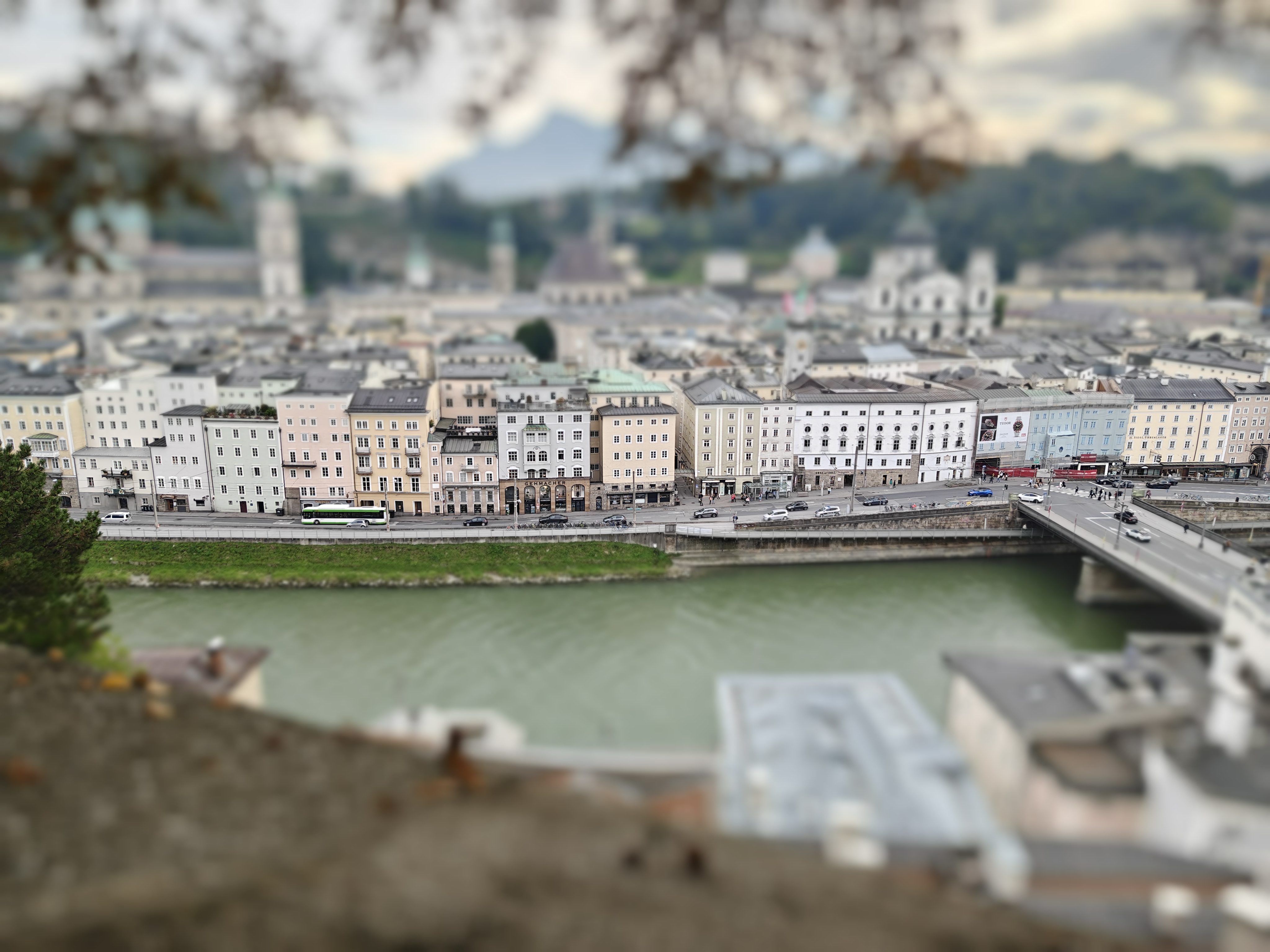
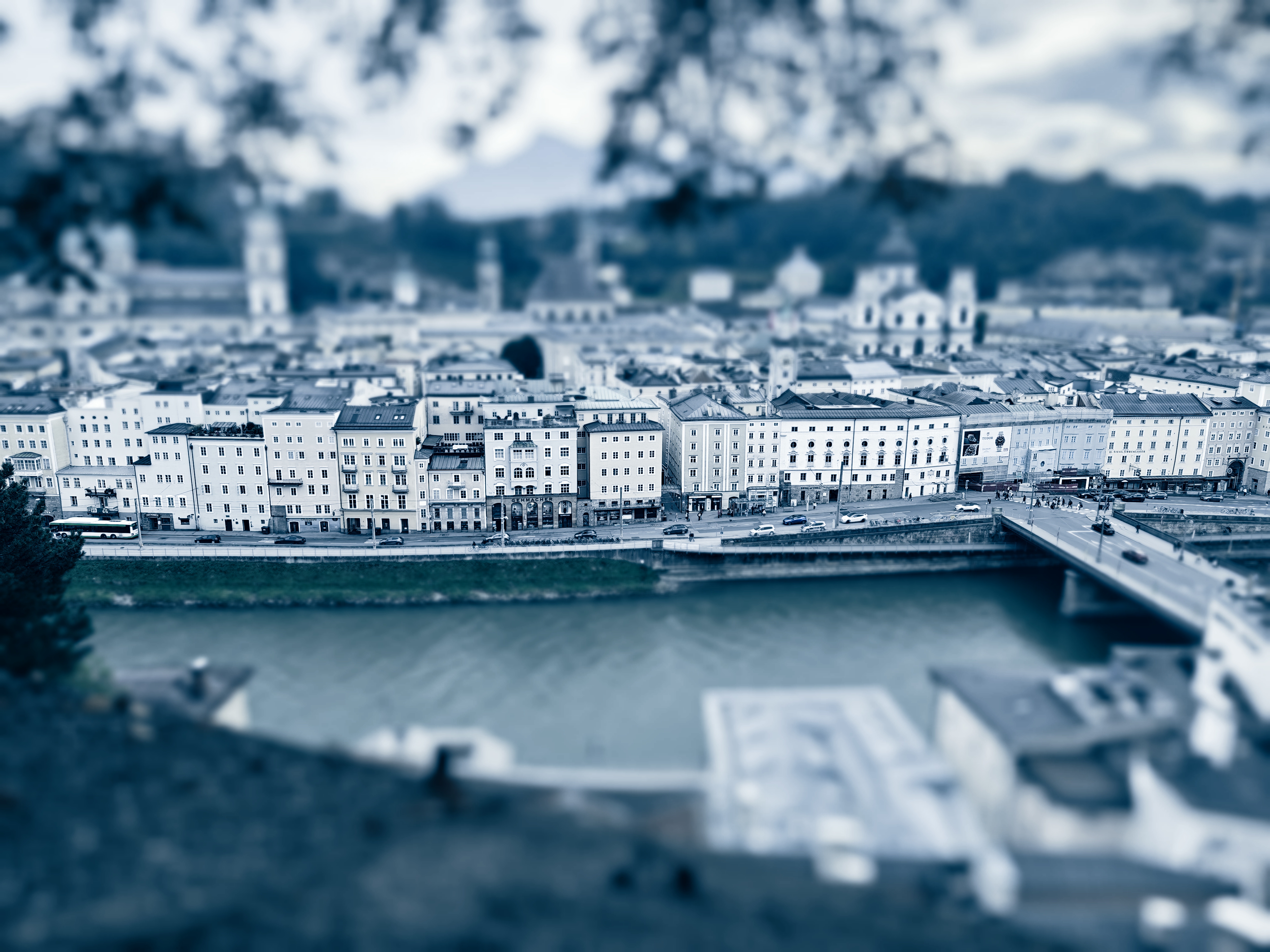
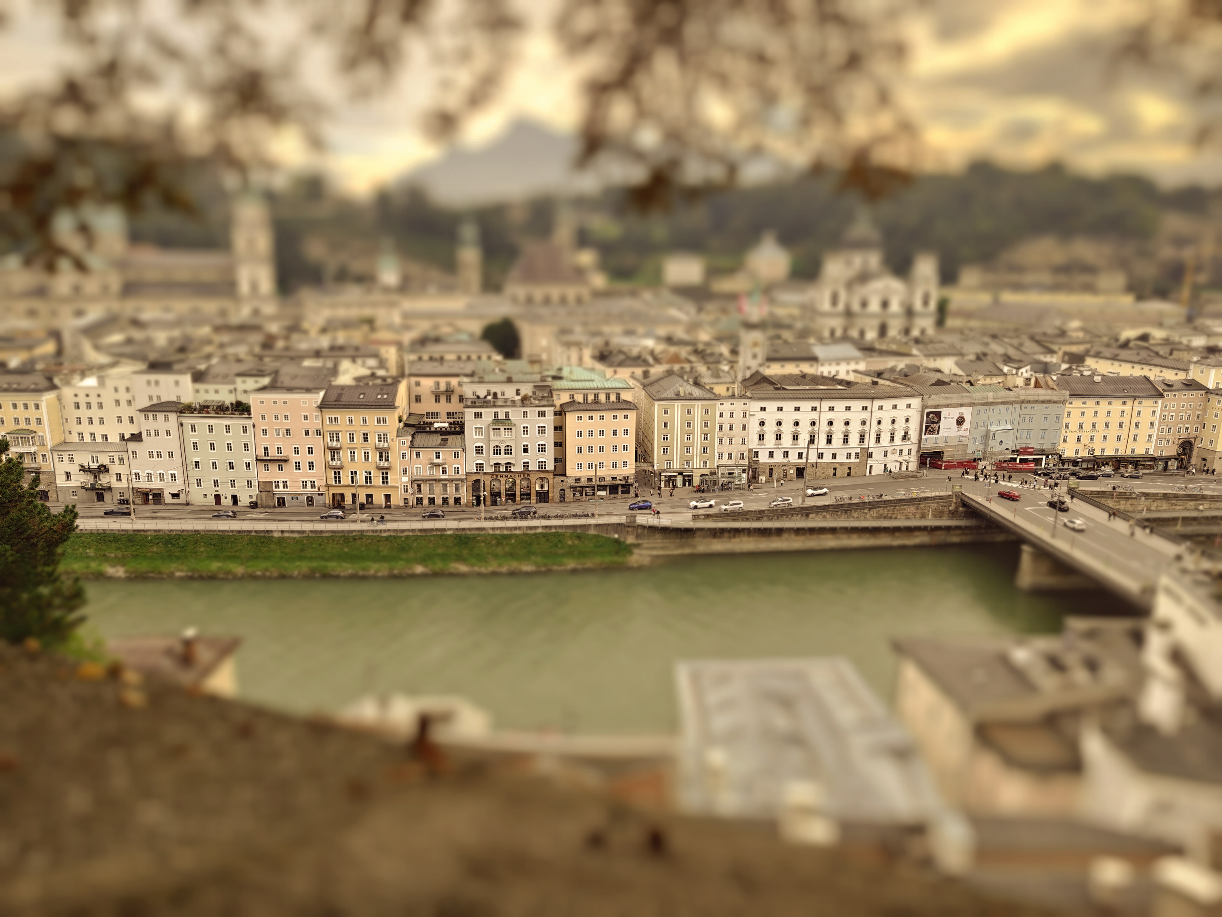
I played with tilt shift a fair bit during the camera tests, and that’s because I often find it takes its most interesting pictures of cityscapes or when you’re at a distance from your subject, using the linear-blur effect to isolate one specific element of the snap. In this picture, I did it for the first row of buildings over a river, while losing everything else.
It’s also an image that interestingly illustrates the filters and the effect on the photo. On the standard snap, you can see that the buildings have slightly different colors, adding a quirky pastel look which is commonplace in European cities.
Now to Northlands. This desaturates the row of buildings so they all appear white or gray – if you hadn’t seen the previous picture, you’d be hard-pressed to be able to tell which colors the buildings were previously. It looks clean and clinical but also slightly unwelcoming and devoid of warmth… just like Winterfell in the show.
Then onto Kingdom, which retains the colors of the original picture but adds some vibrancy and warmth to the surrounding blurred areas, too. Immediately, this seems more inviting, like a little toy town you can rush into and explore. Admittedly, the Salzburg in this picture doesn’t have that in common with King’s Landing, which saw more than its fair share of murder, war, and death, but it’s a great counterpoint with the other versions of this picture anyway.
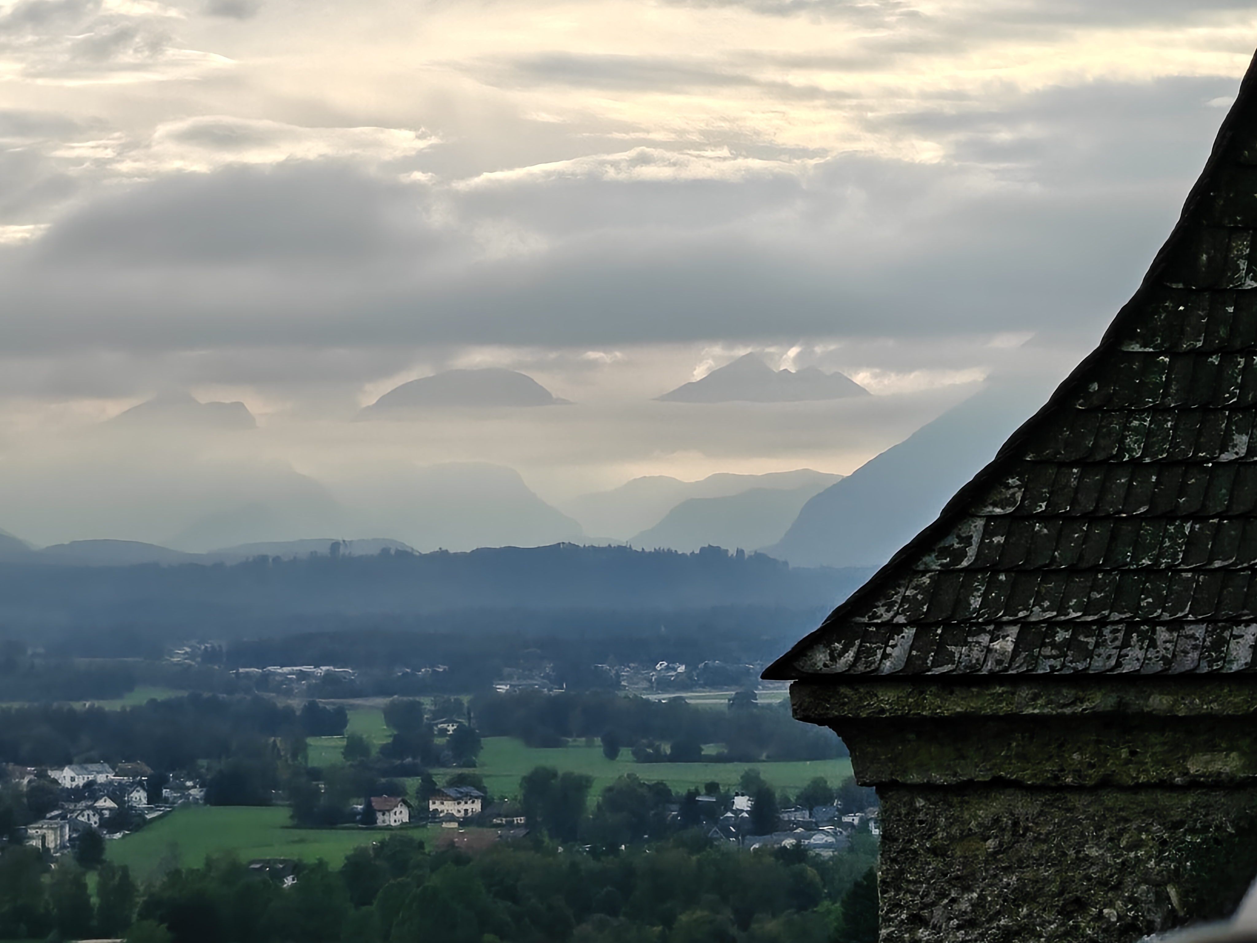
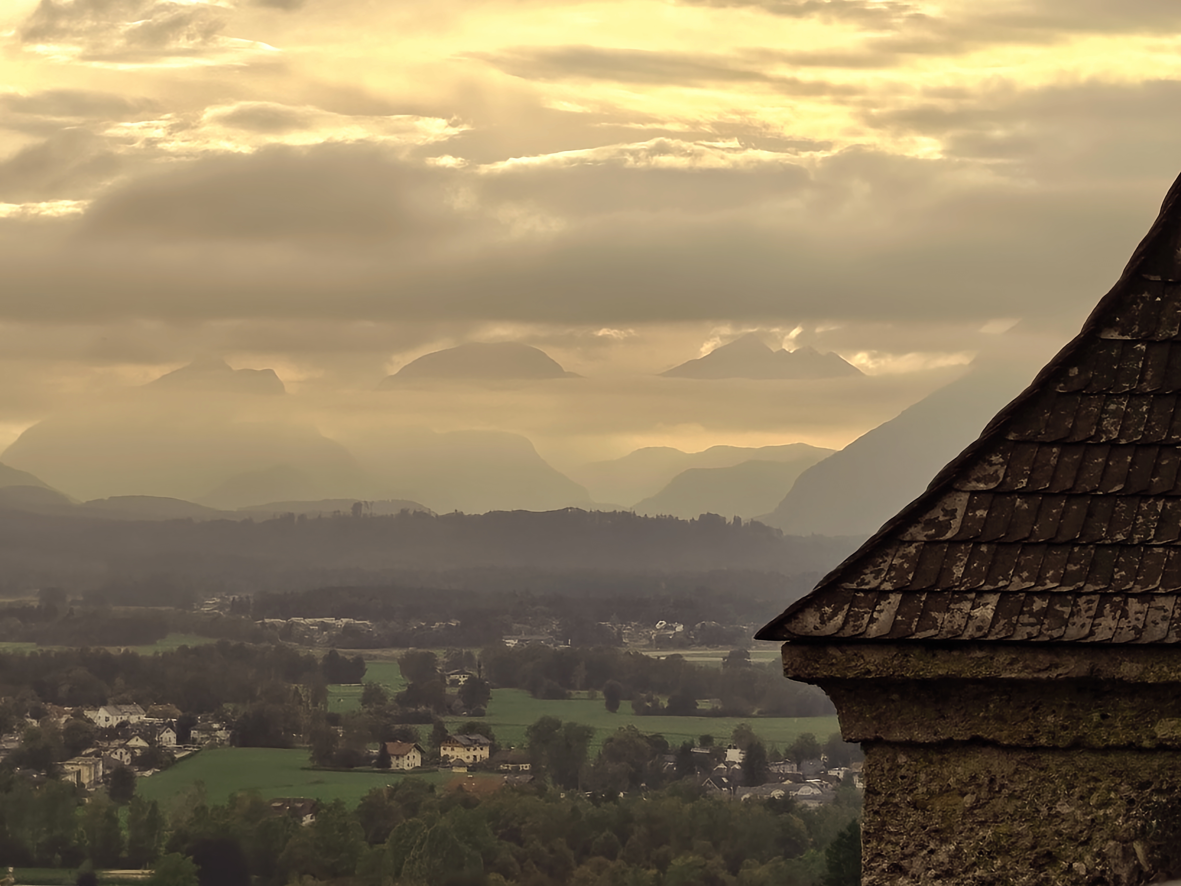
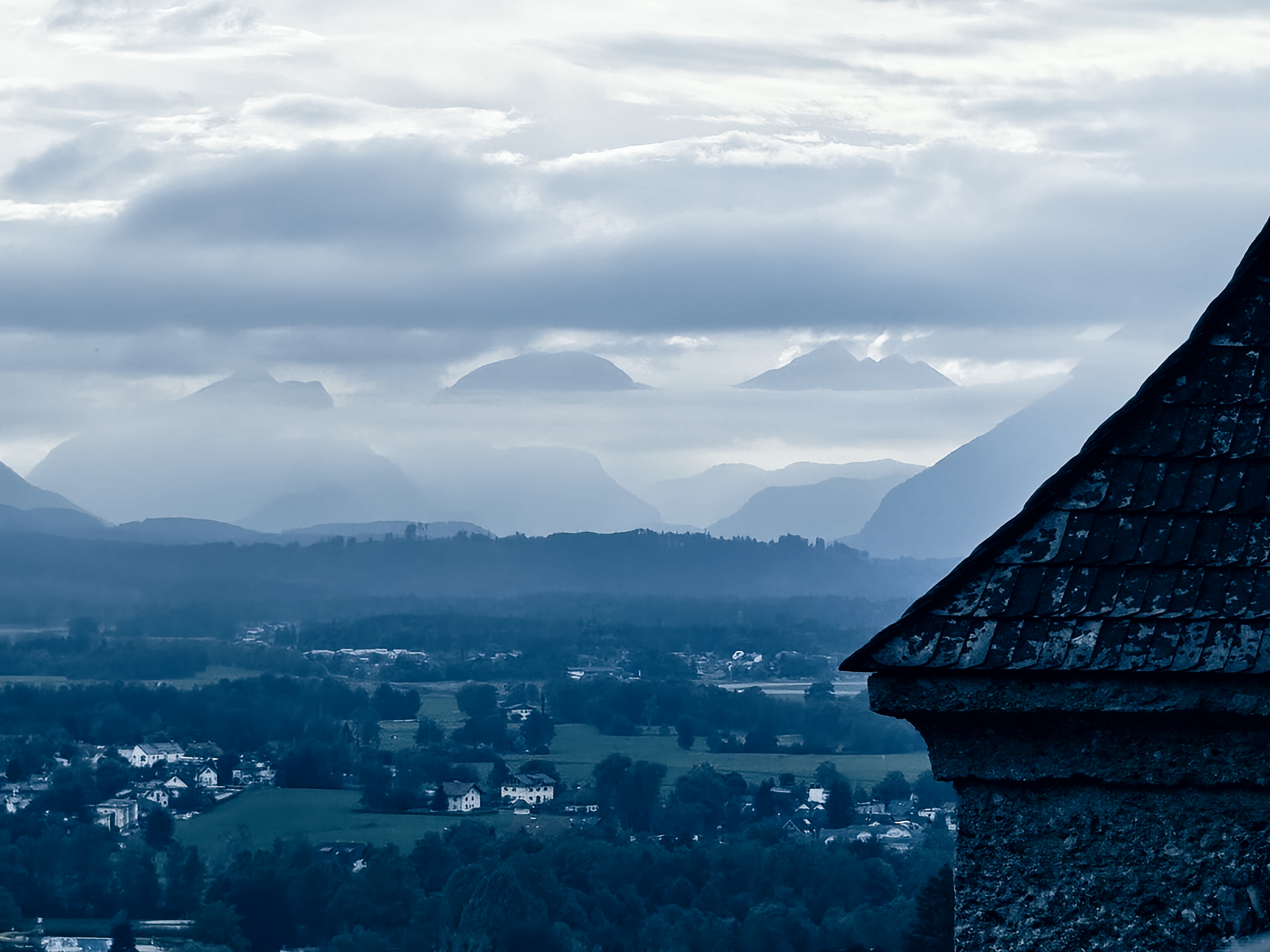
For the last picture, we’re looking at mountains again – not the staggeringly beautiful Unterberg, which towers over the town and captured my imagination for every second I was in the city, but from the ramparts of the fortress to glimpse at the Bavarian Alps.
This isn’t exactly an artistic picture, but I am always captivated by mountains in the distance and wanted to see how well the phone camera would pick up the cloud-hidden peaks in the distance. And I think it’s another example of how the color filters – and the emotional attributions we assign to them – can manipulate our viewing of an image.
In this line-up, I think I prefer the Northlands filter, particularly the slight contrast between the mountains' different shades of gray, and the cloud that cuts through them. The peaks look imposing, looming up into the distance, and yet somehow alluring. It's just a shame that the filter makes the foreground houses and castle roof look too blue.
In the standard picture, those closer elements look natural, and the verdant greenery of the landscape looks safe and calm compared to the misty formations of the background. Then in Kingdom, the same juxtaposition stands, but with the warm yellow haze looking almost sickly, and I'm not sure the filter's effects add much to the shot.
I enjoyed testing the camera's filters because even when they didn't add much to a shot, or even made it look worse, they were more heavy-handed and effective than the standard ones you see on a smartphone. They let me play with the white balance and look of a shot without having to spend too much time in Pro mode to deliver the same effect. And for some of the shots, I really like the resulting images.
Follow TechRadar on Google News and add us as a preferred source to get our expert news, reviews, and opinion in your feeds. Make sure to click the Follow button!
And of course you can also follow TechRadar on TikTok for news, reviews, unboxings in video form, and get regular updates from us on WhatsApp too.
You might also like
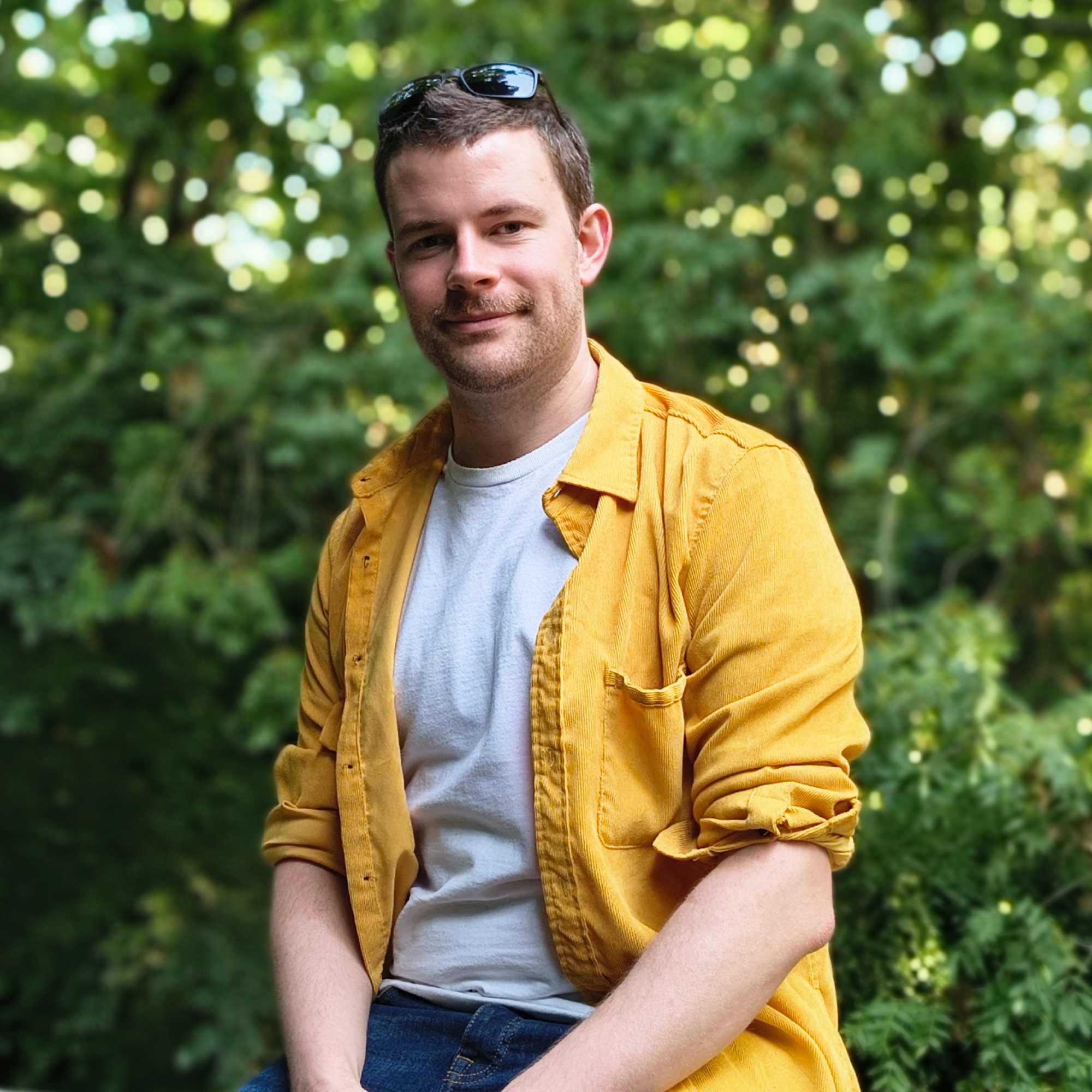
Tom Bedford is a freelance contributor covering tech, entertainment and gaming. Beyond TechRadar, he has bylines on sites including GamesRadar, Digital Trends, Android Police, TechAdvisor, WhattoWatch and BGR. From 2019 to 2022 he was on the TechRadar team as the staff writer and then deputy editor for the mobile team.
You must confirm your public display name before commenting
Please logout and then login again, you will then be prompted to enter your display name.
 Become a TechRadar Insider


