
 Become a TechRadar Insider


Your iPhone’s Lock Screen is the first thing you see when you pick up your phone. It’s also the face you present to the world and those who might glance at the phone in your hand, its screen temporarily lit up by your touch.
The Lock Screen is the thing you interact with more than anything else on your phone - it's the most personalized part of the phone, and yet with iOS 16, Apple is offering fundamental changes to the iconic screen; Apple SVP of Engineering Craig Federighi described it to TechRadar this week as “a massive step forward.”
The roughly two-year-long journey from early Home Screen personalization efforts in iOS 14 to the rich and surprisingly expressive tools in iOS 16 is, in some ways, obvious: a joint effort between engineering and design to offer customization without muddying what people know and love about the iOS interface. But it's also a story full of surprises and, yes, innovation.
As Apple’s WWDC 2022 wound down, Federighi and Apple VP of Design Alan Dye sat down via video conference with us to walk us through the development, decisions, and deep technology that led to the all-new Lock Screen features coming to iPhones.
Your Lock Screen is already a destination for utility (camera and flashlight access), information (all those notifications that can crowd the screen), and some light personalization (the photo of your partner or cat).
But the personalization changes Apple made to the iPhone’s home screen two years ago in iOS 14 (customizable widgets sharing the screen with app icons) set the stage for bigger Lock Screen changes.
“We knew this was a multi-act play, and we knew our next venue would be the Lock Screen,” said Federighi.
“We saw a real opportunity to take that area that really has evolved slowly over time but has never seen this kind of massive step forward, and to do something really big -- but something very Apple and very personal. So, this is an act of love this year,” he added.
We saw a real opportunity to do something really big -- but something very Apple and very personal. This is an act of love.
Craig Federighi
Federighi, who is something of a WWDC meme and well known for his effusive, all-things-Apple passion, and exacting attention to detail can be forgiven for some hyperbole, but it fits with the notion that Apple takes this issue more seriously than many other phone manufacturers.
Redefining the face of your iPhone requires quite a gamble - consumers need to feel like they're not being forced into change for the sake of it, meaning what's offered has to be both personal and maintain the brand recognition Apple is known for.
“Our goal,” Dye told us, “was to make the iPhone even more personal - and definitely more useful - but also keep intact those key elements that make iPhone, iPhone.”
More than once Dye said that the Lock Screen is a key part of “the icon of the iPhone.”
It’s about time

If you had to choose one element that really speaks “iPhone,” it might be the clock. You can look back at the 15-year history of the iPhone and instantly identify the device by that large, centered, top third of the screen time display.
That won’t change with the new Lock Screen - while Apple did consider it, the decision was made to keep the iconic element.
Instead, Dye described how his team designed a new bold, custom version of its San Francisco typeface and, for the first time, is letting iPhone users choose a different clock font style and colors.
“Typography is such a huge passion of ours, the design teams,’ and we have a number of other Apple design typefaces, even some non-Latin scripts. So, for the first time, we’re letting users choose their favorite,” said Dye.
Obviously, the personalization doesn’t stop with the adjustments to the way you see the time.
iOS 16’s is amping up all of the Lock Screen’s core features (information, personalization, and utility) while also creating something far more visually striking than has ever existed before on an iPhone.
“From a Design Team perspective, our goal was to create something that felt almost more editorial, and to give the user the ability to create a Lock Screen that really… ends up looking like a great magazine cover or film poster but doing it in a way that’s hopefully really simple to create, very fun, and even with a lot of automation there,” said Dye.
That "magazine look" is achieved through a collection of new controls and customizations that bring together the revamped time, widgets, photos, and deep technology that both identifies good Lock Screen images and can meld them with elements in new ways.
Instead of a screen that you can update with a favorite photo but are otherwise unable to change, iOS 16 will let you dig into the Lock Screen by long-pressing your finger on it. Doing so will open up a gallery of Lock Screen options and the ability to customize each lock screen to your liking.
At the center of all this customization and new Lock Screen looks is the photo you choose - or not.
iOS 16 will have many pre-built Lock Screen options to help nudge you towards looks and styles that it thinks will look the best on your smartphone, without removing users' ability to make the changes they want.
The subject is photos

Starting with iOS 10 and its introduction of portrait photography, Apple’s been on a photo understanding journey that has evolved into machine learning that's now capable of understanding what makes for a good Lock Screen photo.
“[There are] actually about a dozen neural networks that judge the photo based on whether it’s a desirable subject, if there are people there, how they’re framed and cropped in the photo, their expressions. All these things that allow us to surface automatically really great, compelling options for people and then to render them on the screen in a way that makes them feel almost all-new,” said Federighi.
Choosing and suggesting Lock Screen-worthy photos is one thing, but with iOS 16, Apple is making the images – or rather the subject – an integral part of the interface.
About a dozen neural networks judge the photo based on whether it’s a desirable subject
Craig Federighi
The "magazine look" Dye mentioned is more than just the overall composition of Lock Screen elements. It’s that fluff of dog fur or the swell of flowing hair that intersects with the time element and, instead of sitting behind the numbers, layers on top of it. It’s an arresting - and professional - look that’s created automatically. Apple calls it “segmentation.”
Creating this look is something Dye, and his design team dreamed of for years.
“We’ve been wanting to achieve this look, but the segmentation’s gotten so good, that we really feel comfortable putting [in there]. Unless the segmentation is just ridiculously good, it breaks the illusion.”
Breakthrough
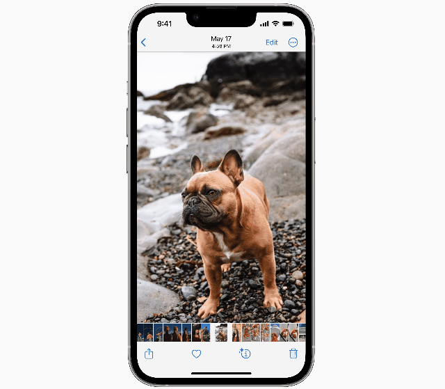
Segmentation in IOS 16 actually goes beyond the Lock Screen. During the WWDC keynote, Federighi showed how an iPhone user could touch and hold on a photo of a bulldog at the beach and drag just the bulldog into, for instance, Messages.
It’s no great leap to see the connection between segmentation in the Lock Screen and dragging and dropping perfectly selected elements out of a photo and into another app.
“You’re right in connecting those two things, and we developed some new neural networks - using a technique called 'attention' that allows us this new level of precision in identifying the subject and segmenting them - that we were able to apply to this and other cases.
"In the context of what you saw with us lifting and allowing interactive lifting out of photos, what’s also really amazing is, using the Apple neural engine, we’re able to do that in, like, a 100-milliseconds,” explained Federighi.
That speed is evident in the Lock Screen segmentation, which makes that hair overlaying instantaneous.
The intelligence, which happens on-device and through the Apple Neural Engine on the A15 Bionic CPU, allows Apple to, as Federighi explained it, “take a photo we’ve never seen before and figure out the subject, and segment it, and allow that interaction so fast, that we can do it the moment that your finger hits the glass.”
This segmentation, which reminds us of what Google Pixel can do with its magic eraser, feels like a technological leap.
“It’s certainly an area we’re working in, the space of depth and segmentation, but you’re correct that this year we had some breakthroughs that we were able to apply to this problem,” added Federighi.
Apple’s understanding of your photos extends to helping you make filter adjustments that will complement the image elements, although calling them filters is a mischaracterization of the styles iOS 16 lets you apply to Lock Screen photos.
Instead of a set collection of filters you can apply to images, Apple is using that segmentation knowledge to offer up a bespoke set of looks.
“These styles are so much more than filters,” said Dye. “We’re actually using segmentation, tonal values, all of our scene understanding to really help us determine how we can intelligently offer a variety of treatments for each photo. Which is also really cool because it’s very much Apple at its best. Design and engineering technology all working together to offer something, really, I think, quite beautiful.”
Instead of eight or a dozen set filters, you might only be offered two styles for a photo, and they’re unlikely to be the same two if you chose a different Lock Screen photo.
Dye told us that if the system doesn’t think the photo will look great, it won’t suggest it, a point of care and attention that helps guide the user towards more visually arresting Lock Screens.
“You get something so much more compelling than just laying a filter over the photo,” added Federighi.
Make it useful, too

Less visually striking, but no less important are all the utility changes iOS 16 brings to the Lock Screen. There is now a space below the time for as many as four widgets, offering up live information on the weather, your Activity progress, calendar, the stock market, and more.
Adding them to an iOS Lock Screen should feel familiar to anyone who owns an Apple Watch and has fiddled with complications. This is no accident.
“Of course, we took a lot of inspiration for Apple Watch complications in designing these widgets that make it very easy to get information at a glance,” said Dye.
“There’s no question – one of the benefits of having one design team that works on every product and the design across all of our products, we learned a lot about glanceable information and how to portray that over a variety of different images,” he added.
Apple, though, has held back on the introduction of widgets on the Lock Screen. While you can drop as many as four small square widgets on the page, you can’t put them just anywhere and you can’t introduce a second or third row of widgets. You also can’t reposition the time, date, and widget boxes.
“This [placement of the widgets] is very intentional. It would’ve been very easy for us to say, ‘Hey, drag anything anywhere.’ Honestly, technically, this would not have been a challenge,” said Federighi.
For Apple, the goal is balancing personalization with the coherence of the iPhone interface. Not that Apple didn’t examine a few other options.
“It was certainly – we explored – Alan and I both looked and considered a lot of. ‘Put big things all over the screen.’ We tried all of the possibilities,” recalled Federighi.
Dye told us that they could’ve just placed all the widgets in “some container shape to create really easy legibility,” but then they would’ve lost personalization.
Interface fabric

As it is, the introduction of new information on the Lock Screen, especially a collection of translucent boxes, introduces its own set of challenges for the design and engineering teams.
“We worked really hard at creating some really 'smart materials', if you will, that can react to sort of any wallpaper image and make sure that they remain legible. So that was a big challenge for us,” said Dye.
'Materials' is the way Apple renders these widgets on top of the wallpaper image.
“We build what are essentially virtual – if you want to think of materials like paper, glass, or cloth - materials and those are how we blur, create translucency, how light that may come from the background comes through that material and might light up the content on it," said Federighi.
"[Or] how shadow works. These are all these parameters that can allow us to put something like a gauge or some text over what can be a variable wallpaper. Who knows what’s in that photo, right? And [the aim is to] still maintain legibility and harmony with what’s underneath it.”
Apple didn’t just build the widgets and materials and call it a day. With the level of variability introduced by billions of photos, Apple tested to make sure the materials are robust enough to handle “a variety of images"... and developed an internal tool to help to truly stress test millions of images against the materials, to ensure the user was getting a detailed and rich effect no matter which picture they chose.
“We have a tool that has these different, almost like sliders, if you will, so we can make adjustments. And then we essentially swipe between hundreds of different wallpaper images including some pretty challenging ones like – imagine like a chess board, you know, a black and white grid,” said Dye.
Up to the bottom
At the other end of the utility spectrum, actually the other end of the Lock Screen, are the new notifications.
Apple’s engineering and design teams took a hard look at the current state of iPhone notifications on the Lock Screen, and it sounds like they didn’t exactly like what they saw.
“This notion where they flow in from the bottom is especially nice if you think about the personalization part because so often we see notifications completely obscuring the photo on your Lock Screen, which we didn’t want to do with this new design,” Dye told us.
In iOS 16, Notifications will stay stacked at the bottom until you wipe up to expand them. It’s a demonstrably cleaner look.
“For a lot of us this getting the notifications down at bottom of the phone below the photo is just so changing the feel of the Lock Screen,” added Federighi, “because in practice, so many of us – what our phone mostly looks like is all of its personality is obscured by a list of text, a bunch of notifications.”
And it might mess with that “magazine cover” look and feel.
Living right below the new notifications are two stalwarts: the camera and the flashlight. Apple didn’t move or update them because they know this is still the best place for those app icons.
“We always explore new [ideas]; especially with this project we definitely explored new layouts,” said Dye. But Apple decided that “people really take advantage of those two features pretty extensively, so, we kept them where they are.”
Into focus

There is also a new richness to iOS 16’s Lock Screen that isn’t immediately obvious and it revolves around Focus.
Apple introduced Focus modes with iOS 15, which breaks down Focus into Personal, Work, Sleep, Driving, and includes the broad brush “Do Not Disturb.”
iOS 16 does something that it's almost surprising it hasn't done already, such is its simplicity and effect: linking the new Lock Screens to Focus modes in a rich and almost surprising way.
“Well, we think of the personality of your phone as being connected with what sort of frame of mind you are in or want to be in at the moment,” said Federighi when we asked him why Apple chose to connect the two.
And because our focus is different depending on our situation (work, home, vacation), the Lock Screen should and, with iOS 16, will reflect that. Customization will let you connect a focus mode to a Lock Screen and will carry through to the Home Screen underneath it.
“My phone will just be signaling to me, in all respects, that that’s the kind of frame of mind I’ve said I want to be in and that reinforces it for me,” said Federighi.
These changes, right down to which Lock Screen shows depending on your focus mode, can become automatic.
“When we introduced Focus, it came with both the ability to set explicit policies like time of day and location and also to learn and develop implicit policies,” explained Federighi.
“Notice you switch when you get to work and eventually it says, ‘Hey, I notice you switch when you get to work, do you want me to do this for you automatically?’
You say, ‘Yes,’ and it will start doing it for you automatically. And now, instead of that simply being a change to the focus policies, it will also reflect itself very visibly in your choice of Lock Screen wallpaper.”
Too much?
Complexity is often the unwelcome guest in a house of change. With the Lock Screen offering so many levels of personalization not just on a single screen, but on potentially multiple Lock Screens, how does Apple ensure that iPhone users won’t confused or frustrated?
Federighi, though, isn’t worried. He told us that it’s not Apple’s way to force anyone into these changes. Sure, there’ll be the unmissable, new clock style, but the segmented photo is a choice, as are adding widgets and multiple Lock Screens.
“When someone upgrades to iOS 16, they essentially won’t be confronted with any big change,” insisted Federighi. But consumers will find the option to implement these changes.
“Somebody who would occasionally change the photo on their Lock Screen, they’d go into settings, and they’d go to that screen [that lets them make the change]. We meet them right there, as they go there and, some of this isn’t in the seed build right now, but we make them aware of their option to either change what they have like they did in the past or to add another [lock screen],” said Federighi.
The implementation leaves room for those who only want to change their wallpaper image once a year and also those who want a dozen different Lock Screens.
iOS 16’s Lock Screen segmented photo improved attractiveness means you might almost be sad to swipe up and open your home screen with all these app icons obscuring your beloved’s face. Apple has acknowledged it and is making a subtle - but rather surprising - change to address this issue.
Dye told us that iOS 16 adds a little blur effect to wallpaper images on the home screen. “As you may know the grid of apps over photos has always been a bit of a challenge for us, especially designers because it’s hard not to feel very busy. Now we do this intelligent blur for your image that adds vibrancy, [so] your icons really lift off the screen.”
Federighi seemed quite into the change, “I think sometimes it felt almost disrespectful to your family when icons were right over their faces and things. So having the blur by default, it seems respectful to all involved and also beautiful.”
If there’s an overarching theme to the iOS 16 Lock Screen redesign, it’s the push and pull between Federighi’s Engineering and Dye’s Design teams.
Design might have dreams, like segmentation, which gets hair over text right, and engineering has to program and develop, sometimes over the course of years, to develop it. It’s a symbiosis that’s built on support – and maybe a little healthy tension.
“Alan and his team have a vision and they drive us hard. There’s no ambiguity about the ambition of the effect that they want to achieve to really deliver the result, and so that is highly motivating and clarifying as we do our work,” said Federighi.
The Lock Screen may seem like the smallest piece of Apple's vast iOS platform, but it's really the front door, a signature that says as much about you as it does what you'll find inside your phone. It's done its job for years but this redesign, which is far more than a fresh coat of paint, is well deserved and, even at this early stage, startlingly impressive. Apple's largely unheralded breakthroughs in image segmentation are used here to eye-pleasing effect on photos and designs, but they speak to larger possibilities on the image manipulation front.
Even with all the new information packed into the iOS 16 Lock Screen, it doesn't look like someone slapped your front door with Post-It notes. No, Dye and Federighi's attention to detail and, yes, love for the product, already shine through. There's power, simplicity, and personalization here in an interface that still says, "I'm an iPhone, made by Apple."
Clarification: June 13, 2022
An earlier version of this story, which was quoting one of the story's subjects, said Portrait Mode started with iPhone X. We missed the incorrect reference. Portrait Mode photography started with iOS 10.
