TechRadar Verdict
It's a conservative upgrade but the new screen makes this the best Kindle Paperwhite yet, with a brilliant balance of price and features.
Pros
- +
Super-sharp screen
- +
Improved typography
- +
Fairly affordable
Cons
- -
Nothing that new
- -
Bland design
- -
Still missing some features
Why you can trust TechRadar
Update: This isn't the latest version of the Paperwhite, and it's worth bearing in mind there's a more recent Kindle Paperwhite 2018. You can still sometimes find the third generation Kindle Paperwhite on sale, and we've found the price drop.
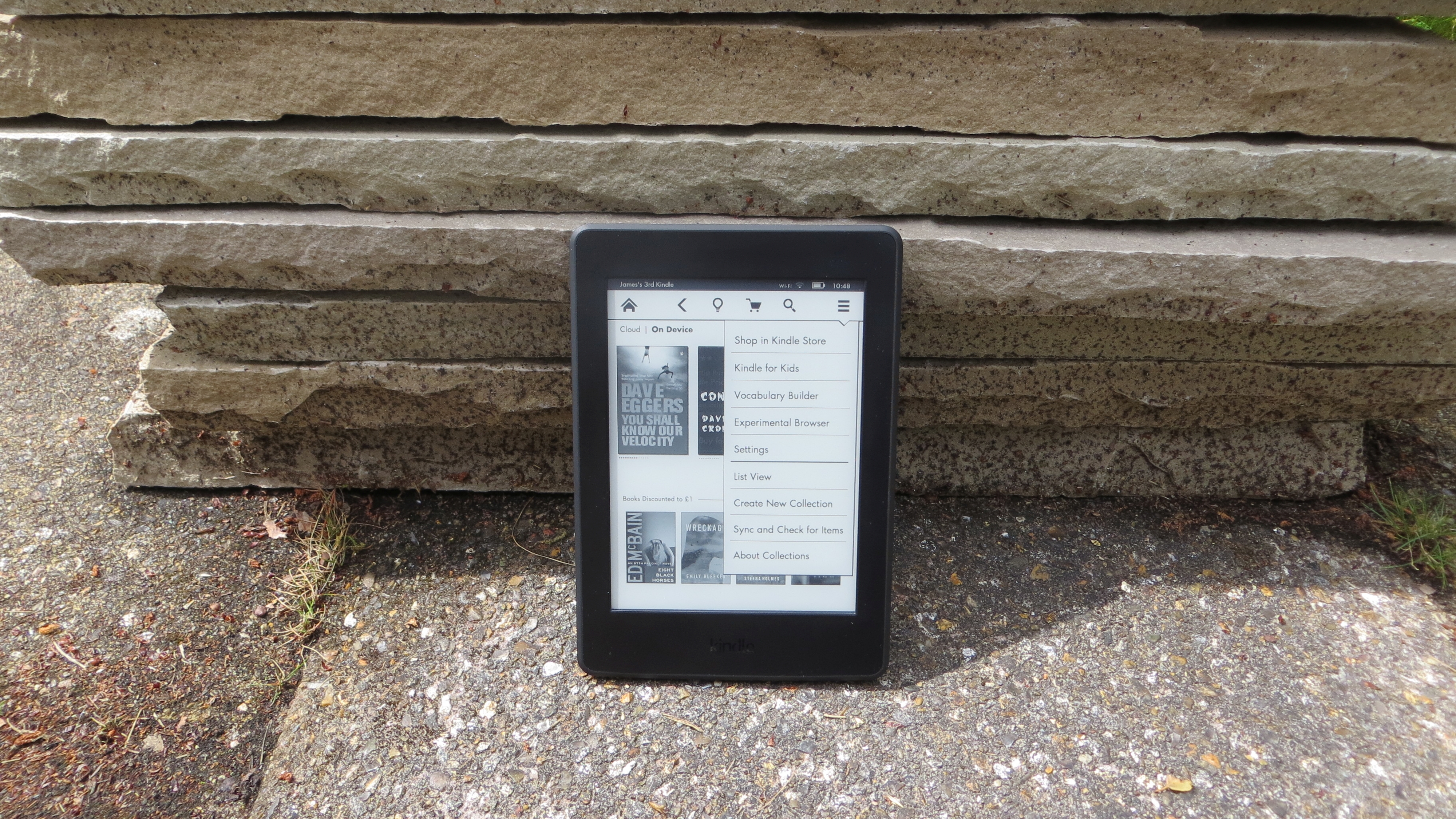
With its small form factor and built-in reading light, the Kindle Paperwhite (2015) held the crown as Amazon's most popular ereader for a long time – and it's easy to see why.
The 2015 edition was the first to offer an improved 300ppi display, a tweaked Bookerly font and a whole new typesetting engine – designed to improve character spacing, typography and page layouts for a more pleasant reading experience.
But the best bit is that the pixel boost actually puts the more affordable Paperwhite on par with the more expensive Kindle Voyage and Kindle Oasis. With a starting price of £109.99 ($119, AU$190) the Kindle Paperwhite is far more wallet-friendly than the extravagant high-end devices but we've also seen the price drop to around £90 / $109 / AU$174.
The Paperwhite's price originally went up to £119.99 ($139, AU$139.99) if you want it without adverts and up to £179.99 ($209, AU$209.99) for a version with 3G and no adverts.
- Like the Kindle Paperwhite? Before you decide, check out our comparison of the best Kindles and ereaders
On the other hand you can get Amazon's most basic Kindle from just £49.99 ($79, AU$109), but with a screen that's almost twice as sharp and has a built-in light, the company is clearly hoping buyers will continue to see the value in its Paperwhite model.
The Kindle Paperwhite (2015) does have some new features and improvements over the second generation model that are worth highlighting. In fact, in theory it's quite a big improvement over the previous model.
Sign up for breaking news, reviews, opinion, top tech deals, and more.
Crystal clear screen
Probably the biggest improvement in the new Kindle Paperwhite, and the biggest reason to consider upgrading to it if you already have an earlier model, is its 300ppi screen.
That's up from 212ppi on the previous model, and it makes a big difference. Text is sharper, making it less of a strain to read, which if you tend to spend hours getting engulfed in a good book is a very important factor.

It also means it's more comfortable to read tiny fonts if your eyes are up to it, making it feasible to fit more words on each page.
Amazon even goes so far as to call it print-quality, which I can just about believe. Pixels are almost imperceptible, and with the built-in light the reading experience is if anything superior to reading off a printed page, particularly when the lighting is otherwise sub-optimal.
Bookerly font
Amazon has created its own typeface, called Bookerly, and it's making its ereader debut on the new Kindle Paperwhite, though it's not an entirely new thing as it's already available on Amazon's Fire tablets.
It's been inspired by existing typefaces, particularly Palatino and Caecilia, but it's designed for use on digital screens, with the aim of helping users read faster with less eyestrain at any type size.

While that could all easily be dismissed as marketing nonsense I have to admit to being a fan of it. It's far from game-changing, but it's slightly easier to read than Baskerville, more modern and elegant than Futura and less harsh than Helvetica, to name three of the alternatives offered by the Kindle Paperwhite (2015).
It's not a reason to buy the new Paperwhite over any other Kindle, as many have now received the Bookerly font in a software update anyway and the difference it makes is marginal and in part surely comes down to personal taste. But it's a nice font, I like it and I plan to stick with it.
Top-notch typesetting
Amazon has also outfitted the Kindle Paperwhite (2015) with a new typesetting engine and this changes things in ways which are both subtle and significant.
The sharp screen and useful built in light of the Kindle Voyage – and to some extent previous generations of the Kindle Paperwhite (2013) – in many ways replicate and even improve on the experience of reading a printed book, but typography has always been a weak link.
It's more obvious in some titles than other (and to some readers than others), but previous Kindles have been known to lay out words, paragraphs and even whole pages in an awkward manner.

It's often as simple as slightly awkward spacing between letters and words, leading to too much white space, or words and paragraphs being broken up poorly. It can be distracting, and even if you don't notice it there's every chance it's slowing down your reading.
The new typesetting engine aims to fix all that, as well as making larger font sizes more readable with reduced white space and no more broken sentences. It also adds drop caps where applicable, which previously were often absent from ebooks.
It's a huge step towards fixing one of the biggest problems Kindles still have, and while it currently only works on a subset of Kindle books, that subset numbers at well over 500,000 with more added all the time.
James is a freelance phones, tablets and wearables writer and sub-editor at TechRadar. He has a love for everything ‘smart’, from watches to lights, and can often be found arguing with AI assistants or drowning in the latest apps. James also contributes to 3G.co.uk, 4G.co.uk and 5G.co.uk and has written for T3, Digital Camera World, Clarity Media and others, with work on the web, in print and on TV.


