Why you can trust TechRadar
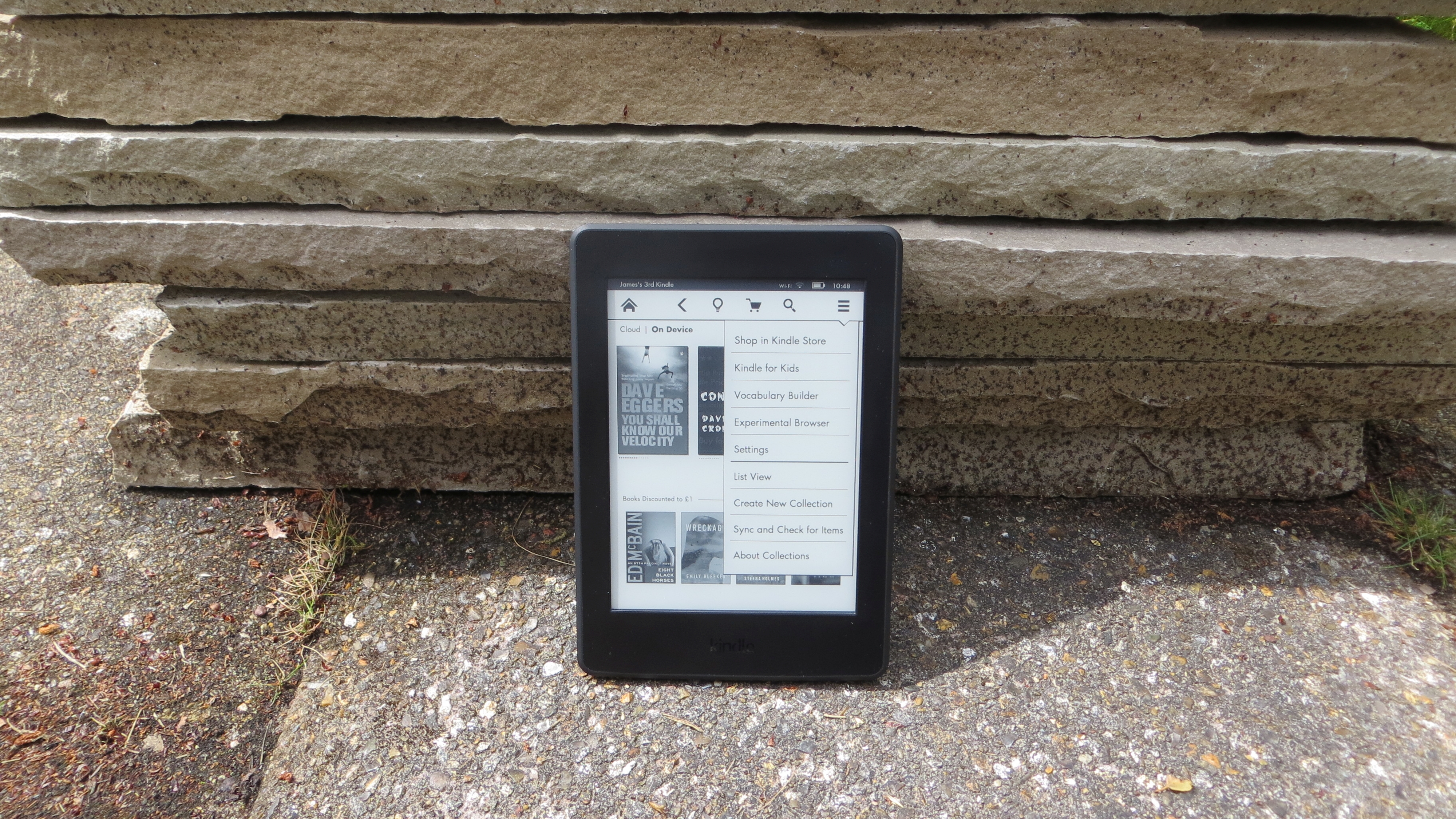
The new Kindle Paperwhite doesn't really look any different to the old Kindle Paperwhite (2013), which is to say it's not much of a looker at all, with a plain black plastic shell, broken up only by Kindle branding below the screen on the front, Amazon branding on the back and a micro USB port and power button on the bottom edge.
The bezels are fairly sizeable but that's no bad thing here, as it gives you somewhere to rest your hands without obscuring the screen – or worse, accidentally turning the page.

It's a plain design but it feels solid and well built. At 169 x 117 x 9.1mm it is, as Amazon loves to remind you, smaller than a paperback, while the Wi-Fi + 3G model that I tried came in at a surprisingly weighty 217g.
I say surprising because it's heavier than it looks, not because it's in any danger of actually weighing you down and if you opt for the Wi-Fi version it's a slightly daintier 205g. It's certainly small and light enough to hold comfortably with one hand.

With its recessed display and plain design, it's got none of the style of the Kindle Voyage, but that's OK, as all it's meant to be is a window into your books. If you want to add a little style, Amazon also offers a fairly attractive form-fitting leather cover with a metal clasp.
Like other Kindles there's no microSD card slot, but there is enough storage built in for thousands of books, and if you have more than that there's also cloud storage for any books purchased from Amazon.

Display and reading
A Kindle is only as good as its screen, and this is one area where the Kindle Paperwhite (2015) really excels.
Sign up for breaking news, reviews, opinion, top tech deals, and more.
Its 300ppi display really is a step up and it makes ereading a more pleasant experience than ever, and of course the built-in light has made a return too, ensuring you can comfortably read even in dark environments.
The act of reading is much the same as ever. A tap on the centre or right of the screen will turn to the next page, which it does quite speedily, while a tap to the far left edge will turn it back one and a tap on the bottom left corner will let you switch between viewing the estimated time left in the book, or in the chapter, or the page or location you're on.

Finally, a tap near the top will bring down a menu bar which lets you customise the reading experience. This allows you to quickly change the brightness, search for something in the book, jump to a specific chapter, or change the font, text size, margins and line spacing. You'll find the new Bookerly font here, though the Kindle Paperwhite (2015) defaults to it anyway.
I talked about this in the key features section, but in short it's a good font. It looks attractive, doesn't seem out of place in a book, and importantly it's easy to read.
There are six other font options though if you're not a fan of Amazon's creation, and text can be made very large, which could be handy if you don't have the best eyesight.
Other Kindle staples are also only a tap away. There's X-Ray for example, which lets you explore the "bones of a book," as Amazon puts it, to learn more about its characters and themes.

If you're ever unsure of what a word means when reading you can just long press it to get a definition. You can bookmark pages, highlight text, read in landscape view and enable Word Wise to see definitions of unfamiliar words above the words themselves, so you don't even need to look things up.
There's a lot here and most of it's useful, but it's no surprise as Amazon has been improving its Kindle software for years.
Despite all those years of work, the actual typography has always left much to be desired. Perhaps the single biggest issue was Amazon's insistence on keeping the margins straight. That might not sound like such a bad thing, but it meant that gaps between words could be uneven and sometimes ludicrously large, especially when using a larger font.

Thankfully Amazon has finally fixed this. You can see what I mean in the image above. On the left is how it was and on the right is how things are with the new typesetting engine, though currently not all books are supported by it.
The improvements go beyond word spacing though. Character spacing has been tweaked too. Rather than having an equal gap between each letter it now looks at pairs of letters and ensures they're spaced in such a way that they fit better together.
Page layouts have been improved as well, for example with the addition of drop caps, while text and images conform more faithfully to the layout of printed books.
All of this makes reading on the new Kindle Paperwhite faster, easier and more pleasurable than ever. But if you're stuck on an older Kindle there's no need for jealousy as the new typesetting engine and Bookerly font have come as a software update to other recent Kindles.
Current page: Design and screen
Prev Page Introduction and key features Next Page Store and battery lifeJames is a freelance phones, tablets and wearables writer and sub-editor at TechRadar. He has a love for everything ‘smart’, from watches to lights, and can often be found arguing with AI assistants or drowning in the latest apps. James also contributes to 3G.co.uk, 4G.co.uk and 5G.co.uk and has written for T3, Digital Camera World, Clarity Media and others, with work on the web, in print and on TV.


