


Barely 10 days ago, Google announced that it had renamed its popular office suite as Workspace, claiming that it was the culmination of an incremental revolution that led to a less-siloed model. Now, the company has started rolling out individual icons for a portfolio that includes Gmail, Calendar, Drive, Docs, Sheets and Slides.
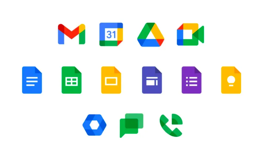
The company, which rebranded its G-Suite towards an office-less workspace, began rolling out new icons starting with the Google Drive that is visible to users first, due to the fact that the design is relatively unchanged. The triangle gets rounded edges with a splash of red on the icon that previously had only three colors.
- Google has overhauled G Suite - but not all users will be happy
- Microsoft 365 vs Google Workspace: What's the best office software?
- Pixel 4a priced at Rs.29,999 in India; Nest Audio launched
“Ten years ago, when many of our products were first developed, they were created as individual apps that solved distinct challenges. Over time, our products have become more integrated, so much so that the lines between our apps have started to disappear,” wrote Javier Soltero, VP and GM, Google Workspace introducing the concept via a blog post.
In the coming months we’ll also be bringing this new experience to consumers to help them do things like set up a neighborhood group, manage a family budget, or plan a celebration using integrated tools like Gmail, Chat, Meet, Docs, and Tasks, the company said.
Google Drive starts it off
While Google Drive is the first among the Workspace apps to get a new icon, a look at Play Store suggests that the company is rolling out newer versions though actual listings are yet to be updated for this app. However, the Android status bar shows the new design with a material theme treatment resulting in a hallowed outline.
In case you are using the web app for Google Drive, the new icon would have already appeared on the top-left corner. However, the favicon is yet to get similar treatment, which ends up being a bit sore on the eyes. But then, it's barely a few days since the company announced its rebranding, so we need to cut them some slack.
Workspace sees red
As users would have already observed, a major shift in the icon design comes from that dash of red that gets added to the original three colours, viz., yellow, green and blue. While the new colour is prominent on the Gmail icon, it is less so on those of Google Calendar, Drive and Meet.
Another shift in design thought is that while all past Gmail icons had an envelope at the centre, this time it is more implied as Google has utilized the whitespace above and below the alphabet to suggest the shape. Also, this time round, all smartphone icons would be placed on a white background, which makes the design changes stand out despite their subtleties.
Even with Google Calendar, the company has done away with the obvious by getting rid of the dates. The new icon is now just a square with a crease around the bottom right corner. However, blue continues to be the primary colour and 31 remains at the centre of the design.
