Why you can trust TechRadar
The whole point of the 'modern' interface isn't just to make the most of the Metro design language Microsoft came up with for Windows Phone and is rolling out across all the Microsoft interfaces, from Xbox to Office. It's the WinRT apps that use the new Windows Runtime, run in a sandbox for safety
In the past Microsoft referred to these as Metro style apps; that name is out of fashion and they're variously known as Modern UI apps and (confusingly) Windows 8 apps, but whatever they end up being called, they're apps written in WinRT that run in the new user interface rather than the desktop and work with contracts like Search and Share. Some are installed automatically, others you download from the Windows Store.
Essentials
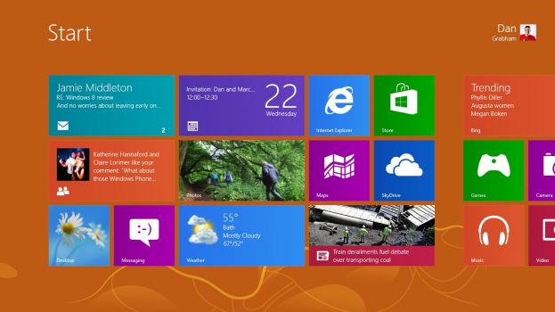
Until you have the bundled apps set up, the Start screen can look flat and rather childish. Once you connect it to your online accounts, pin some friends, choose your city for weather and start seeing your photos scroll by, you'll find having your email, photos, appointments and friends pinned to the Start screen livens it up considerably.
The apps you get automatically are in three groups; the ones with content from Bing like Sport, Weather and Finance, Music, Video and games from Xbox and those that come from what used to be the Windows Live team – Mail, Calendar, Photos, Messaging, People and SkyDrive, plus a couple of extra like an excellent PDF Reader app. So that's some essentials, some Microsoft services and some showcases for the features and interfaces 'modern' apps can have, like semantic zoom, photo galleries and the app bar.
The People hub goes from being a rather pedestrian address book with social network connections for all the services you link Windows to (through your Live account or by adding specific accounts for email and calendar) to a way to stay up to date with your friends. Read the stream of social updates (it works well snapped to the side of the desktop), see replies all in one place or see all the contact details from friends. (A good address book is useful, after all).
Pinch zoom and you go straight from tiles with photos on to an alphabet you can navigate with; you can also just stat typing a name to jump to it. Compared to the earlier versions, the People app is snappy and responsive and makes much better use of the space to show you lots of updates without looking crowded. The last thing we'd say is missing is the ability to post to more than one social network at once, but the People app turns into a great way to stay in touch.
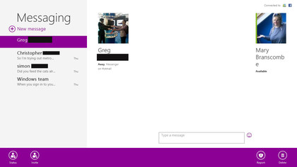
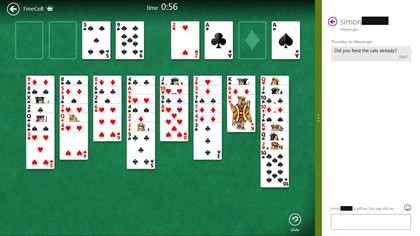
The Messaging app is still purple and it still makes good use of the screen to show you multiple conversations on Facebook and Windows Live, with details about your contacts so you can see what they're talking about on other services. Snap it into the smaller window, next to the desktop or another app, and you see your most recent conversation, so you can chat while you work (or play) You can also send group messages, but it's just text chat; no voice or video.
Sign up for breaking news, reviews, opinion, top tech deals, and more.
Mail still isn't an Outlook replacement; you don't get categories, you can't flag messages for follow up or mark them as spam, there's still no threading or conversation view, but it's fast, simple and easy to navigate. You see your tree of folders without having to swipe back and forth between panes, you can tap on attachments in a message, download them and tap to open them without delving into the app bar.
You can also pin any folder to the Start menu as a secondary tile to see message subjects as they arrive. And you can now connect to IMAP and POP email accounts as well as Hotmail, Gmail and Exchange (now called Outlook as it includes Outlook.com) accounts.
The Calendar app aggregates calendar feeds from multiple accounts (Hotmail, Exchange/Outlook and Google, all of which use EAS to sync calendar and in some cases to do items). There are nice day (actually two days at a time unless you're in portrait on a tablet when you only see one), week and month views. You can now turn individual calendars on and off and pick the colours the way you can on Windows Phone.
And you get on-screen notifications for meetings and alerts that you've set. It's a shame that you can't pinch to zoom in and out from month to week to day view and you have to get used to the way tapping on a day in week or month view creates a new event rather than zooming in to that day.
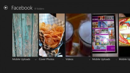
The Photos app's tile shuffles through your images from both your PC and cloud services where you store photos, like Flickr, Facebook and SkyDrive. These show as different albums inside the app, along with any PCs you're running the SkyDrive app on. If they're turned on, you can browse photos remotely so it doesn't matters which PC your baby photos are on – you can sit on the sofa and show them to the family on a tablet.
This is a nice app; you can swipe through images, zoom out to see thumbnails, play a slide show or pick an image for the Lock screen, simply and elegantly. You can also import images from a USB stick or camera card directly. But the backdrop to the app is a lovely professional photograph of a Ferris wheel; we'd prefer to choose our own favourite image to see here.
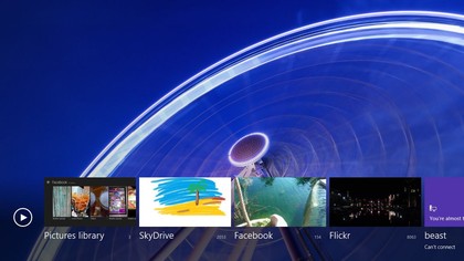
The Metro SkyDrive app still doesn't sync files the way the desktop SkyDrive app does; it's for viewing files when you're online in a clean and simple interface with tiles for folders and thumbnails for images that looks just like the redesigned SkyDrive website, with the same detailed view if you prefer, and tools are similar. Select a file and you can open, download or delete it from the app bar.
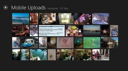
It's a great way to work with your online files; documents on your SkyDrive open in either the Office apps on the desktop if you have them installed or the Office web apps in Metro IE. And PDFs open in Windows Reader, which is an excellent and simple PDF tool. Large files open quickly and scrolling through documents is equally fast.
There are no confusing toolbars floating over the page like the irritating Adobe Reader; you can pinch to zoom in and out or double tap to zoom into a page, and the commands on the app bar enable you to search, switch views, rotate a page or see what you have permission to do with a password-protected PDF. This is far more pleasant to use than Acrobat Reader - and noticeably faster. The only missing feature is that you can't use it to preview PDFs in File Explorer on the desktop.
Bringing Bing to you
The News, Sports, Travel, Finance and Weather apps are great examples of what a rich, content-filled 'modern' app can look like; the images and typography are gorgeous, the layout it great for a widescreen tablet and the intention is that you swipe, tap and flick your way through the screens. You can browse through stories or pick a topic, team or destination and pin it to the Start screen to see updates.
There's enough content to keep you busy for a while, especially in the News app where you can pick individual topics like Kinect , linear equations or Lindsey Lohan. This gets as specialist as you want (linear equations got us stories about Olympic performance, the Higgs Boson and the Babylonians and education as well as more traditional mathematics).
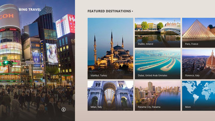
The Travel app combines guides from recent Google purchase Frommers with 360 degree panoramas, photo albums, maps, currency, restaurant, hotel and flight tools, so you can browse or book a trip.
The Maps app is a joy to use on a touchscreen (and as functional as the Bing Maps website with a mouse). Turn on aerial views and spend some time flying round the world; it's the kind of fun Google Earth was when it first came out, but at your fingertips and with high resolution photography (you can see a glacier in Greenland from 20 yards or a sheep farm in Scotland from seven yards). Or you can check traffic and get directions to addresses and towns (though not businesses by name).
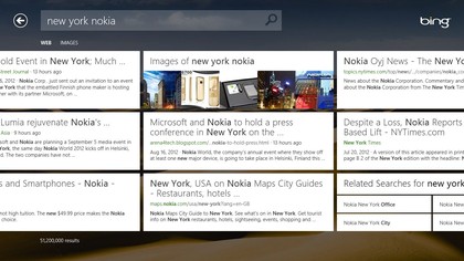
The Bing Search app is new in the final version, and will look familiar to Windows Phone users (although it doesn't have the audio and video search (yet). Again, it's very finger friendly; suggested topics appear in large boxes as you type.
The results show up with large previews so you might see what you need to know immediately and you're likely to see exactly which page has the details you want. Image results are particularly nice; you can zoom in and out and browse through the like an impromptu photo album. And the Bing Search tile flips between the (often stunning) daily image and trendy search topics. It's eye candy, but it's useful eye candy.
Apps in the Store
The 500-odd apps in the Windows Store (529 when we last counted) already include a handful of desktop apps like WinZip and some pay-for apps. Expect lots more as the October launch date gets closer. The New Releases tile shows the latest 100 titles, you can browse by category or search for specific apps.
And if you change PC, there's the Your Apps option on the app bar, which shows you a list of all the apps you've downloaded previously, which you can sort by whether they're currently installed and filter to show which apps you have on which PC. We were able to reinstall the vast majority of apps we'd tried during the different previews; of course it's up to developers whether they want to carry on making free apps available.
If the 'modern' app idea is going to take off, the Windows Store is going to need lots of great apps. But if Windows RT tablets sell anything like as well as the iPad, there's every incentive for developers to create them, especially as Microsoft has powerful development tools.
Mary (Twitter, Google+, website) started her career at Future Publishing, saw the AOL meltdown first hand the first time around when she ran the AOL UK computing channel, and she's been a freelance tech writer for over a decade. She's used every version of Windows and Office released, and every smartphone too, but she's still looking for the perfect tablet. Yes, she really does have USB earrings.
