Why you can trust TechRadar
Once you activate Windows 8 you can personalise the Start and Lock screens. You can choose from one of 25 colour schemes. Some of these are extremely bright - the vivid pink background is quite the eye-opener – others have grey or black backgrounds with an accent colour.
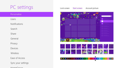
There's also a selection of 20 different abstract designs too, ranging from plain to detailed to some quite strange and quirky images with floating mountains and swimming birds. Pick an animal, mechanical or musical theme or choose from the more abstract designs.
Some of the designs have a mix of related shades; others have a range of colours that change to match and contrast with the colour scheme you pick – some of the combinations of these are gorgeous artwork that wouldn't be out of place on clothes or furniture and we're hoping to see tablet sleeves, notebook cases or Artist Edition mice to match.
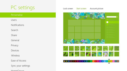
A nice touch is that as you scroll the Start screen, the design you choose scrolls along; especially on a touchscreen tablet, we reckon you'd probably get a bit of motion sickness if it didn't. But the designs are so carefully put together that they scale smoothly to the size of the screen and you never see an ugly join where it wraps.
That's another reason you can't pick your favourite photo for the Start screen; it's not likely it would scale, stretch, scroll and wrap around these screen anything like as neatly. And there are plenty of other places you can use your own images, like the Lock screen, the picture password and the desktop.
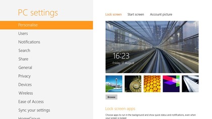
There are six new images to choose from for the Lock screen, from a stylised Seattle skyline that blends photographic mountains with painted and sketched hills and clouds in what could easily be an attempt to say that familiar desktop apps and the flat 'modern' interface (which Microsoft is no longer calling Metro) can look just fine next to each other. And if you don't like the piano, train, honeycomb, nautilus shell or abstract art you can pick any of your own pictures instead.
Navigating the 'modern' interface, is no more puzzling than any other new interface. Swipe up from the Lock screen, press the right arrow or right-click to get started. If you've added your Microsoft account or set a password you can type it in, or add a Picture Password so you can tap or swipe rather than typing on a touch screen.
Sign up for breaking news, reviews, opinion, top tech deals, and more.
The Lock screen isn't just a prettier way of getting started; you get the same kind of status information as on a phone – date and time, battery life and connectivity, unread messages plus your next appointment.
You can pick which apps can put notifications here, which becomes much more important when we get PCs with Connected Standby (all Windows RT devices plus all Windows 8 System on Chip models), as these will be the apps that stay connected when the screen is off.
That's why a 'modern' WinRT version of Outlook would be such a big deal (and why it's a disappointment it's not in Office 2013); the Mail and Calendar apps will stay up to date overnight on a Connected Standby system, but Outlook won't get mail till you turn your PC on.
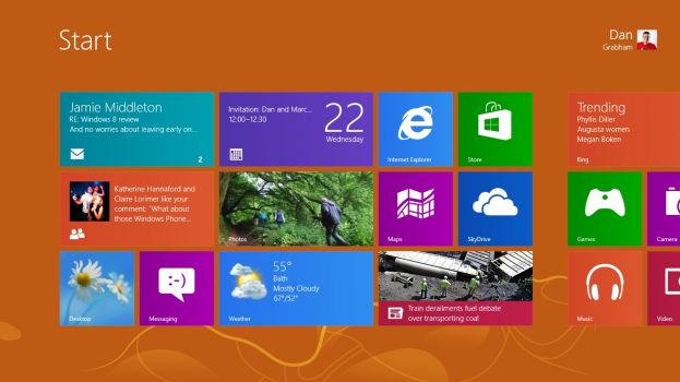
Press the Windows Start key (or turn on your PC) and you get the new-look Start screen instead of a Start menu. It's bigger, brighter, bolder, much more personal – and much more controversial, even though you can go for hours or days at a time without seeing it. This shows tiles for key apps, desktop programs and settings, but not everything that's installed.
For that you right click or swipe up from the bottom of the screen and pick All Apps; or you can just start typing the name of an app or setting to search for it (remember, you have to specifically select Settings to see those results). As you install new apps and desktop programs, they'll be added to the Start screen as tiles.
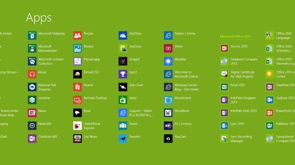
Drag to move tiles around, from group to group or to make a new group. As you drag a tile into the gap between two groups, when you position it between them a vertical grey bar appears to show that you're creating a new group to put it in.
Working with tiles is a little faster and more responsive but otherwise much the same. The Semantic zoom lets you pinch to shrink the tiles on the Start screen to tiny thumbnails so you can see everything at once or move an entire group. Select a group and drag it down to get the option of naming it.
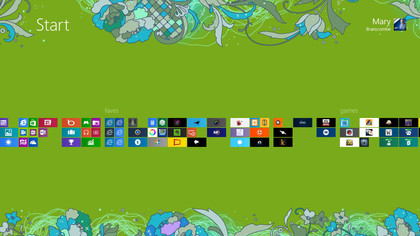
If you drag a tile to the top or bottom of the screen, Semantic Zoom turns on automatically to make it easier to move an item a long way across the screen without disturbing the arrangement of all your tiles and groups.
Swipe from the right edge of the screen and you get the charm bar, with Search, Share, Start, Devices and Settings. If you don't want to learn keyboard shortcuts, you can do the same thing by leaving your mouse pointer in the top or bottom right corner.
First the charms appear as white outlines, then if you don't move your mouse they disappear because Windows assumes you didn't want to trigger them, since you might be moving the mouse to scroll or closing a window at the side of the screen instead. If you are, you don't have to wait for the charms to vanish to do so. Move the mouse towards the charms and the black bar and charm titles draw in on screen.
Swipe from the left side of the screen and you switch to the next app in the stack (which might be the desktop); throw your mouse into the top left corner and you get an icon showing you what app that will be that you can click to switch.
Putting your mouse pointer in the bottom left corner shows an icon to click for the Start screen which feels more like a rectangular Start button than an unwelcome reminder of Metro (unless you're on the Start screen already, when it gets you the icon for the next app on the stack), plus hints for the thumbnails in the switching pane.
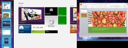
Drag the mouse up or down from the top or bottom left corner and you get the switching pane with a list of apps with labels under each thumbnail.
On a touch screen you do that by pausing as you drag from the left and then drag back. If you only drag back a little, you snap the next app into a window taking up a third of the screen, if you drag further back, you get the switching pane. The desktop and any desktop apps show up as a single thumbnail here; if you snap the desktop next to a Metro app you can have a desktop slightly smaller than full screen, or a thumbnail list of running desktop apps, depending on whether you snap it into the smaller or larger tile.
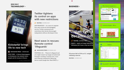
You can also use the Start button to jump between the Start screen and the app you were just using. Or you can use Alt+Tab to switch between all running apps, Metro or desktop. If there's a Metro app pinned at the side of the screen Alt+Tab respects that and switches the app in the pane you were working in last.
Windows plus the '.' key swaps apps between the different window positions on screen at top speed; on a touch screen you do that by dragging. In fact, there are far more ways of switching between apps than in previous versions of Windows, so you can pick the ones you prefer and ignore the others.
This is all much easier and more natural to use, even with a mouse, than it is to describe.
Charms and settings
Microsoft has continued tweaking the charms and the controls they bring up, like the Settings bar. Where the pre-release versions of Windows 8 favoured boring and obvious over cute but potentially confusing, the final version nails the interface with controls that are both cute and functional.
Take the keyboard icon on the Settings bar; this has gone from an icon to an abbreviation for the keyboard language you're using, to an icon that opens a menu with two options – open the on-screen keyboard so you can type something, or change the keyboard language.
The speaker icon opens a volume slider with a mute button, the screen icon opens a slider for brightness with an icon to manually rotate the screen. Notifications lets you turn off the sometimes intrusive 'toasts' that pop up for alarms and new messages for a set period.
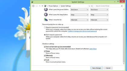
The network icon shows you the current network connection and opens a pane with available networks and an airplane mode slider to turn off all the radios. And the power icon produces a popup menu with Sleep, Shutdown and Restart (if you want to add Hibernation, that is hidden away in the advanced power options in the desktop control panel because it will be much less relevant on new machines with Connected Standby).
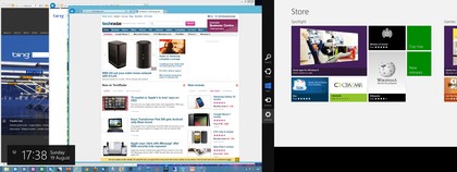
It's all remarkably clear and simple, once you relearn habits like pressing Start to shutdown.
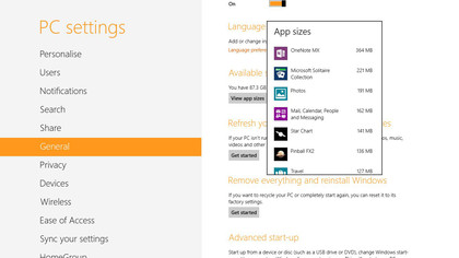
Search, Share and Settings are what Microsoft calls contracts; they're something apps can sign up to use. Settings shows you the settings for the current app but you can always choose Change PC settings at the bottom for a much simpler version of the key options from control panel. There's one new feature here in the final version; under General you can see how much space all the 'modern' style apps you have installed use up (remember, you can uninstall any 'modern' app, even one pre-loaded by an OEM, by right-clicking its icon on the Start screen and choosing Uninstall).
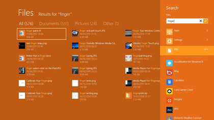
Whether you want a file, a program, an email message or a specific photograph, you can search for it wherever you are using the Search charm. The initial results are context sensitive (unless you use the keyboard combination to start a file search).
If you're at the Start screen you get a list of apps, if you're in IE when you choose it, you get results from Bing first but you can repeat the search in any app that has signed up to the search contract by clicking its icon in the Search pane. When you search files, you can hover with the mouse to see more details; right-click (with mouse or finger) and you can open the file location in Explorer.
Similarly, a variety of 'modern' style apps use the Share charm, and share is about more than sending tweets or emailing links to web pages; you pick Share to send a photo from a viewer to an image editing app or to print it, or to copy a figure from a web page into a calculator.
Think of it as the new universal clipboard. This could be one of the more exciting tools in Windows 8 and we're starting to see apps take advantage of it. In the end, the 'modern' interface is only going to be as useful and interesting as the apps that run in it.
Mary (Twitter, Google+, website) started her career at Future Publishing, saw the AOL meltdown first hand the first time around when she ran the AOL UK computing channel, and she's been a freelance tech writer for over a decade. She's used every version of Windows and Office released, and every smartphone too, but she's still looking for the perfect tablet. Yes, she really does have USB earrings.
