TechRadar Verdict
One of the best small tablets around, and with an excellent screen, but it's held back by niggles.
Pros
- +
Great design
- +
Excellent screen
- +
Some nice media features
- +
Good processor
- +
Decent price
Cons
- -
Low battery life
- -
Fiddly on-screen keyboard
- -
MotoCast not ready yet, and no microSD slot
- -
Irritating Lock key placement
- -
Smudgy screen
Why you can trust TechRadar
The best-selling tablet on the market might be the 9.7-inch iPad 2, but that hasn't stopped manufacturers differentiating themselves using by going with a smaller screen size than Apple's offering. We've seen the likes of the original Samsung Galaxy Tab and the HTC Flyer in the past, but the Amazon Kindle Fire is the first seven-inch tablet to really make an impact.
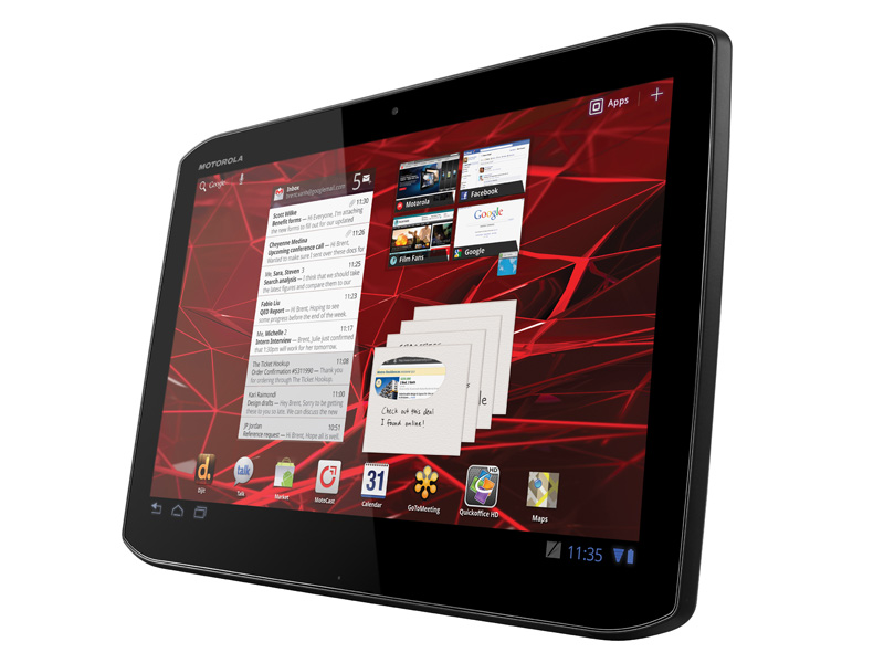
Now we have the new Xoom tablets from Motorola, and not content with just releasing the 10.1-inch Xoom 2 to compete with the iPad, we've also got the 8.2-inch Xoom 2 Media Edition, which will end up head to head with the likes of the Kindle Fire.
If you're wondering what the difference is between the Xoom 2 and the Xoom 2 Media Edition other than size, the answer is pretty much nothing. Both are Android 3.2 tablets, with a 1.2GHz dual-core processor, a 1280 x 800 screen (yep, it's the same despite the different sizes) and 16GB of storage.
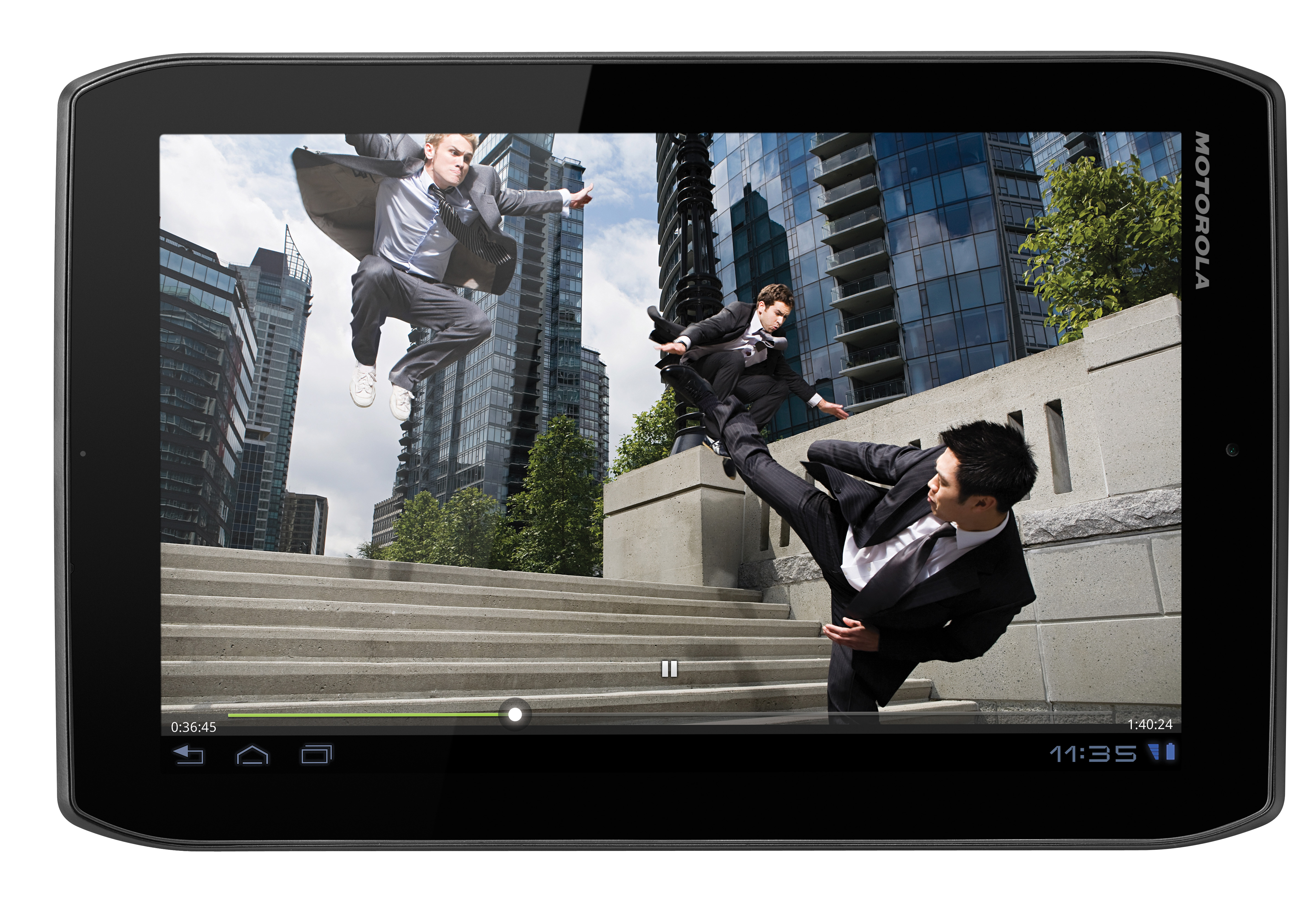
Well, there are a couple of other differences, we confess. As you might expect, a reduction in size also means a reduction in weight, and the Xoom 2 Media Edition weighs just 388g – even lighter than the Kindle Fire, which weighs in at 413g, and a lot lighter than the 599g of its big brother.
And, being smaller, the battery has had a big reduction in size in the Media Edition. In fact, it's been nearly halved from 7000mAh in the Xoom 2 to 3900mAh in the Media Edition, a drop that's reflected in the quoted battery life of 6 hours browsing over Wi-Fi.
There's also one notable loss when it comes to software: the impressive Floating Notes app is absent from the Media Edition. We realise that Motorola is making a point that the smaller tablet is more for home media use (hence the name), but since apps such as Citrix and Evernote are still present, we don't see why Floating Notes couldn't also have been including.
As you might expect, the price is different between the two models, too. The Media Edition comes in at around £319 – a marked saving over the 10.1-inch Xoom 2, or the likes of the iPad 2 or Samsung Galaxy Tab 10.1.
Sign up for breaking news, reviews, opinion, top tech deals, and more.
Like the bigger Xoom 2, there's a five-megapixel camera on the back, capable of recording 720p HD footage, and a 1.3-megapixel camera on the front.
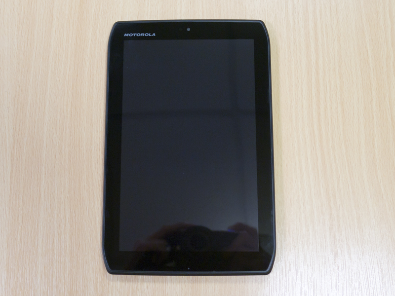
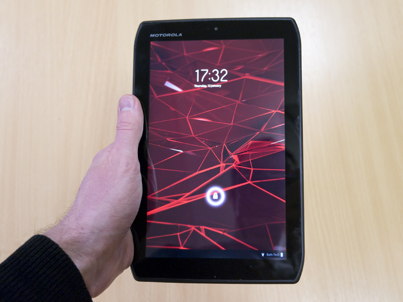
Unlike the bigger Xoom 2, though, it's pretty clear the Media Edition is intended to be used in portrait mode most of the time. Where the 10.1-inch version had its cameras, ports and infrared transmitter on the long edges of the device, with the controls on the short edge, the opposite is true here. The front-facing camera sits at the top short edge, like the iPad 2, with the controls on the long edge to the right.
Apart from this subtle change, the design of the Xoom 2 Media Edition stays really rather close to the 10.1-inch version. It's the same shape, with the same cut-outs in the corners.
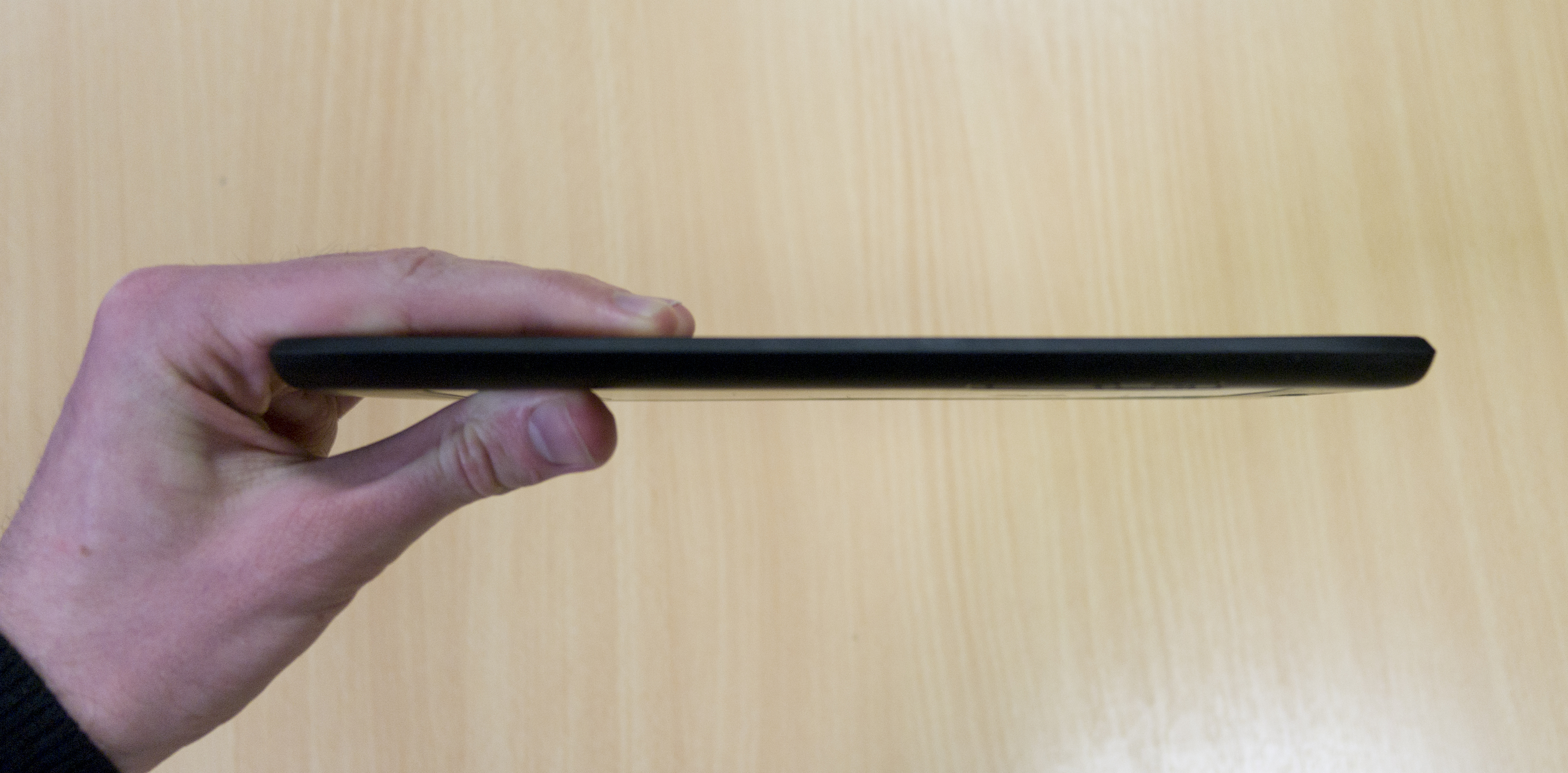
They're as good as the same thickness, with the Media Edition coming in at 8.9mm thick (0.1mm thicker than the Xoom 2) and made of the same matte plastic, meaning that Media Edition is just as comfortable to hold the big Xoom 2, except it's much lighter – a winning combination.
Unfortunately, the front screen is still an appalling fingerprint magnet. The Xoom 2 was one of the worst we've seen for picking up smudges and grease, and things are no different here.
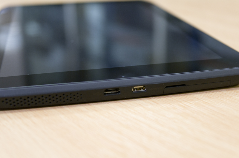
On the top edge of the Media Edition, you have the infrared transmitter and 3.5mm headphone jack, as well as a couple of speaker grilles. On the bottom of the device are the micro-USB and micro-HDMI ports, and another speaker grille. You've also got a flap that opens, but like the flap on the big Xoom 2, it goes nowhere. No SIM card slot and no microSD slot.
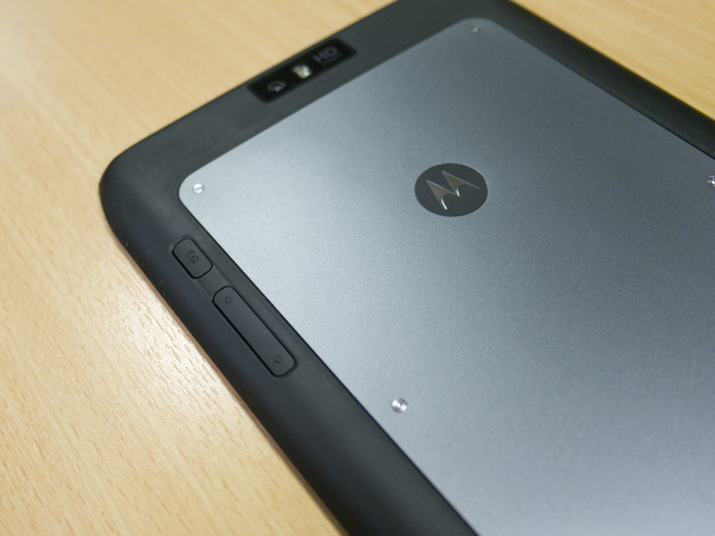
On the back you'll find the main camera and a shinier backplate that's actually held on with screws. Screws! We can't remember the last time we saw them so prominently on… anything, really, but they suit the look of the materials Motorola's used.
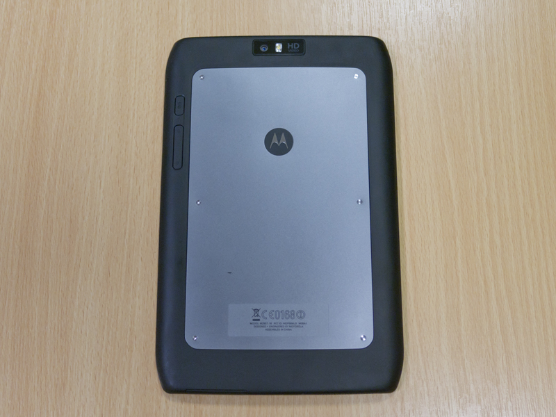
We only really have one issue with the Xoom 2's design, and that's the ridiculous placement of the Lock key and volume buttons. The big Xoom 2 has them hidden on the device's curves, much like the iPad 2, but on the Media Edition they're effectively on the back of the device.
This means that if the Xoom 2 Media Edition is on a table with it's screen off, there's no way to turn it on without picking it up. It may not seem like the biggest deal, but it really annoyed us, especially since it's compounded by the fact that these buttons actually aren't that easy to find and press without looking at them even if you are holding the tablet.
Tablets should be pick-up-and-go devices. There should be no fumbling to get the screen on or off, especially since the screen is all there is. It's still not quite a deal-breaker, but when other tablets manage to avoid this problem, it's definitely a mark against the Xoom 2 Media Edition.
