Sign up for breaking news, reviews, opinion, top tech deals, and more.
You are now subscribed
Your newsletter sign-up was successful
Join the club
Get full access to premium articles, exclusive features and a growing list of member rewards.
The colour of success
Colour schemes are a hotly debated topic. Get it right, and your site will project a coherent, professional appearance. Get it wrong, and it'll look like an amateurish mess.
In general, information heavy sites have settled on white or neutral off-whites in order to enhance contrast with text, therefore improving readability. Black with white text, on the other hand, is considered difficult to read.
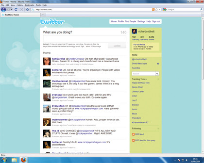
Many so-called Web 2.0 sites – Twitter, for example – use unusual colours for backgrounds. Although it often makes for a messy look, for the moment it is one way of avoiding being boring.

Colour is predominantly a psychological issue, although cultural factors are also involved. Different colours evoke emotional responses, and thus raise expectations about site contents. Simplistic statements like 'pink is feminine' may contain a grain of truth, but the issue is more complicated.
Hot pink is decidedly more mature and sexualised than the paler pinks, which are associated with childhood, and the Financial Times' salmon-pink pages (both in print and on the web) aren't feminine at all.
Some basic rules apply: as would be expected, reds do attract users' attention, but overusing them can be off-putting. Blue is statistically most people's favourite colour, though there are clear differences in response to sky blues, cyan, navy and royal blues. Whatever the shade, blues are generally considered restful, relatively neutral and relaxing – hence their popularity with corporate websites. The flipside is that blue can be seen as dull and conservative.
Sign up for breaking news, reviews, opinion, top tech deals, and more.
Inspiration for colour can be drawn from design outside the web: compare Tesco's cheap and cheerful value range adorned in blue and white with the dark and rich experience of the Dunhill brand of luxury goods.
Fashion plays a major role in this, and associations change over time; for example, dark browns are currently popular in interior and furniture design because they evoke an earthy sense of reliability and luxury. Black is traditionally seen as authoritative or edgy, depending on the context, and white indicates purity or cleanliness, for obvious reasons.
Different cultural norms can change these expected meanings, though – for instance, white is linked with death in Japan.
If used skillfully, colour can be used to surprise. The Times newspaper, for example, is a solid (some might say stolid) institution, and yet when designer Tomaso Capuano reworked its online identity he introduced key lime into the masthead. Initially some complained that this was jarring, but it had the effect of making the brand look more youthful.
Advanced design and psychology
There is a strong scientific element to web design, and what people look at on a website can be scientifically measured through a process called eye-tracking. This involves precisely measuring which elements users are looking at, for how long and in what way.
It's the closest thing to a science of what people look at on the web. Dr Philip Michael Zeman is a researcher with the University of Victoria in British Colombia who also works with a Canadian web design firm.
Zeman's area of study is neurophysiology and psychology, which involves some advanced uses of eye-tracking. He says that people's responses to websites are significant: "The eyes are pretty telling – pupil dilation indicates the level of interest or cognitive load."
Eye-tracking can deliver precise information on the way users interact with your website, but the cost of the study means that the practice is, for now, the almost exclusive preserve of large corporations such as IBM, Ask, the New York Times, Microsoft, Yahoo and Xerox – all of which have worked with a company called EyeTools.
This doesn't mean, however, that regular web designers can't borrow a few tips. Sites like Jakob Nielsen's www.useit.com will happily share the wealth with any designer interested in improving their art. One of the key discoveries of eye-tracking is the F-pattern.
This means that users tend to read sites by looking across horizontally, dropping down and reading across horizontally again and then looking vertically down, forming a rough 'F' pattern. As Nielsen stresses, this has a number of implications: firstly, the opening two paragraphs of any text-centric page will be the ones that people read in detail, while other text must be broken up with subheadings and other items that grab users' attention.
One of the most striking results of eye-tracking surveys has been that underlined headlines are a problem: visitors view them as a link, and therefore tend to ignore any explanatory copy below, something that bloggers in particular should keep in mind.
Despite Zeman's interest in the area, he says that many websites don't need to go to such lengths: "It depends on what the level of [required] sophistication is and what the budget is," he said. "Any company spending a hundred thousand dollars on web marketing probably should look at eye-tracking."
Making pages usable One British web design house that engages in eye-tracking and other user studies is Fortune Cookie. Fortune Cookie's David Ward explains that this is because the firm places a high premium on 'usability':
"If we're redesigning an existing website, we look at site [traffic] analysis. We also identify the users and what they want using focus groups and individual sessions, and we do eye-tracking throughout the process. We have something called iMotion that detects emotional reactions to a site: blink rate, pupil dilation and so on. It gives us a scale of one to 10 [for emotional response]."
The raw data is useful in sorting out basic elements such as typography and layout, but according to Ward, even this emotional response is dependent on the site's objective: "You wouldn't expect a massive emotional response to a financial planning website, whereas a glossy brochure site might elicit a higher response," he said.
Usability core to good design
Matching form and content is, as ever, paramount. Ward argues that design conventions represent the development of a body of user knowledge and expectation, and therefore form the basis for ensuring that a page meets usability targets:
"Usability is core to our design process. There are conventions [that are widely understood], and you don't want to completely surprise a user when they come to a website."
The best way to ensure that a site meets user expectations is to make the path from the homepage into the main content clear: "You need signposting," said Ward. "People come to a website for a reason, so you need things like trigger words. On a finance site it might be 'Home Insurance'. The other benefit is that these phrases are good for search engine optimisation."
Ward also feels that good usability generally results from simplicity, and that designers should resist the temptation to over-fill homepages with information: "The homepage is a shop window. There is a tendency to cram everything in there, to get everything 'above the fold' as it were."
Instead, the correct strategy is to make the information that's available easy to find: "A great homepage is made from great content, and you need to constantly monitor it. Really small changes, such as changing the colour of a call to action, can create a five to 10 per cent increase in clickthroughs," he said.
Ultimately, homepages are only a single aspect of web design, but they are a crucial one. They need to be functional and attractive, but that's not all. They also need to represent the fact that today's websites – even personal ones such as blogs – exist in a state of flux, usually offering more than a one-off 'designed' experience. "It's all about interaction design," says Ward, "not static pages". That's the key.

 Become a TechRadar Insider


