How to design a logo for free
Design.com lets you quickly and easily create logos - here's how it works
A good logo goes a long way when you’re building a new business, side-project, or portfolio, helping people recognise you instantly.
The good news is that you no longer need design software like Photoshop or a big budget to create one.
Free logo makers have become far more capable in recent years, and Design.com offers a simple, browser-based way to generate a clean, professional-looking logo without spending anything upfront.
You can produce a solid starter design for free – with paid options available later if you need high-resolution files, vector formats, or a wider brand kit.
Today, we're looking at how to create a quality logo quickly and easily, with a step-by-step guide to get you started.
You can check out the platform by clicking here.
Save up to 88% off logo packages on Design.com
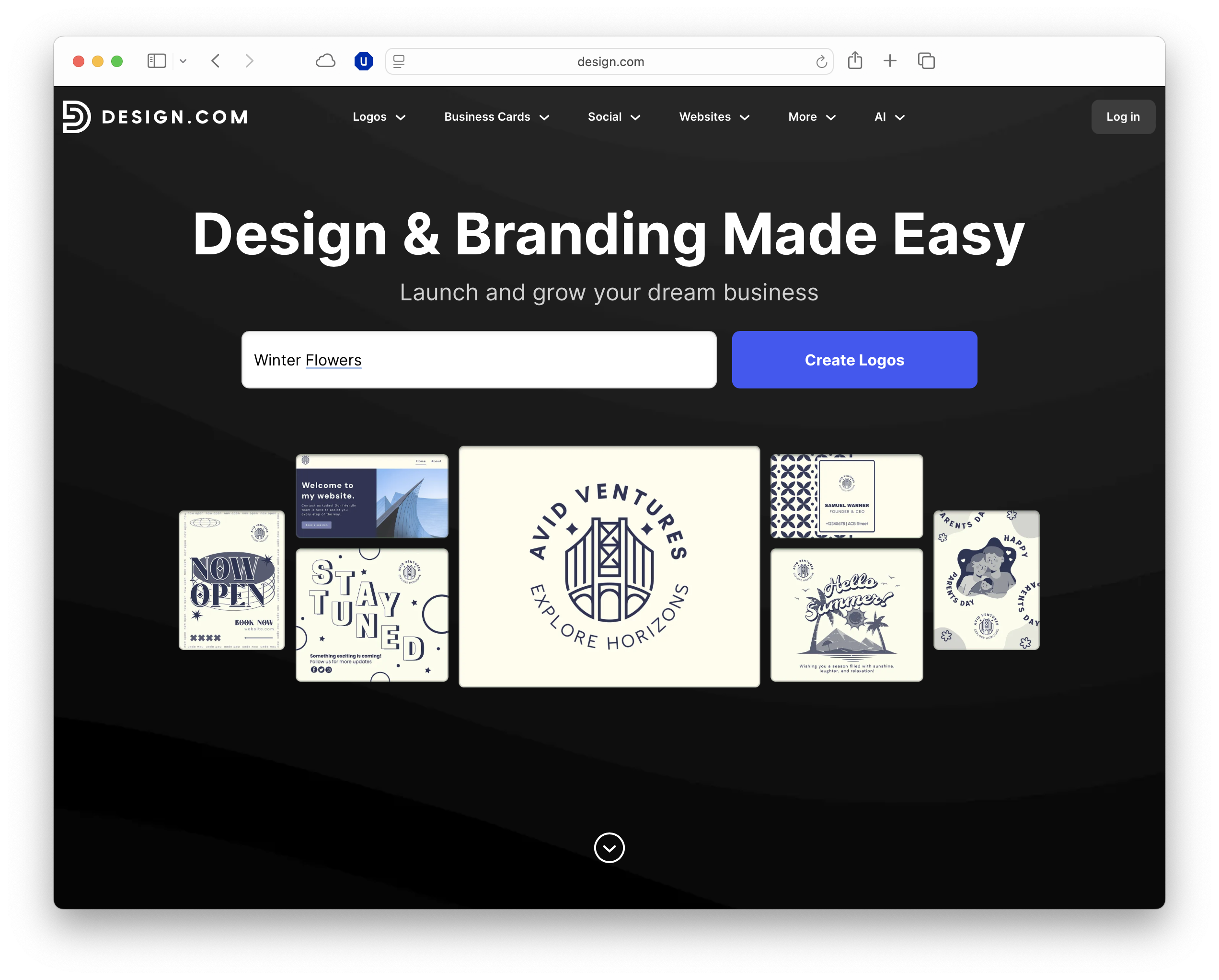
Design.com’s AI-powered logo platform does all the heavy lifting behind the scenes, so you don’t need to throw your time and cash away on an expensive creative team or complex software. Simply enter your business name and watch thousands of logo ideas show up in seconds.
What you need
Before you open Design.com, it helps to gather a few basics that will guide the look and feel of your logo. Start with your brand name, any slogan you plan to use, and a sense of the colours or tone that best reflect your audience.
It’s also worth thinking about the style you prefer: whether that’s a clean word-mark, an icon-based design, a simple monogram, or something more abstract.
If you're a bit stuck, putting together a quick inspiration board can make this process much easier, especially if you browse sites like Pinterest or look at the logos used by competitors in your space.
With these elements in place, you’ll get far more relevant suggestions from Design.com’s AI features when you enter your industry keywords, colour preferences, and descriptive prompts.
How Design.com’s free logo maker works
Design.com’s free logo maker is built around a guided workflow that produces dozens of concepts based on your business details.
Once you’ve gathered your basics, the platform makes it easy to move from a rough idea to a polished design.
1. Enter your brand name and industry
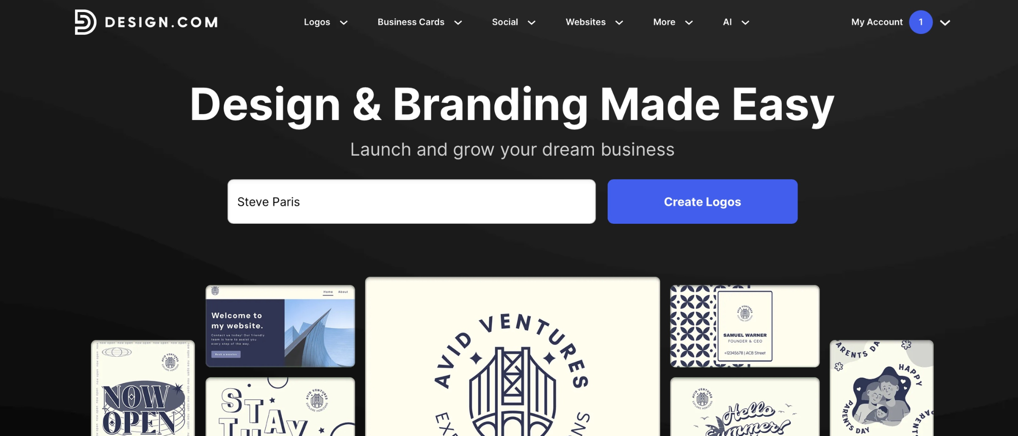
Start by typing in your brand name, optional slogan, and a few keywords that describe what you do into the Design.com website.
You don’t need to write a long paragraph – a short, clear description works best.
Design.com uses these terms to shape its initial layouts, colour palettes, and icon suggestions, so choosing accurate keywords helps.
2. Choose initial styles and symbols
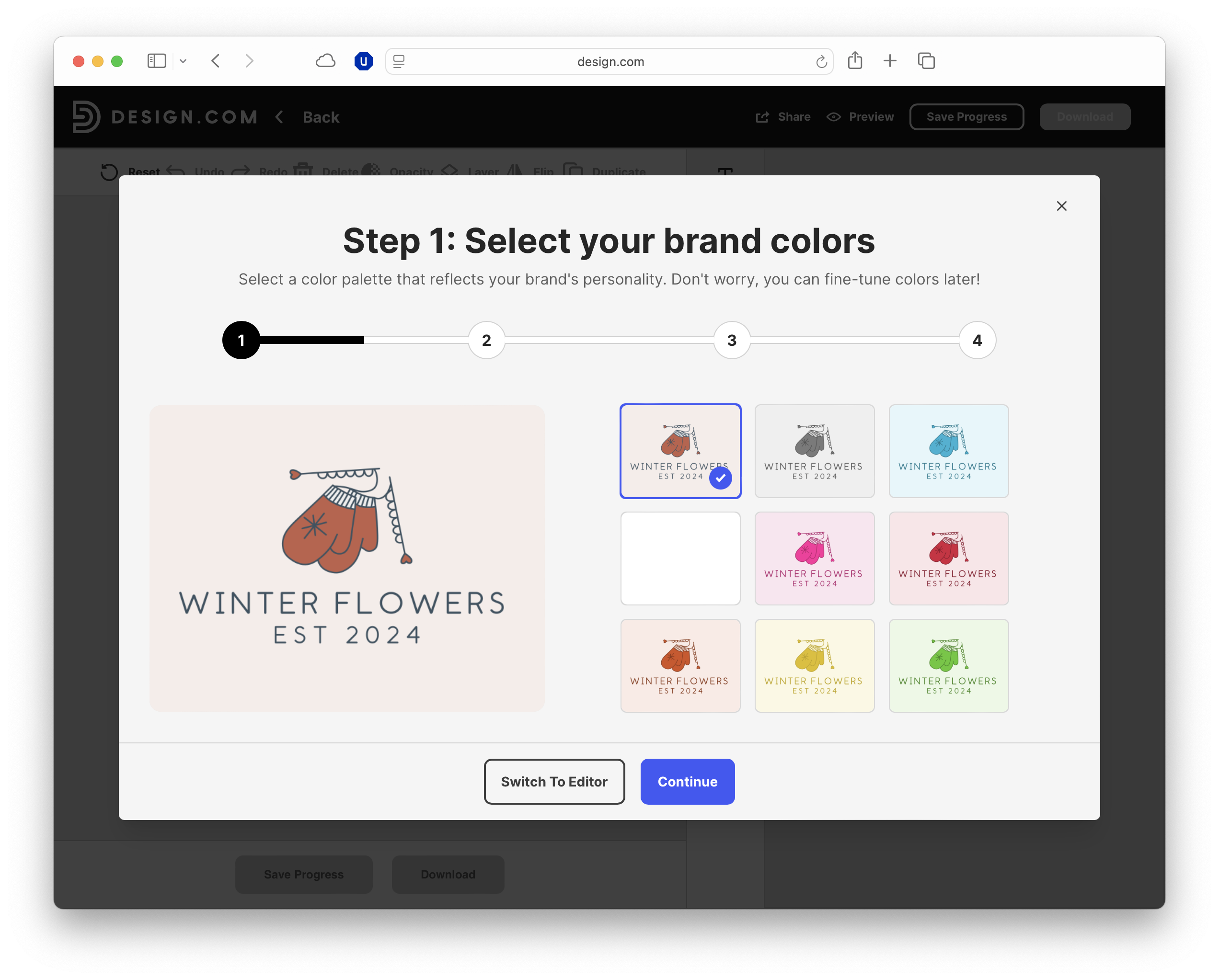
After submitting your details, you’ll be shown a range of visual styles and icons that match your industry. These come from a shared library, so they’re not entirely unique, but they offer a quick way to explore different directions.
3. Review the suggested logo concepts
Design.com will generate dozens of logo ideas, which you can scroll through or filter by layout, colour, or symbol type.
At this stage, we would suggest focusing on clarity and balance rather than perfection. A good concept will be easy to read at a glance, work at small sizes, and feel broadly aligned with the tone you’re aiming for.
4. Customize your chosen design
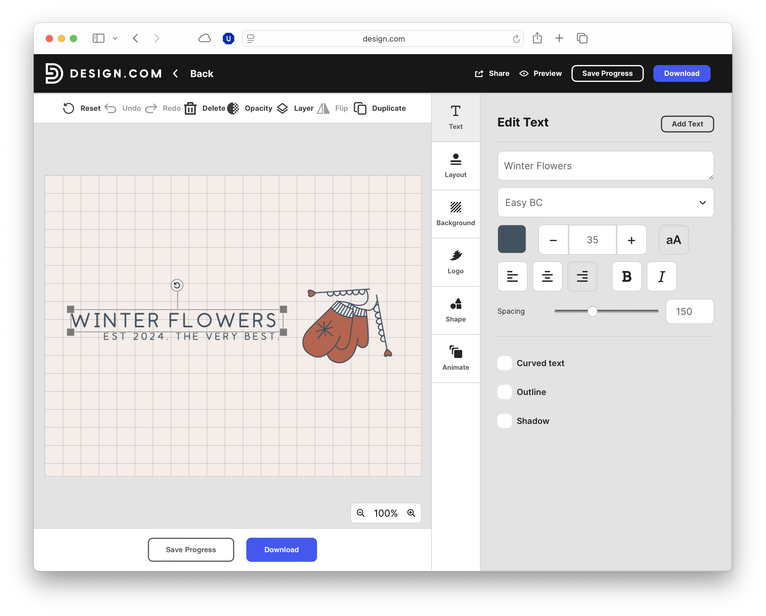
Once you’ve picked a starting point, the editor lets you adjust fonts, colours, spacing, and icon placement.
Even small tweaks can have a big impact: tightening letter spacing, adjusting alignment, or choosing a more readable font often elevates the whole design.
Test several ideas, check contrast, and preview the logo on both light and dark backgrounds to make sure it stays legible everywhere.
5. Download your free logo
When you’re happy with the result, you can export a free PNG file, which is suitable for websites, social profiles, and early-stage branding.
If you need high-resolution assets, vector formats like SVG or EPS, or a full brand kit with social templates, those sit behind Design.com’s paid tiers.
Design principles and tips
A free logo can still look polished if you follow a few core design principles. Start with simplicity: aim for a clean, uncluttered layout that works instantly.
Conventional wisdom says detailed icons, long taglines, or busy colour combinations can make a logo feel dated or hard to read. Scalability is essential, so check that your design remains clear when reduced to favicon size.
Typography has a major impact on quality. Choose readable, well-weighted fonts, and avoid decorative scripts unless they genuinely suit your brand.
Keep your palette tight – two or three colours are usually enough – and ensure good contrast on light and dark backgrounds.
Balance is what separates a basic template from something more professional. Use consistent spacing, align elements carefully, and size your icon so nothing feels top-heavy or cramped.
It also helps to create multiple versions: a square format, a wider horizontal layout, and an icon-only mark for social media avatars.
Finally, test your logo everywhere – on a phone, in monochrome, and across different backgrounds – and refine it until it looks cohesive and distinctive, rather than like a default AI output.
FAQs
- Is Design.com completely free? You can create and download a basic PNG logo for free, but high-res and vector files are paid.
- Can I use the free logo commercially? Yes, you can use the free PNG for commercial projects.
- Are the logo designs unique? Not fully – they’re generated from shared templates and icons, so customising your design is important.
- Do I need design experience to use Design.com? No, the platform is built for beginners and guides you through each step.
- Can I edit my logo after downloading it? Yes, you can reopen your design in Design.com to make changes any time.

TechRadar Pro created this content as part of a paid partnership with Design.com. The company had no editorial input in this article, and it was not sent to Design.com for approval.
Sign up to the TechRadar Pro newsletter to get all the top news, opinion, features and guidance your business needs to succeed!
Max Slater-Robins has been writing about technology for nearly a decade at various outlets, covering the rise of the technology giants, trends in enterprise and SaaS companies, and much more besides. Originally from Suffolk, he currently lives in London and likes a good night out and walks in the countryside.
 Become a TechRadar Insider


