How to create a business logo design for your website
Design.com lets your business quickly and easily create logos
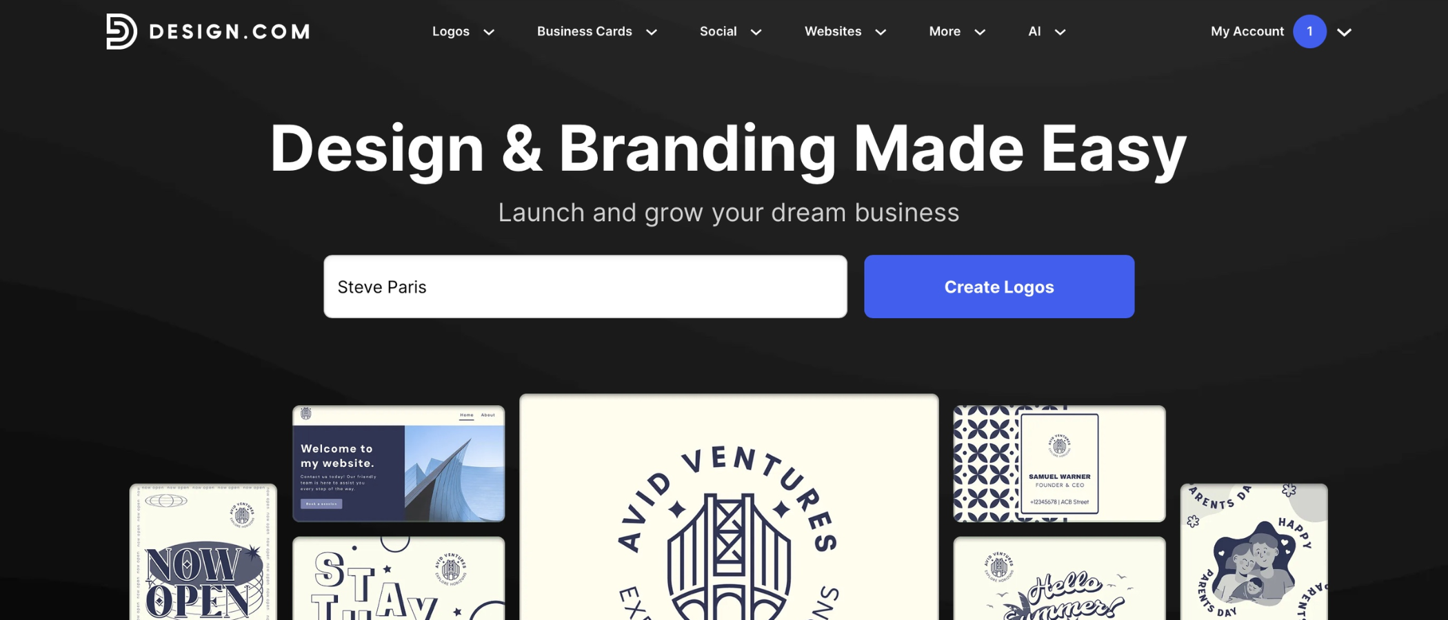
A clear, memorable logo is one of the simplest ways to make your business stand out online, and it can shape how visitors perceive your brand from the moment they land on your website.
While professional designers remain a great option, tools like Design.com make it far easier to create a polished logo yourself – even if you have no design experience.
In this guide, we’ll walk through the process of planning your logo, creating it with Design.com, refining the design, and exporting the right formats for your site and any other uses.
By the end, you’ll have a clean, consistent logo that fits your brand and works across any modern website.
You can check out the platform's AI logo maker by clicking here.
Save up to 88% off logo packages on Design.com
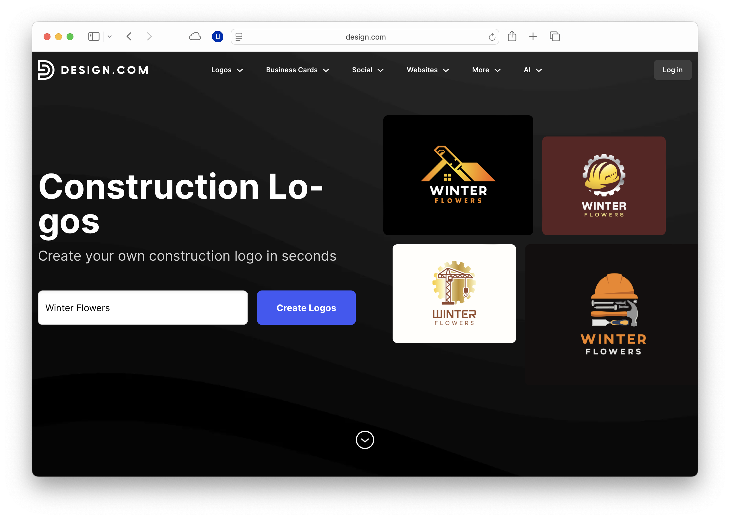
Design.com’s AI-powered logo platform does all the heavy lifting behind the scenes, so you don’t need to throw your time and cash away on an expensive creative team or complex software. Simply enter your business name and watch thousands of logo ideas show up in seconds.
What you need
Before you jump into the design process, it helps to have a smooth setup.
Design.com runs in any modern desktop browser, but you’ll get the best experience with an up-to-date version of Chrome, Edge, or Safari, and a stable internet connection to handle real-time previews.
Make sure your screen brightness and colour profile are accurate, as this will affect how your final logo appears.
It also helps to have your brand name, a rough colour preference, and a clear idea of where the logo will sit on your website, as this keeps your choices consistent once you start designing.
How Design.com’s free logo maker works
Design.com is built to help businesses produce a professional-looking logo without needing a designer, but taking a structured approach will help you get the best result.
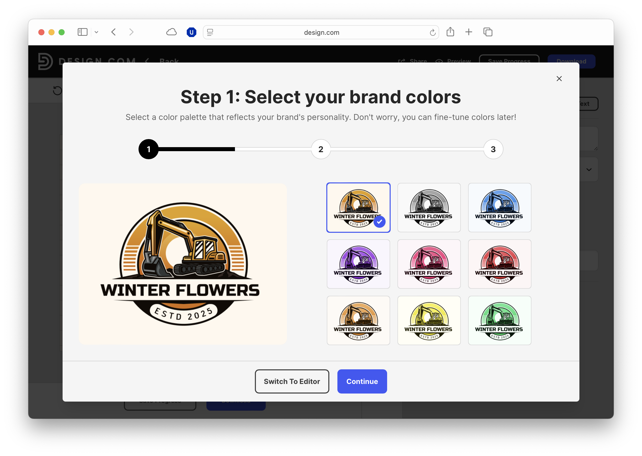
1. Start a new logo project
Enter your business name and choose the category that reflects your sector, whether that’s retail, consultancy, hospitality, or something more niche.
These details help the tool generate designs that look appropriate for your industry, which is especially useful if you’re aiming for a specific tone such as premium, approachable, or tech-focused.
2. Pick a starting point
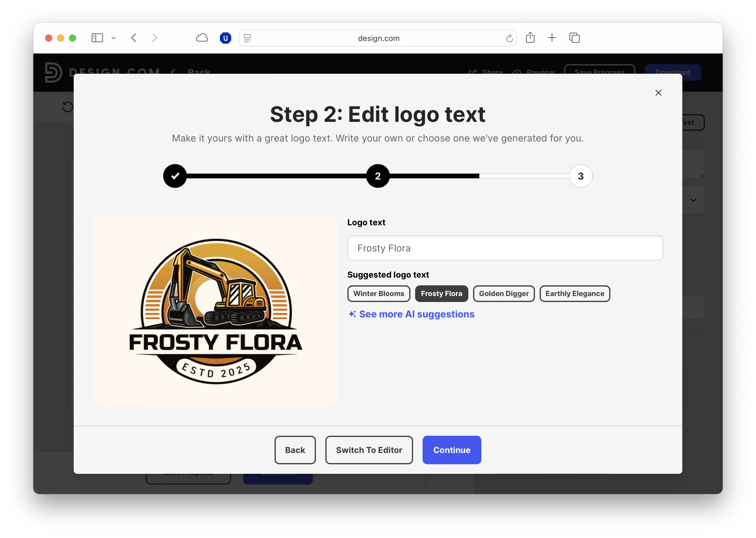
The platform will present a broad selection of logo concepts based on your inputs, and these are great starting points.
Look for templates that communicate your business personality at a glance – for example, clean geometric shapes for a modern service brand, or soft, rounded typefaces for something more people-centred.
The aim at this stage is to choose a direction that feels close to your brand identity, rather than get the final result.
3. Customize the design
This is where your business identity starts to take shape.
Adjust the fonts, colours, and overall structure so the design reflects how you want customers to perceive you.
A bold typeface can convey confidence, while a muted palette may suit a more understated brand.
Design.com lets you swap icons instantly, which is useful if your business relies on visual cues. Cafés, trades, fitness brands, and creative services all benefit from recognisable symbols.
4. Fine-tune the layout
Spend time refining spacing, alignment, and the balance between text and icon, which makes your logo feel more deliberate and professional.
Doing this really matters when it appears on your website header, social profiles, or email signatures.
Check the design against both light and dark backgrounds, especially if your site supports dark mode or uses a coloured header.
5. Export your files
Download the logo in SVG (available to paying users) and PNG formats so you have flexibility across your website.
SVG is ideal for crisp scaling on high-resolution screens, while PNG with transparency works well for banners, headers, and branded assets.
It’s worth saving a horizontal version and a simplified icon-only version, as many businesses use these across different parts of their site and marketing materials.
Design principles and tips
A business logo has to work across a wide range of screen sizes, so clarity should always take priority.
Keep the overall shape simple enough that it remains readable on mobile, where many customers will encounter your brand for the first time.
Aim for a colour palette that complements your website header rather than competing with it; a strong contrast helps the logo feel integrated rather than pasted on.
It’s also worth preparing both horizontal and stacked versions so your layout can adapt between desktop and mobile views.
Before finalising anything, preview the logo across different devices and check the favicon version remains legible at very small sizes, as this can subtly reinforce your brand whenever a user opens a new tab.
FAQs
- Do I need design experience to create a logo with Design.com? No. The platform handles the visual basics for you, letting you focus on the overall style and message.
- Which file format should I use for my website logo? SVG is usually best for crisp scaling, while PNG works well for transparent backgrounds.
- Can I edit my logo after downloading it? Yes, you can reopen your project on Design.com and make adjustments whenever your brand evolves.
- Should my business logo include a tagline? Only if it remains clear at smaller sizes, as long taglines often become unreadable on mobile.
- How can I make sure my logo fits my website design? Preview it against your site’s colours, check it in both light and dark modes, and ensure it stays legible on mobile.

TechRadar Pro created this content as part of a paid partnership with Design.com. The company had no editorial input in this article, and it was not sent to Design.com for approval.
Sign up to the TechRadar Pro newsletter to get all the top news, opinion, features and guidance your business needs to succeed!
Max Slater-Robins has been writing about technology for nearly a decade at various outlets, covering the rise of the technology giants, trends in enterprise and SaaS companies, and much more besides. Originally from Suffolk, he currently lives in London and likes a good night out and walks in the countryside.
 Become a TechRadar Insider


