Google is redesigning Google News on the desktop again and I kind of hate it
A glimpse of the possible future
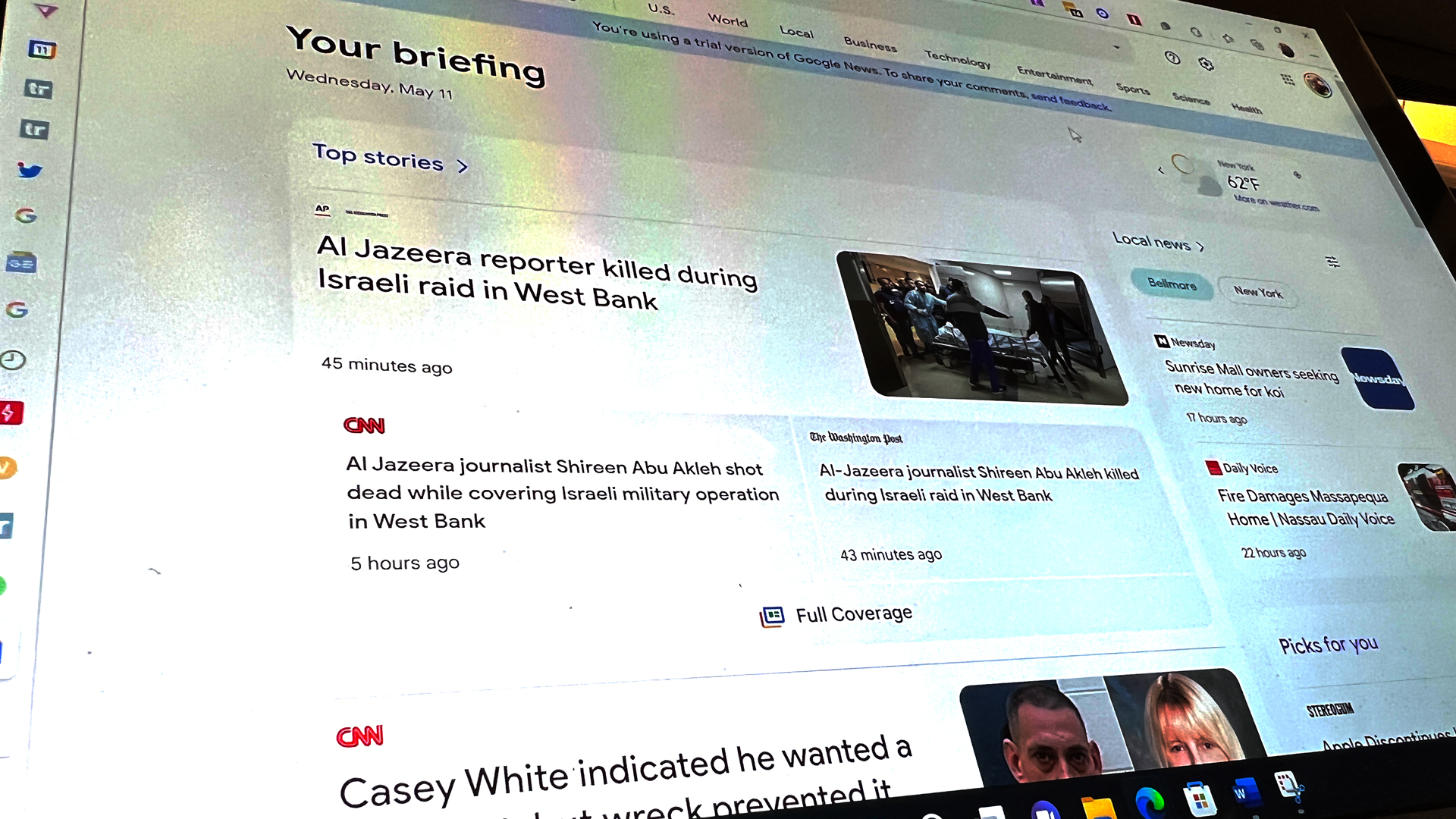
My favorite version of Google News is from 2006. It was a lean, austere, two-column design, that prioritized HTML text over aesthetics. The look was so function-first that Google News soon became my homepage.
To this day, the very first thing I open in the morning is Google News. It's the single best way to get a broad overview of news of the world across a wide swath of categories. Judging by the amount of traffic sites like my own, TechRadar, receive from Google News, it's a popular homepage for millions of others, as well.
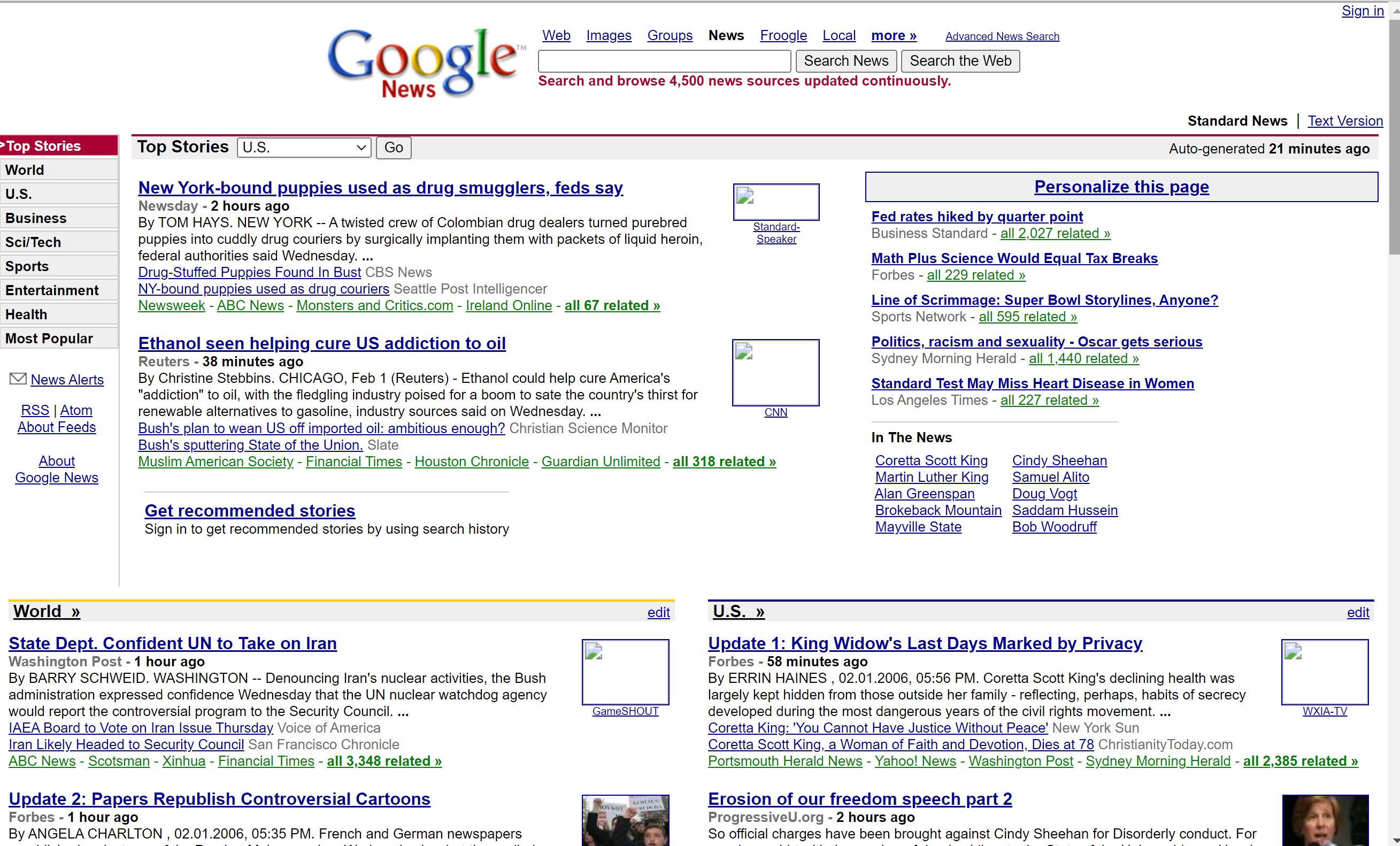
Google has been messing with the platform for all these 16 years, prioritizing images, bloating the simple navigation with personalization, and doing its best to tailor the landing page to what Google's algorithms think I want to read about. On mobile this means I have to remember to switch from the "For You" tab to "Top Stories" to see a less filtered news list.
Article continues below 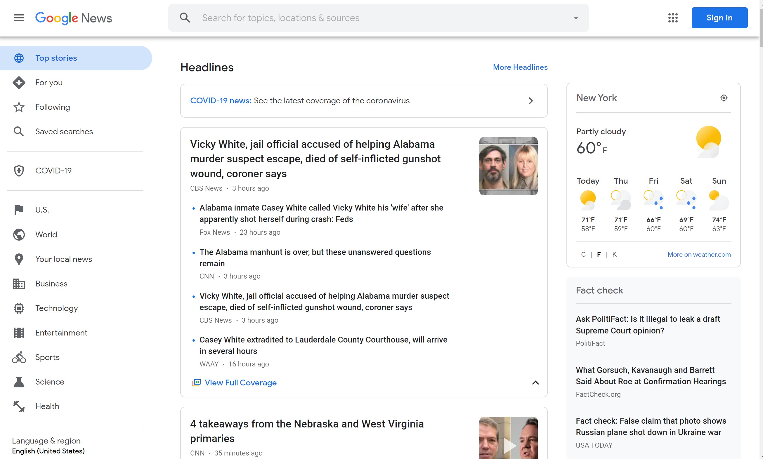
At least on the desktop, Google still feeds me the Top Headlines with a nice linear list of boxes devoted to each news section: Headlines (all the categories), World, Business, Technology, Entertainment, Sports, Science, and Health.
Well, they did.
Recently, I got randomly drafted into testing a trial version of Google News and exposed to a very different design.
My first reaction was...well, I can't write that here.
Sign up for breaking news, reviews, opinion, top tech deals, and more.
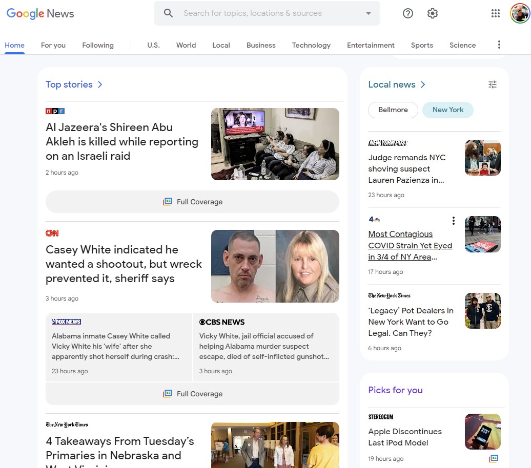
I can share that I thought, 'Wait. What's this?" did I miss the memo that Google was redesigning News again? It took me a while to notice the "trial" message at the top of the page. Now the only way I can see the old look is by opening an incognito web browser.
Where the current, public Google News is lean and sensible, this test version looks over-designed, with lots of shaded boxes, oversized headlines, and an icky gray (or is it light purple?) background.
There's a significant Your Topics section below the oversized "Your Briefing" that makes it harder to quickly spot the sections I care about most: Tech, Science. It's also worth noting that "Your briefing" is huge and there's a ton of wasted negative space next to it.
My goal in starting with Google News is to quickly digest as many headlines as possible. I'm not saying Google should go all DrudgeReport on me, but I always thought the current Google News was a happy medium of style and substance.
Also, shifting the navbar to the top of the page, somehow makes it less visible to me.
My point is since Google is asking for feedback, let's not do this, Google. Take another look at Google News from 2006 and try to remember why that was so wonderful. Let's head in that direction and not overdo it with the design.
Please, and thanks.

A 38-year industry veteran and award-winning journalist, Lance has covered technology since PCs were the size of suitcases and “on line” meant “waiting.” He’s a former Lifewire Editor-in-Chief, Mashable Editor-in-Chief, and, before that, Editor in Chief of PCMag.com and Senior Vice President of Content for Ziff Davis, Inc. He also wrote a popular, weekly tech column for Medium called The Upgrade.
Lance Ulanoff makes frequent appearances on national, international, and local news programs including Live with Kelly and Mark, the Today Show, Good Morning America, CNBC, CNN, and the BBC.
 Become a TechRadar Insider


