Android 9 Pie vs Android 8 Oreo: what's new and what's changed?
All the differences you need to know

Sign up for breaking news, reviews, opinion, top tech deals, and more.
You are now subscribed
Your newsletter sign-up was successful
Android was first released to the public 10 years ago, in 2008. It was a wobbly, brilliant, infuriating and lovable work-in-progress.
Today Android is just as slick as Apple's iOS. Google didn’t need to revamp the whole system with an Android 9 Pie worthy of a 10th anniversary update.
But what’s new? In the move from Android 8 to Android 9, also known as Android Pie, we get loads of small interface tweaks, a new way to navigate the interface and a set of tools to let you avoid wasting too much time with your phone.
Article continues belowLet’s run down some of the most important changes in Android Pie.
Android Pie vs Android Oreo: aesthetics
Android is more stripped-back today than it was in 2014. However, this leaves Google's own Pixel phones looking a little stiff or conservative, compared to other phones with custom interfaces.
Android Pie brings back a little more color, a few more curves, to the system. We would not call this a dramatic new look, but some of its edges have been softened.
For example, the Settings menu now has colorful icons. And the drop-down Quick Settings bar uses blue circles rather than plain icons. The notifications drop-down also looks like a rounded-off digital Post-It, rather than just a plain sheet of white that fills the whole screen, as in Android Oreo.
Sign up for breaking news, reviews, opinion, top tech deals, and more.
You’ll get used to this new look in about five minutes. But it does nudge Android’s default look closer to the cuter, friendlier style of the skins Samsung, Huawei and others use in their phones.
Android Pie vs Android Oreo: wellness
We don’t want to sound like a grandparent sitting you down by the fire to tell you how to live your life. But time is just about the most precious resource for most of us, along with how many calories we can gobble in a day without earning an extra chin.
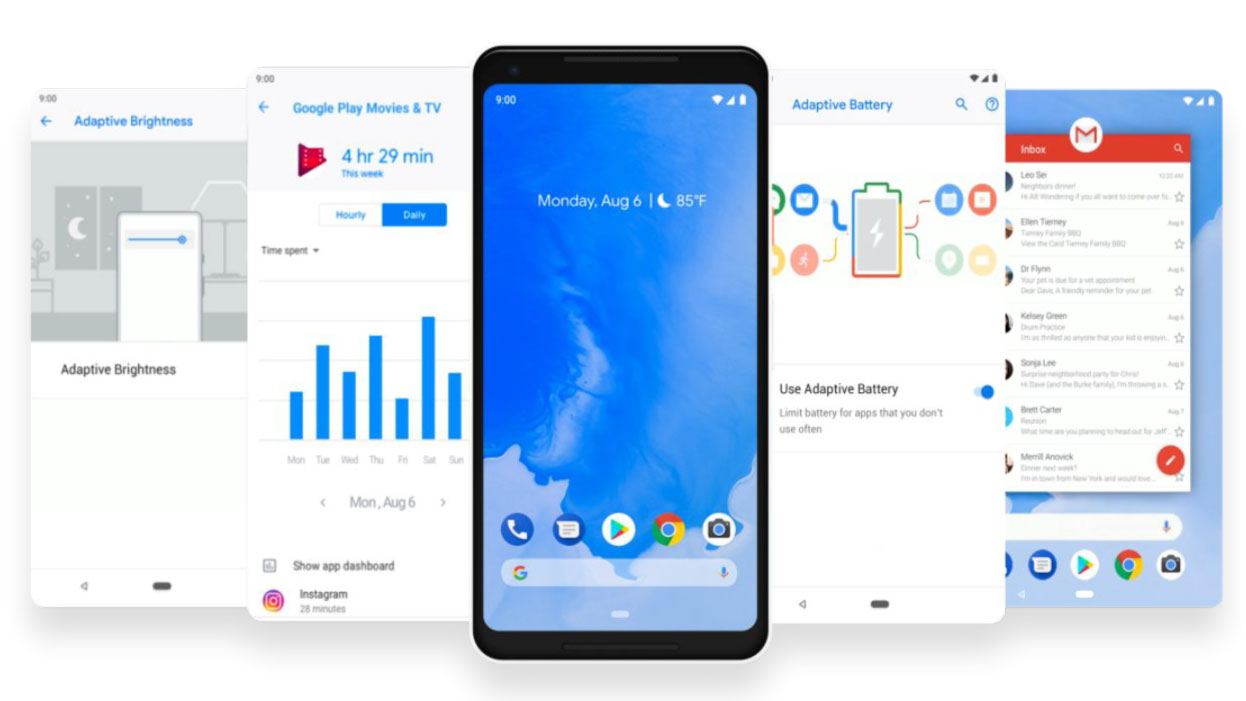
Android Pie is clued up on this idea. A new feature called Dashboard lets you see how much time you spend on your phone each day, breaking that time down into a pie graph of the apps you use.
Did you know you spent four hours on Instagram yesterday looking at videos of puppies? Dashboard is great for a quick digital “sanity check”, a more human take on Android Oreo’s existing feature that lets you see how much battery power apps use.
It also notes how many times you unlock your phone each day, and how many notifications you receive. We’re not planning on a digital detox any time soon, but being able to see exactly how much time you waste on Facebook is useful.

Android Pie vs Android Oreo: usage limits
Want to get more hardcore with your digital discipline? Android Pie lets you do that too. App Timers set a time allowance for specific apps, one that resets at midnight each day.
You’ll get a reminder when that allowance is nearly gone. And once it’s up, the app icon will grey-out. That’s your lot, Instagram fiend.
Many of us know we use an app a little too much, whether it’s YouTube, Facebook, Instagram or a “just one more go” casual game. App Timers are a neat way to curb bad habits. But, yes, some willpower is still required.
Android Pie vs Android Oreo: night mode
Wind Down is the other major pillar in Android Pie’s "digital wellness" features.
Android Oreo has a feature called Night Light, which takes the blue light out of the display as you get closer to bed time. This is easier on the eyes, makes the display look yellow/orange, and makes phone use less of a sleep disturbance.
Wind Down goes a few steps further. You still have Night Light, but when your reach "bedtime", which you set, the display turns grey-scale and Do Not Disturb mode is activated.
Like the other digital wellness feature above, Wind Down makes unhealthy phone use easier to avoid.

Android Pie vs Android Oreo: brightness control
Android Oreo has a fairly standard adaptive brightness mode. This increases and decreases screen brightness based on ambient light conditions. All but the cheapest phones in the wold have this feature.
Android Pie makes Adaptive Brightness a little more intelligent. It learns from the tweaks you make in different lighting conditions, mapping out a custom back light curve. In theory the Auto Brightness settings should land on exactly the level you want after a few days of normal use.
This is not a life-changing feature, but it does add some hidden convenience not seen in Android Oreo.
Android Pie vs Android Oreo: battery management
This is not a replacement for Battery Saver, still present in Android Pie. It should result in slightly better longevity in some app-packed phones, though.
Over the last few Android updates, Google has tried to make the system use less battery, particularly when the phone snoozing in your pocket. However, the main battery-problem-solving feature in Android Oreo was the ability to see which apps were consuming the most energy.
Android Pie makes the control of background power use more visible, with a mode called Adaptive Battery. This tailors how Android treats apps based on how often they are used.
Apps you use rarely will only have the most basic of background permissions. Any notifications from them may be delayed, but they’ll use less battery as a result. Apps you use all the time won’t be affected.

Android Pie vs Android Oreo: app AI
Android 9 Pie is smarter than Android 8 Oreo. It predicts the features you’ll want, and puts them in front of you before you go looking for them.
This might be a shortcut to call someone, resume a playlist in Spotify or order a taxi. What you see depends on what you’re doing, the time of day, whether you just plugged-in (or wirelessly connected) headphones and so on.
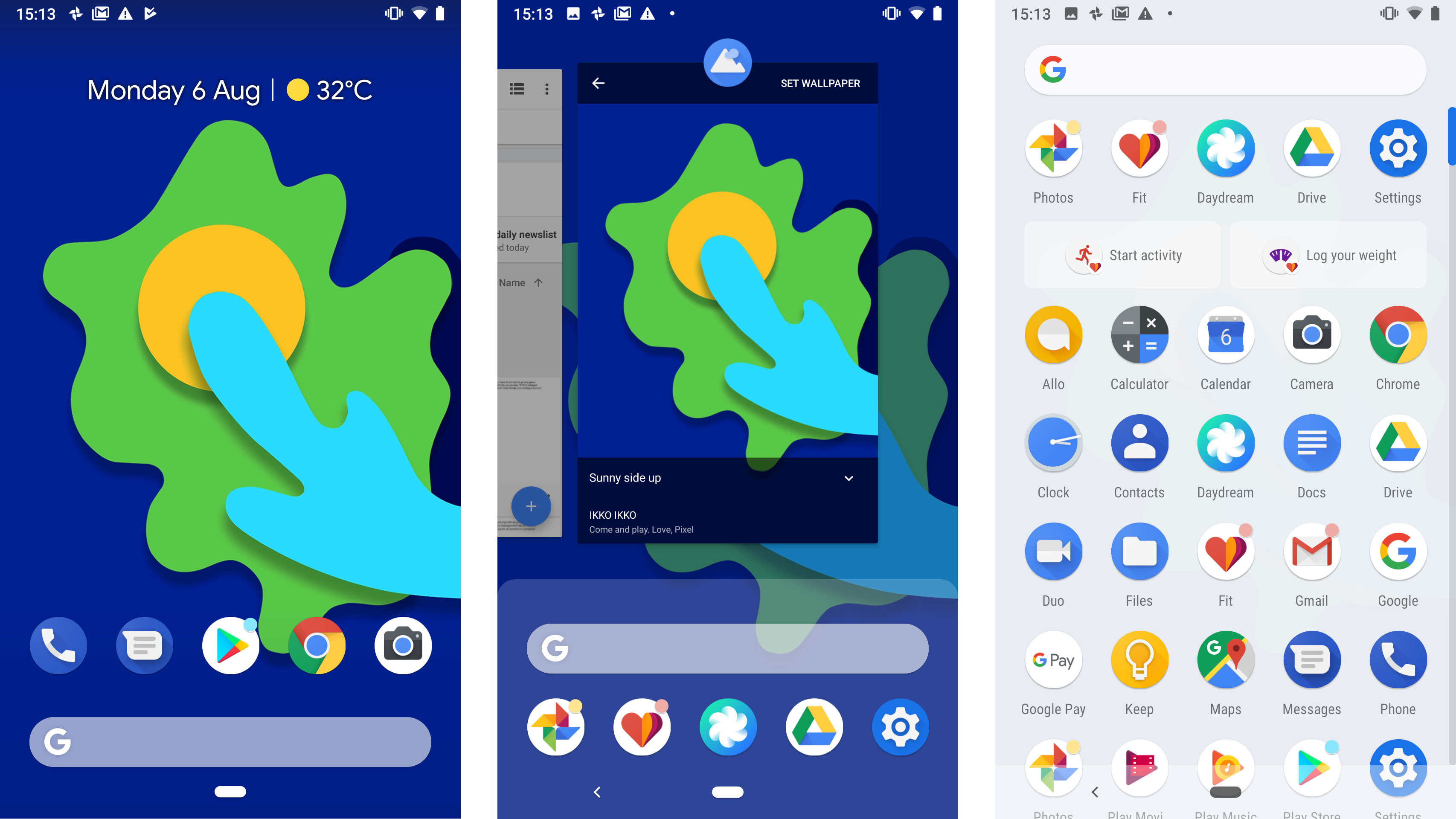
The most obvious spot in which they appear is just below the top row of icons on the apps menu. However, these app actions will also show up in the universal search bar, in Google Assistant and the Play Store.
This is another example of how well Google already knows us, by collating our past behavior. However, it’s nice to see this used to speed-up Android operation rather than show us tailored ads.
Android Pie vs Android Oreo: app functionality
The cousin of App Actions, App Slices are the specific slivers of app functionality third-party developers can create to surface in Android Pie’s interface.
These are the bits that will, in time, make Android Pie feel more rich than Android Oreo. One demo Google has shown-off relates to Lyft, the taxi app.
Search for "lyft" in the universal search and you’ll see how long a wait there’ll be for a taxi, and quotes to get you home, rather than just a link to the Lyft app. Slices are little parts of app information that don’t have to live in apps anymore.
We’ll have to wait to see what other uses app developers devise. But this feature has a lot of potential.
Android Pie vs Android Oreo: volume control
Press the volume buttons on an Android Oreo phone and the control that pops-up will vary depending on the context. If there’s a song or video playing, it’ll alter media volume. If there isn’t, the buttons will alter notification volume.
That changes in Android Pie. Volume buttons will control media volume as standard, letting you drop the volume of a track or video before it starts playing. You no longer have to be the person on the bus embarrassing themselves by piping out some classic Hanson at max volume.
The volume interface also has a button to switch between silent, normal and vibrate-only notification modes. If you’re the kind of person who actually alters the volume of notifications regularly, you may not like this change.
However, we virtually never need this: we either want silence, or the level we always use. You can still alter notification volume using a Settings shortcut below the volume slider.
Android Pie vs Android Oreo: copy and paste
Copy and pasting gets one of the most sensible, and overdue, tweaks in Android Pie. When you long-press and drag to select a phrase in an article or email, you’ll see a magnified version of what’s under your finger. This makes selecting the right portion of text first time much easier.
If this sounds familiar it's because iPhones already have this feature, and have done for a long time now.
Android Oreo did introduce some neat text selection extras, mind. Smart Text Selection auto-highlights things like addresses and phone numbers without you having to do so manually.
However, with that previous version, selecting a certain part of an article still feels fiddly. Bring on Android Pie.
Android Pie vs Android Oreo: navigation
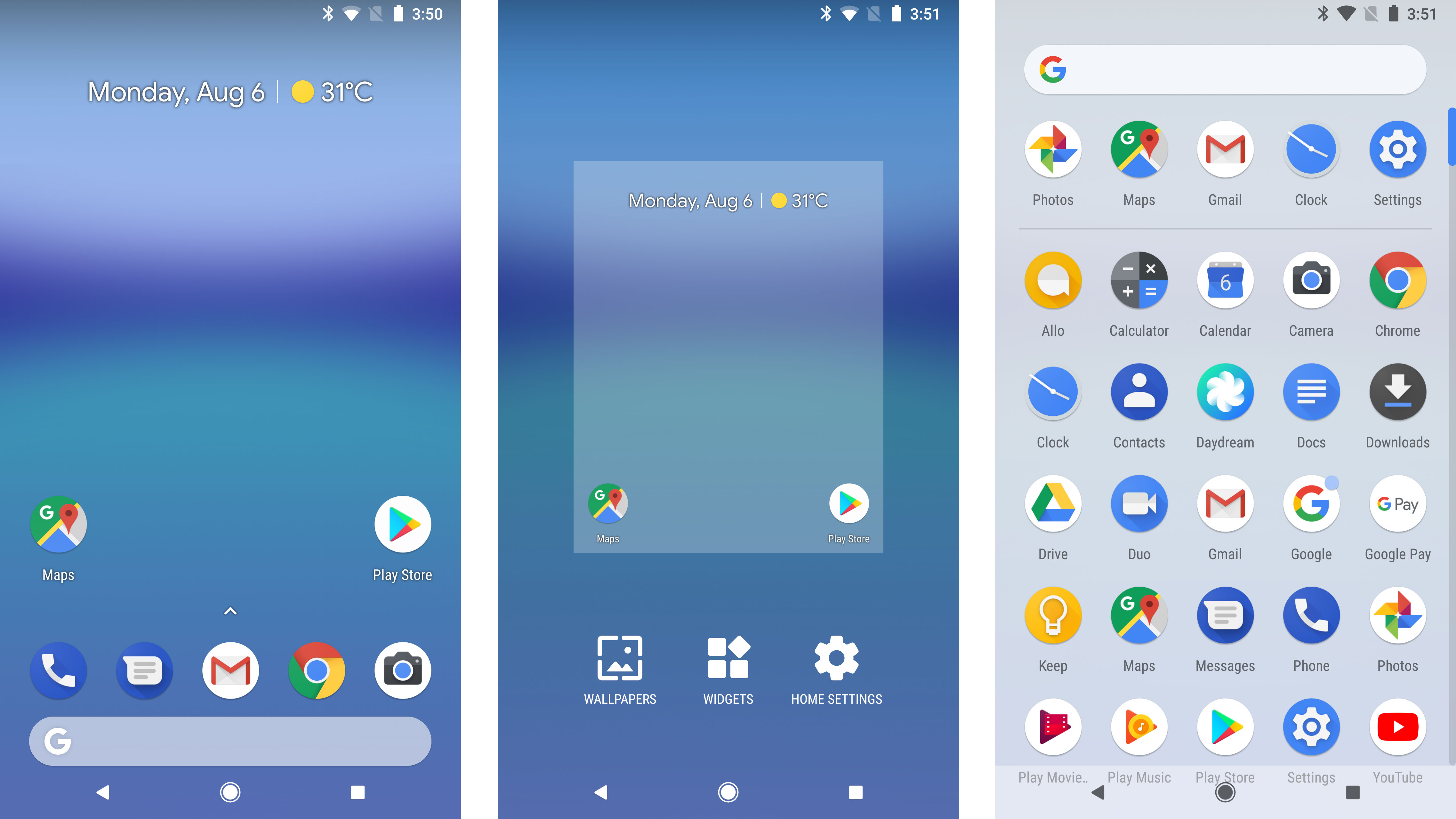
Almost all Android phone use the same basic interface “language”. Three soft keys at the bottom of the screen let you switch between the recent apps and apps drawer pages, and the back button takes you “back” a step no matter where you are in the phone.
Android P offers a new approach, one based around a single central button that looks like a little white pill. Tap on it, and it’ll function like a normal Home button.
Swipe up, though, and it first takes you to the Recent Apps screen, then the Apps Drawer after a second swipe. This represents a more gesture-led approach to Android, and one that assumes we do quite a lot of fast app switching.
There’s also a context-sensitive back button. It only appears when it is possible to “go back”. The button doesn’t appear on the homescreen, for example.
This new nav style is optional. You can use classic soft keys if you prefer.
Android Pie vs Android Oreo: recent apps
In Android Oreo, the Recent Apps display is a 3D stack of cards, each representing an app used recently. It works well enough, but would not be a good fit for the new gesture nav style of Android Pie, which puts a lot more focus on the Recent Apps area.
In Android Pie, this multi-tasking staple looks more like the app switching interface of an iPhone. App previews are flat cards that sit side-by-side, not on top of each other, as in Android Oreo.
This is the most start visual difference between Android 8 and 9. And we think it’s an improvement. The new Recent Apps screen is much more consistent with the visual design of the system, and seems less like the appendix at the back of a book. It’s cleaner, and more useful.
It also features the same row of popular apps as the app drawer.

Andrew is a freelance journalist and has been writing and editing for some of the UK's top tech and lifestyle publications including TrustedReviews, Stuff, T3, TechRadar, Lifehacker and others.