Windows 10 redesign could be in the works going by new more colorful icons
Even the icon for File Explorer is being rejigged by all accounts

Sign up for breaking news, reviews, opinion, top tech deals, and more.
You are now subscribed
Your newsletter sign-up was successful
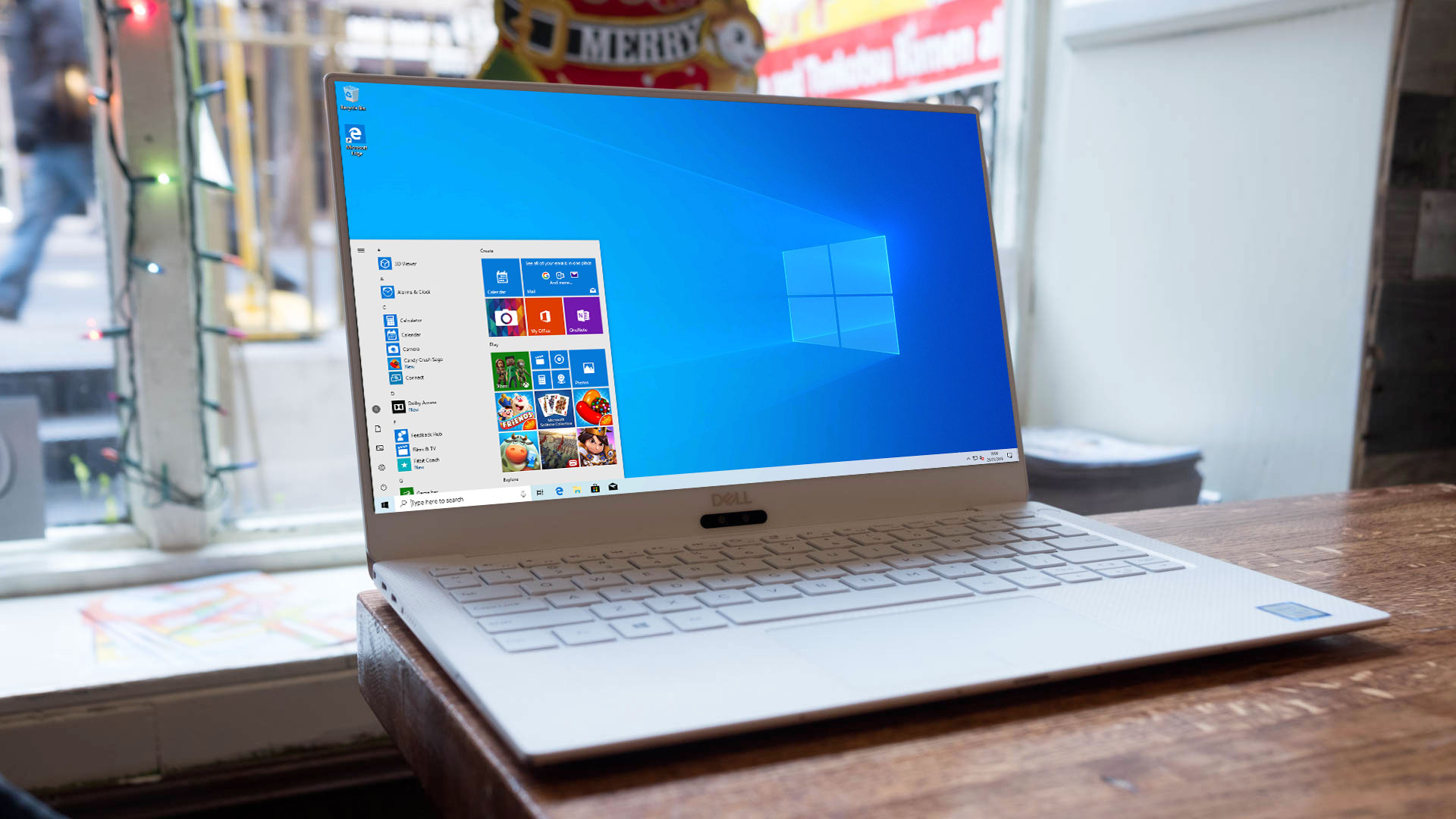
Microsoft is apparently busy working on making new icons for various core Windows 10 apps – including File Explorer itself – and images of said icons have been spilled online, perhaps hinting at bigger changes in store for Microsoft’s desktop OS.
The icons were unearthed and shared on Twitter by Italian tech site Aggiornamenti Lumia (via Windows Latest), and comprise of redesigned versions of the likes of Groove Music, Films & TV, Microsoft Solitaire Collection, Mail, and Calendar apps, as well as File Explorer (the name for the actual windows in which you browse through folders and files on the desktop).

As you can see above, the idea with most of these is to give them a lick of Fluent Design paint, some clean lines, and of course to add color (to the otherwise rather bland and flat-looking two-tone icons which are currently in place).
Article continues below- New Windows 10 fail causes Cortana to pummel CPUs
- How to reinstall Windows 10
- We solve 100 common Windows 10 problems
Although the File Explorer icon itself isn’t much different to the existing version, although it does spice things up with some different shades of blue highlights rather than just the one blue color.
Aggiornamenti Lumia reckons that the new icons will be rolled out to preview builds of Windows 10 (20H1) soon (the next major update due to land in the first half of 2020 – bearing in mind that the remaining update for this year is only a minor affair which is about tweaking things under-the-hood, not introducing big new features).
Lite wait
It’s assumed that these are new icons aimed for Windows 10 itself, although there is also the possibility that they could be destined for Windows Lite, Microsoft’s incoming lightweight spin on the OS (or even both of the aforementioned).
You may recall that fairly recently, back in July, Microsoft accidentally spilled a preview build of Windows 10 that wasn’t intended for public consumption, and this contained a stripped-back Start menu with no live tiles. So perhaps these redesigned icons will be tied in with the broader move to a fresh Start interface, and an overall more streamlined and colorful look for the operating system.
Sign up for breaking news, reviews, opinion, top tech deals, and more.
Hopefully Windows 10 preview builds in the near future should give us a more concrete picture of what’s to come.
- These are the best laptops of 2019
Darren is a freelancer writing news and features for TechRadar (and occasionally T3) across a broad range of computing topics including CPUs, GPUs, various other hardware, VPNs, antivirus and more. He has written about tech for the best part of three decades, and writes books in his spare time (his debut novel - 'I Know What You Did Last Supper' - was published by Hachette UK in 2013).