Why you can trust TechRadar
If you've ever used any kind of Windows Phone handset in the past, you won't find a huge amount of difference on the Lumia 930.
On the one hand, that's great, as it provides consistency across the platform, but at the same time it's not changed dramatically in nearly four years.
But, that said, the update to Windows Phone 8.1 is probably one of the biggest jumps for years for the platform, and it brought with it a few elements that allow you to really feel like Microsoft is trying to compete with Android and iOS.
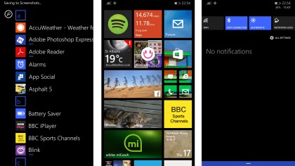
For instance, the notifications area (Action Center) is in the same place it's found on Android as well, with a swipe from the top bringing the chance to toggle key items like Wi-Fi etc (and this can be customised to some other, limited, choices) as well as information on emails, messages and missed calls.
If you think that sounds a bit Android-like, well, it's mostly because it is. It's not as feature rich as you'll find on Google's OS, nor does it have the live widgets of Apple's forthcoming iOS 8.
It even has swipe-away as an action, which seems a little too like Android for my liking, but then again if you're coming to the Lumia 930 from a Samsung or HTC Google-powered phone, you'll like the synergy.
It's a bit erratic in function too. For instance, hold Wi-Fi and you're taken to the menu to interact with connections, but do the same with Bluetooth and nothing happens. Why the inconsistency?
Sign up for breaking news, reviews, opinion, top tech deals, and more.
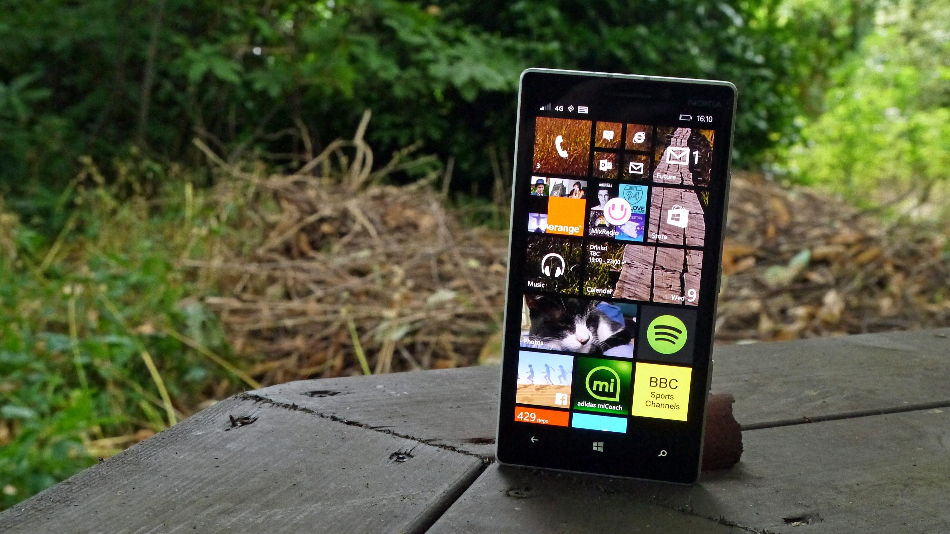
The rest of the OS is largely the same as before, with the live tiles spinning all over the home screen to give information about what's going on with each app.
This is a nice touch, and always has been one of the things I've loved about Windows Phone. And with newer versions of the platforms, you can resize the tiles to be smaller (so you can have four in the size of one live square) or double size, to give more information.
The latter is the nicest part, as it means things like Facebook, running apps or photos become so much richer, giving information when you actually need it (like what a notification on a social network means, or prompting you to strap on your trainers and run, unobtrusively).
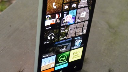
On top of that there's the new function that allows you to choose a picture to sit behind the tiles, which become transparent to show it as you scroll up and down the homescreen. It's a nice touch and solves the issue of Windows Phone looking very similar on every person's phone.
However, it's very messy when you've got a few apps on there, as those that do provide live information aren't transparent, which ruins the effect somewhat.
Given these tiles flip, it would make more sense to have the info side only blocking the picture out, and the logo letting the picture shine through. While I'm on my soapbox here, why can't we have it so these tiles don't flip? When listening to music or looking for my next run, I know where the app is – I want to see the information it's spewing, not look at the logo.
It's picky, but these are the things that would make the experience more fluid.
And then there's the long-standing apps issue, and one that I'd like to say I'm partly impressed by. It's a horrible task trying to jump into the apps race years after it's started, but Microsoft is making inroads.
Where a couple of years ago it had barely any top-level apps, at least now Spotify, Facebook, Twitter, Whatsapp, Instagram and friends are all present and correct, leading to a less irritating first trip into the Windows Phone Store.
However (and you knew this was coming) there's still a problem: the apps that are there are largely much poorer cousins compared to their Android or iOS counterparts. BBC iPlayer doesn't allow downloads. Spotify is a pared-down version compared to the super sleek Android iteration. Many news outlets still haven't bother with Windows Phone.
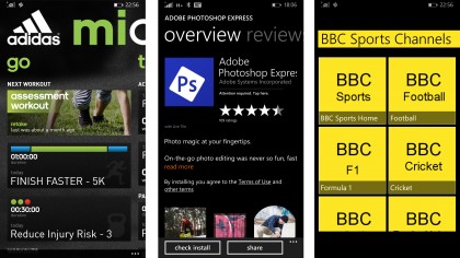
And then there's the gaming side: it's still miles away from the top level apps we're used to seeing. Real Racing 3 isn't there – it's Real Racing 2. Asphalt 8? Try Asphalt 5, with graphics like those seen on a PlayStation One.
I don't want to harangue Microsoft with the same tired apps argument – it is making some good traction, and things will only get better – but if you're looking to switch from Android or iOS, be prepared for a number of annoying app experiences that you'll have to work around.
There are some apps which are superior, of course – the likes of Adidas MiCoach is much better than on the other platforms, and that's because it's a nicer UI to code for, the brand tells me. So there is hope, but the reality right now is this OS still needs work.
If you're a new smartphone user, looking to break into the big leagues, then Windows Phone is an easy entry point. For those that are a little more au fait with how a smartphone works, then there's a lot to get used to with this newer interface, and not all of it is as intuitive as the competition.

Gareth has been part of the consumer technology world in a career spanning three decades. He started life as a staff writer on the fledgling TechRadar, and has grew with the site (primarily as phones, tablets and wearables editor) until becoming Global Editor in Chief in 2018. Gareth has written over 4,000 articles for TechRadar, has contributed expert insight to a number of other publications, chaired panels on zeitgeist technologies, presented at the Gadget Show Live as well as representing the brand on TV and radio for multiple channels including Sky, BBC, ITV and Al-Jazeera. Passionate about fitness, he can bore anyone rigid about stress management, sleep tracking, heart rate variance as well as bemoaning something about the latest iPhone, Galaxy or OLED TV.
