


Why you can trust TechRadar We spend hours testing every product or service we review, so you can be sure you're buying the best. Find out more about how we test.
If you've ever owned a Motorola Android device before, chances are that at least once, you threw it deliberately under a bus or purposefully whacked yourself over the head with a frying pan repeatedly.

Only a previous Motorola user could appreciate the true pain of having to use MotoBlur.
But we're looking to the future, not the past, so we'll park Motorola's dreadful Android interface firmly where it deserves to die a slow, painful death and tell you that the skin atop the Motorola Razr i is actually a real pleasure to use.
As it ships, the handset comes running Android 4.0.4 Ice Cream Sandwich, but Motorola is pushing the Jelly Bean update out to the Razr i as we speak, so we'll update this review fully when it lands on ours.
Firstly, because Google owns Motorola now. And secondly, because this is a high-powered, brand new and flagship handset. Motorola will be super keen to make the most of it.

Motorola has kept the interface pretty basic. As with most Android phones, you get a dock at the bottom with shortcuts to preconfigured apps (which you can alter) and your app drawer.
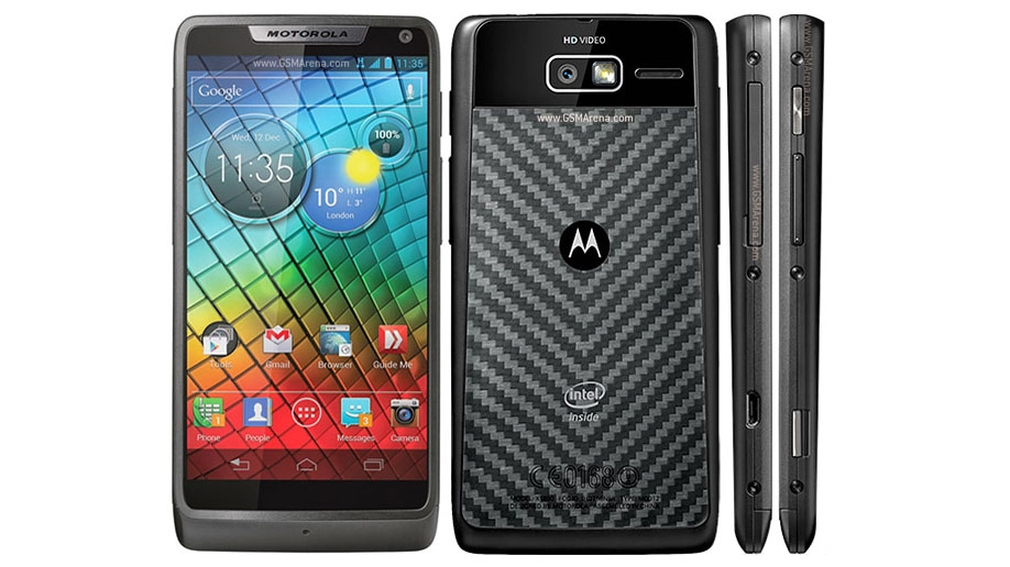
Motorola's tweaked some of the icons for non-Google apps in its own style. We think they look a bit boring, but personal tastes will differ.
The main thing you notice on turning it on is the home screen on the Motorola Razr i has a rather nifty widget.
It's a simple idea - three interlinked bubbles that provide you with shortcuts to things such as clock functions, weather and battery levels. But it's really handy.
Of course, if you're not a fan, with this being an Android device, it's fairly simple for you to delete it and replace it with one of a gazillion other widgets - including one that counts down the sleeps left to Christmas. Yes, one does exist.

The default setup gives you two home screens and then when you swipe to the right, it brings up a page management system that enables you to create a blank home page or use a default template, which is a really nice touch.
We hoped we wouldn't be able to max it out, but once we got to seven, there was no way of adding more home screens - unless you go down the third party launcher route, that is.
Swipe to the left and you get a quick settings tab that enables you to toggle things that are all important, such as Wi-Fi and GPS.
It's exactly the kind of stuff other OEMs add to the top of the notification bar, and we wish Motorola had actually done that and followed the lead of Samsung and others.
Swiping to the left just feels a little more convoluted when you're in home screen number three or have to come out of an app to change something simple.

The notification bar itself is typical Android - no Motorola customisations there. And Motorola has elected to keep it blue, which we're big fans of.
It instantly identifies the operating system as Ice Cream Sandwich to users (or geeks like us).
One other thing that identifies the OS as ICS is the lack of physical home buttons.
Unlike Samsung and others, Motorola has obeyed Google and eschewed physical buttons for the ones you get on the screen instead.
Some like this approach, some hate it, but regardless, that's the way Motorola is playing it. Hardly surprising, considering who the daddy is.
Provided you don't put a lock on the home screen, it's pretty much untouched and has the ability to go straight into one of a number of apps, depending on which way you swipe it.

There's also a rather handy ability to toggle the ringtone on and off on here.
One thing we're not massive fans of is the way the phone vibrates when it unlocks. This is because the battery is sealed in, like on the Razr Maxx, and you get the feeling that there is a lot of hollowness in there.
As a result, every time the phone vibrates, it just ends up feeling a little cheap, rattling about and being a little too noisy.
The app drawer is standard Ice Cream Sandwich too, with your apps nearly laid out into rows and a widgets tab to the right enabling you to preview your widgets before you commit them to screen.
It seems an age ago that you had to view a list of widgets and actually install them on a home screen to see if you liked them. Thankfully you don't have to any more.

There is also another tab called Favourites, which enables you to access your favourites. Funny that.
While we're on the subject of the app drawer, we just have to point out, once again, the amazing colours of the Super AMOLED screen. You really notice it here, because apps are set against a black background.
It really has to be seen to be believed - they just seem to float on nothingness because the background is so black. Motorola has done very well here.
All in all, we'd say that this is a really intuitive system. Android gets a bad press in the Apple vs Google fan wars, with some saying iOS is so much easier to use for a novice.
And while we're inclined to agree, we think that the Motorola Razr i is a handset that anybody with a vague inkling of how smartphones work could pick up and easily get to grips with.