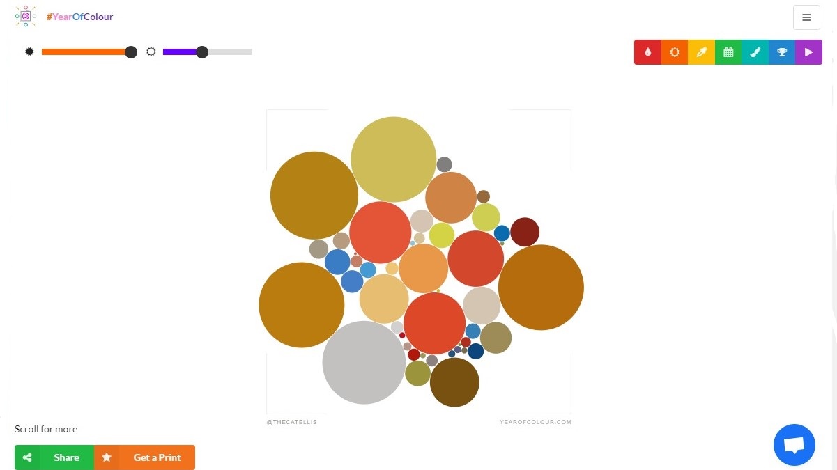
How well curated was your Instagram feed in 2018? Year of Colour is a new web app that takes all the snaps you've shared over the last 12 months (or a custom period of your choice) and pulls out the dominant shades to create a personal bubble diagram.
The idea is that more harmonious colors mean a more attractive feed that's more likely to get people tapping that heart icon.
To give it a try, visit the site and log in using your Instagram account (you can only create palettes for accounts you own). If you're happy with the permissions it requires, go ahead and enter an email address, which will be used to send your report).
Article continues belowShare and print
Year of Colour extracts hues from your most liked photos, and produces a diagram based on the shades in your top 100 snaps. The larger the dot, the more of the color is in the image.
The app also offers a collection of controls that allow you to rearrange the dots based on factors including brightness, saturation, time and popularity.
Once you're happy with the results, you can share the visualization on Instagram (provided you're using a mobile device – it's not possible to post pictures from a desktop without a few tricks) and pre-order a print for your wall.
Via The Verge
Sign up for breaking news, reviews, opinion, top tech deals, and more.

Cat is TechRadar's Homes Editor, covering smart home tech, kitchen appliances, vacuums, haircare and more. She's been a tech journalist for 15 years, having worked on print magazines including PC Plus and PC Format, and is a Speciality Coffee Association (SCA) certified barista. Whether you want to invest in some smart lights, find your ideal hair styler, or pick the espresso machine of your dreams, she's the right person to help.

 Become a TechRadar Insider


