


 Become a TechRadar Insider


Why you can trust TechRadar We spend hours testing every product or service we review, so you can be sure you're buying the best. Find out more about how we test.
Motorola Milestone 2 review: Interface
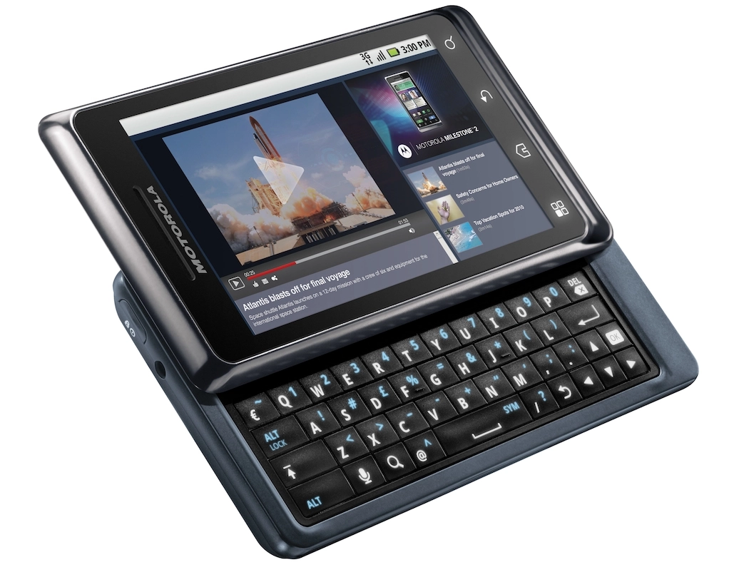
The Milestone 2's Android 2.2 OS comes fully skinned with Motorola's Motoblur interface, so Android is almost unrecognisable. The phone arrives with most of its seven Home screens absolutely packed with Motoblur widgets, with the central one bursting with social networking tools.
The touchscreen is very slick. Ultra-sensitive to the touch and quick to scroll, the only lag we experienced was the odd minor jitter when opening up the Gallery or one of Motorola's overly complex widgets.

It's all a bit of a mess, to be honest, when it comes to the widgets. Motorola's stuck a Twitter and combined messaging widget on the main Home screen, so right from the start you're greeted by two whopping great boxes that duplicate each other's content if you signed into the full range of social networks at start up.

Also, these widgets pull images from Facebook and Twitter profiles, so you get random, poorly cropped and resized icons filling up half your Home screen. It's not pretty.

However, there is some very good functionality provided by Motoblur. Users are able to create custom messaging widgets, having one specifically for email, one for Twitter and Facebook, or one mega-combi widget that pulls in all your text messages, Tweets and everything else. Plus they can be manually resized to fit your favoured layout.

But they're rather ugly. Do we really need a whole screen for each Tweet or Facebook status update? This sort of thing's been done much, much better, with both HTC's Sense interface on phones such as the HTC Desire and Desire HD, and the Sony Ericsson Xperia range, including the X10, X10 Mini and X10 Mini Pro doing a much better job of amalgamating and presenting social bits and bobs.

There are many other design inconsistencies that make the phone's interface look a bit of a mess. The browser illustrates this best. Motorola has stuck in a custom, 3D, flippable selection of tiles to illustrate your bookmarks, which is nice enough – but this same style isn't carried across to the neighbouring Most Visited and History tabs. They're just standard Android text lists.

Also, the Milestone 2 only brings up this tiled Bookmark view if using the phone in landscape orientation. People complain enough about the lack of a consistent experience across the many Android devices out there – but here Motorola's taken that to the next level by not even managing to get a consistent interface on the same phone!
There's also one other annoying Motoblur feature. Paging between Home screens brings up quick menu across the bottom of the screen, which lets users jump to any of the seven Home screens at a touch.

The problem with this is it pops up over the dock, so when you stop paging you have to wait for the dock to reappear so you can access the calling features and app drawer. Plus, in landscape mode, it'll cover any icons you've placed along the bottom of the screen, making Motoblur look a little extra uglier.