
 Become a TechRadar Insider


Creatives working for Google have released a video that demonstrates the company's Material Design principles, and offers a preview of streamlined new versions of key Android apps.
Adam Grabowski and Nicolo Bianchino have created several videos for other Google redesigns, and published the clip as part of a demo reel on Vimeo. It's since been made private, but was also shared by several Google employees on Twitter, so it appears to be genuine.
Google has already given its web apps (including Gmail, Google Calendar and Google Drive) a new look with clearer icons and more white space, and it seems the company's mobile apps will soon follow suit.
The video shows the subtle changes that transformed Google's old Product Sans font (originally used for the company's logo) into Google Sans – a typeface optimized to read well at different sizes. It then demonstrates how text should be used in an app interface, how the company's colors can be used for different elements, and how icons have been redrawn to make them clearer on-screen.
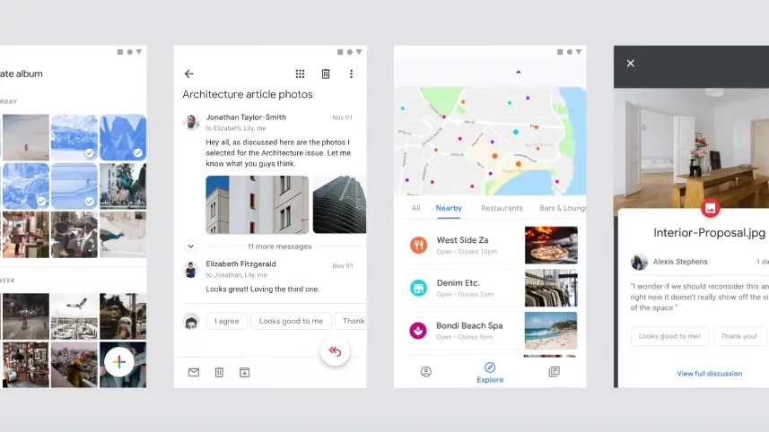
It wraps up with a look at new Material Design versions of its key Android apps, which make heavy use of images with rounded corners and white space.
The mobile apps could just be concepts not intended to hit customers' screens, but it's likely that Google is working on Material Design versions, so we expect to see something similar on our handsets in the coming months.
- Check out our guide to the best free Android apps of 2018
Via Ars Technica
