Get daily insight, inspiration and deals in your inbox
Sign up for breaking news, reviews, opinion, top tech deals, and more.
You are now subscribed
Your newsletter sign-up was successful
An account already exists for this email address, please log in.
Subscribe to our newsletter
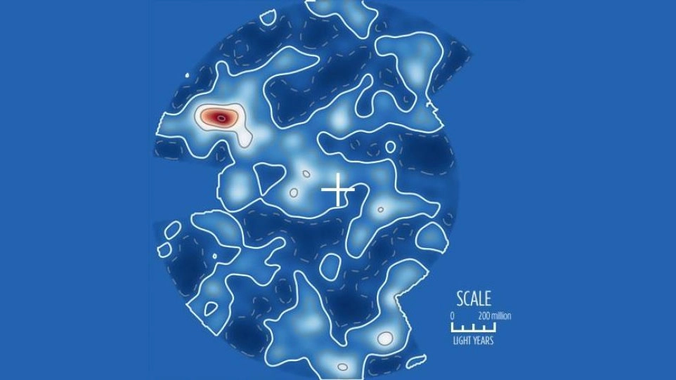
A three-dimensional map of local galaxy superclusters created by a team of astrophysicists gives us the best picture yet of what the Universe looks like.
The map shows how matter is distributed in the nearest two billion light years to Earth. Lighter blue and white areas represent higher concentrations of space objects, with the red area being the Shapley Concentration - a area with a huge number of galaxies very close to each other. The outer blue represents unsurveyed areas, and the Milky Way is in the centre marked with a cross.
What's interesting about the map is that it doesn't show a pattern. "It has peaks and valleys much like a mountain range. This is what we expect if the large-scale structure originates from quantum fluctuations in the early Universe," said Mike Hudson, a member of the team responsible for the research.
Article continues below
Knowing how the nearby Universe is mapped out is useful - not because we're going to visit any of it in the near future, but because it tells us how the Universe is expanding. That expansion isn't uniform, and working out how and why is an important part of modern astrophysics.
It also gives us clues into where and how much dark matter exists - matter that we can't see visually but still exerts a gravitational influence. "A better understanding of dark matter is central to understanding the formation of galaxies and the structures they live in, such as galaxy clusters, superclusters and voids," said Hudson.
Duncan Geere is TechRadar's science writer. Every day he finds the most interesting science news and explains why you should care. You can read more of his stories here, and you can find him on Twitter under the handle @duncangeere.