


TechRadar Verdict
A very good update to the current Android OS, and one that should cement Google's position in the mobile and tablet space
Pros
- +
Clean interface
- +
Slick notifications
- +
Faster internet browser
- +
Clear contacts
- +
NFC integration
Cons
- -
Odd choice of buttons
- -
Overly-simplistic video player
- -
Too few home screens
Why you can trust TechRadar We spend hours testing every product or service we review, so you can be sure you're buying the best. Find out more about how we test.
Ice Cream Sandwich used to be the new kid on the block, but it's been usurped by the likes of Android 4.2: Jelly Bean as the OS to have on the likes of the Samsung Galaxy S3 and Google Nexus 4.
However, loads of users are still waiting for their Ice Cream Sandwich update, and Google told us that this is one of the biggest overhauls of the operating systems since it unleashed the Android project three years ago - and there's certainly a lot to plough through.
From enhanced contact menus to improved keyboards and NFC capabilities, even the most ardent Android users will have to spend some time getting used to the new OS if they've never been Android 4 - so let's dive in.
Interface
The most noticeable change with Ice Cream Sandwich is the interface - it might follow the same principles as the Android of old, but the way it's used is radically different in a number of ways.
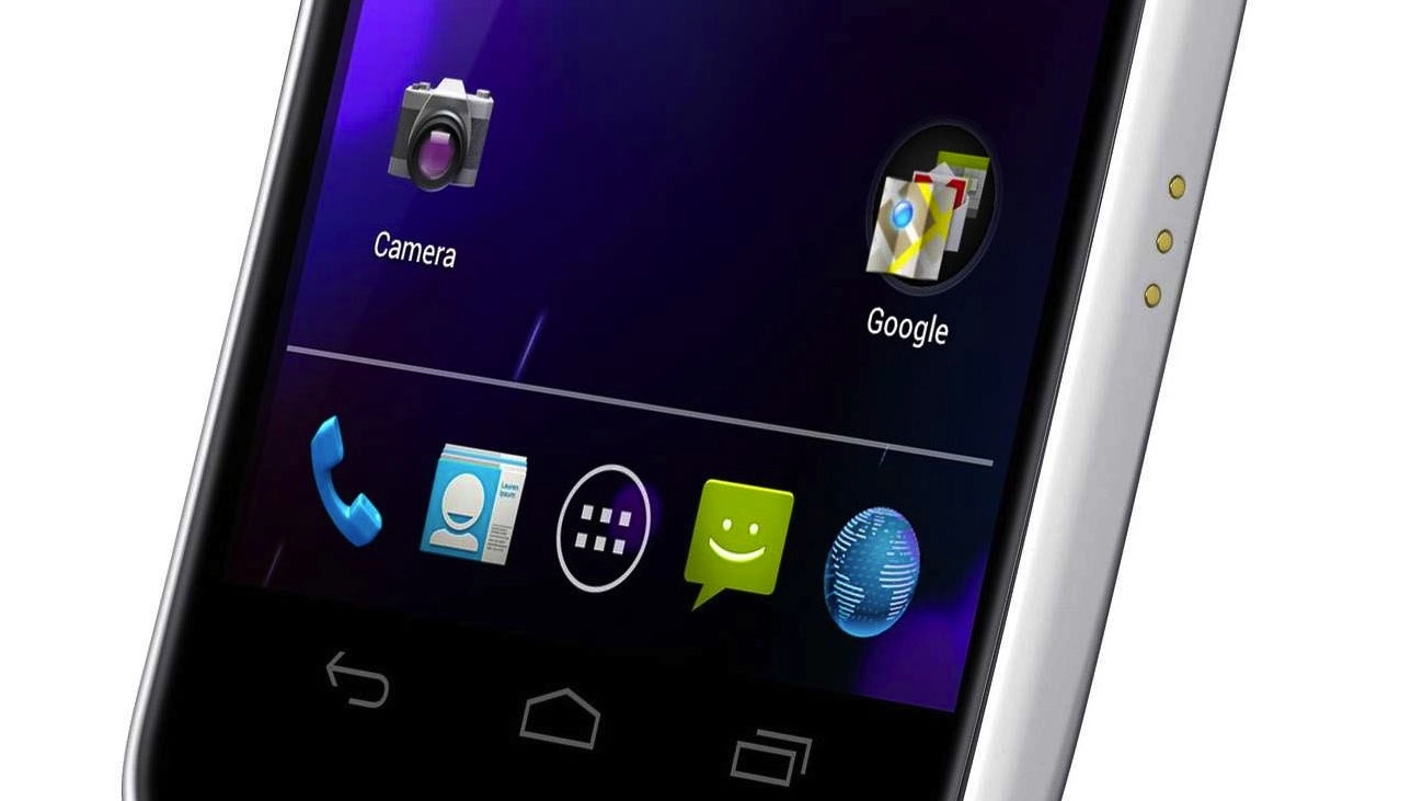
Firstly, Android 4.0 is designed to work without buttons. However, it's clear that notion has died, as physical buttons are still everywhere over a year on... so don't worry if you're a fan of a good home button.

Now to navigate around, you're offered three softkeys: Back, Home and Multi-tasking (or Recent Apps). The latter is particularly new for phones, and comes from the Honeycomb UI - basically a set of thumbnails that show recently opened apps.
Here's the new part: swipe sideways to shut down an application, which will greatly help reduce the battery consumption of your phone if there's something silently updating in the background.
The Home and Back buttons are the same as they've always been, but no longer have a 'long press' function attached... so you can't automatically call up the keyboard, for instance.
If you move into something media-ish, such as watching a movie or browsing the web like a pro, these three buttons shrink down to tiny dots, so you've got more of the screen to look at. However, remember what each dot does, as pressing it will take you home/open the recent apps etc and you might not want to.
For Android fans, this presents something of an issue: with the menu button gone, you'll have to hunt around the screen for three vertical dots which have taken its place. However, these can be anywhere, so sometimes you'll get distracted trying to work out how on earth to alter settings.
The multi-tasking pane also seems an odd choice for one of three buttons - it used to be you could access this functionality by long-pressing the home key, and it makes more sense to keep this and then have the multi-tasking slot taken up by a menu key.

However, despite the odd placement, the multi-tasking pane is cool - simply swipe horizontally on any open app to shut it down, in a similar way to the Cards system on webOS - it certainly helps keep open applications under control.
The home screens are once again limited to five, but this time there's no option to get rid of those you don't want. It's not a huge issue to some people, but with the expandable widgets and loads of apps you'll be looking to download, we'd have expected more.
This isn't the case with most other phones, which will extend it to at least seven screen, but Google likes to be stingy.
There's a plethora of tiny tweaks and changes to the Android OS that we were impressed with, ranging from the Tron-like blue theme that pervades throughout the OS to the ability to unlock the phone simply by using your face.
The latter security option is more novelty than anything else, with Google outlining at the start that it's not meant to be 100% secure.
We also found a few issues with getting it to recognise our face in varying light levels, or even working out which bit of the picture was a face - not the most effective for unlocking your handset, but when it works it's a great party trick.
This has been updated in Android Jelly Bean to include blink detection, but you sadly won't have this option if you're stuck on Ice Cream Sandwich.
The notifications bar has been given a functionality overhaul to now include larger information slots - if it's a contact that's sending you a message or a missed call, their contact photo will now appear too, which is a nice touch.

And sometimes you want to get rid of some notifications, but not others - this has been taken care of by allowing you to swipe away the updates about apps and messages you don't care about, making it easy to maintain your info bar.
Settings has also been given a spot in the notifications pane, meaning no matter where you are in the OS you can always duck out and tinker with the phone - this is excellent news for some applications that need GPS or Wi-Fi enabled swiftly.

However, we would have though Google would have copied the likes of Samsung here and offered one-tap switching to these elements - it works really well on most phones, so we're surprised by its omission.
The other new addition is the dock at the bottom of the screen - this stays on every home screen, and like iOS can be altered to contain the applications you like to tap away at the most.
Folders are more iOS-like too, with users given the ability to drag and drop icons on top of one another from the home screen to create bundles of apps which you can simply rename. Given Apple's ire about Google 'stealing' certain elements of its UI, we can't help but think this created a little more angst down on Infinite Loop.
Google is clearly also thinking about giving users more ability to enjoy apps than ever before by putting a link to the Market in the top right hand corner of the menu screen, which we really liked as it meant we always knew we could quickly update our app catalogue when needed.
The other big change is widgets have been brought to the fore: you can now look at each one on the menu screen without having to actually select it - this really helps when a new application you've downloaded has an associated widget and you're wondering whether to waste time popping it on the home screen.
Overall, we love what Google has done with the Ice Cream Sandwich UI. It's nothing mind-blowing, but the little touches here and there will add to user delight, and that's what's needed to chip away at those that are dyed-in-the-wool iPhone users.
