


Why you can trust TechRadar We spend hours testing every product or service we review, so you can be sure you're buying the best. Find out more about how we test.
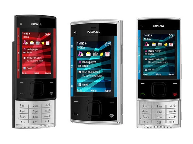
The Nokia X3 user interface is Nokia Series 40 rather than the S60 smartphone platform, so is standard issue, uncomplicated and straightforward to operate.
It's based around the usual type of grid main menu, which drills down into basic sub-menu option lists – all of which should be very familiar to anyone who's packed a Nokia mobile before.

The out-of-the-box default home screen has a row of five scrollable icon shortcuts towards the top of the display and additional lines on the screen for media player and radio status and info, calendar and message updates plus other information.

These home screen shortcuts and info/content options can be user-defined – as can further D-pad shortcuts – with dozens available to select as shortcuts including functions, applications and even any bookmarked web pages – intuitive for a cheaper handset like this.
Alternatively, you can de-clutter the home screen by switching that mode off in the settings menu and sticking with a simpler setup that utilises the D-pad and softkeys only for shortcuts.
It's up to you, although the default home screen does provide more immediate information.

Within the menus, the Nokia Series 40 6th Edition user interface is easy to navigate and operate. The functionality isn't such that the menus are overloaded with confusingly laid out options, so it should be undemanding for any Nokia newcomers too.