Nook vs Kindle: which should you buy?
The interface on the Nook and Kindle are a bit of a toss up - if you've grown accustomed to the way one does things, the other will certainly feel strange.
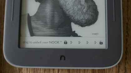
The Lock Screen

One clear benefit of the Nook is that it doesn't display ads. An e-ink display is a bit like an etch-a-sketch, and off is not indicated by a blank screen. Amazon chose to capitalize on this, displaying ads unless you paid an extra $20 to remove them from your screen.
By default, the Nook instead just shows caricatures of your favorite authors. These are surely better than ads for Pampers Diapers or whatever Amazon is showing on any given day (Today it's 53% off Salon Services in San Francisco), but they're still a bit tacky.
Fortunately, they can be changed to photos of Nature in the settings, or even upload your own photo to really personalize your reading experience.

To turn the Kindle on, you need to press the small power button on its bottom edge, whereas on the Nook you press the home button (or hold for 2 seconds to automatically activate the Nook's GlowLight) and then drag to unlock the device.
This drag to unlock presumably saves battery from accidental power-ups while the device is in your bag or purse, but it's a bit inconvenient we realize we're nitpicking here.
Internal Interface
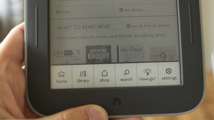
The landing pages of the Nook and Kindle are entirely different. Whereas on the Kindle you'll land on a long list of your purchased literature, on the Nook the home screen is a mishmash of what you're currently reading, what your friends are reading, and what's new.
Sign up for breaking news, reviews, opinion, top tech deals, and more.
This is good in theory, but what you'll quickly discover is that your friends are rather dumb, and the New Reads are always populated with newspapers (New York Post, The New York Times, and The Wall Street Journal, as of writing).
Navigation
Navigation is easier on the Kindle, because it was built with the idea that everything must be accessible from a touch interface. The Nook instead makes you sort through panes by pressing the home button, which displays a column of tabs to click through.
This column is how you choose to get home or to your library or shop, how you search search, how you activate the GlowLight, or how you change settings - suffice it to say you'll be using it often.

All of the Kindle's features can be accessed from conveniently placed icons on the Home page (a shopping cart to access the store, a large tap to search button, and a Menu button for everything else).
Once actually reading a book, the Kindle Touch handles things a bit differently. Tapping in the top 25% of the screen reveals a hidden menu with the same top ribbon and a lower ribbon that allows you to change the font, go to a certain page, or access book particulars with an X-ray button.
This is all done similarly on the Nook, though it only requires you to quick tap the screen anywhere.
Define "Quickly"
One area where the Kindle absolutely blows the sneakers off the Nook is in word definition. On the Kindle Touch, defining a word is as easy as long pressing it. This same long press on the Nook displays a ribbon on the bottom of the screen with Highlight, Add Note, Share, and Look Up.
Unless you have the lexicon of David Foster Wallace, quickly looking up words is one of the absolute best parts of reading on an e-reader. The Nook's slower Look Up feature might not sound like a deal-breaker, but if you look up three or four words a page in a complex book, you're going to actively resent that extra corner tap it requires.
Current page: Nook vs Kindle: Interface
Prev Page Nook vs Kindle: Devices Next Page Nook vs Kindle: The EcosystemNic is a former Online Editor at TechRadar in San Francisco. He started as a games journalist before becoming an editor at Mac|Life magazine. He holds a degree in English Literature and English Writing from Whitworth University.