The future of web fonts
The next web design revolution will be typographic. But all is not plain sailing

Sign up for breaking news, reviews, opinion, top tech deals, and more.
You are now subscribed
Your newsletter sign-up was successful
Join the club
Get full access to premium articles, exclusive features and a growing list of member rewards.
The number of blogs increases daily, and web design currently favours type-led minimalism over elaborate Flash-based interfaces – outside of websites for videogames and movies, anyway.
However, online typography remains a sore point with many designers, who are increasingly irked by restrictions. "We've been limited to choosing fonts users already have installed, or embedding custom type by using images, which isn't practical," complains Yahoo front-end engineer Jonathan Snook.
He adds that sIFR (scalable Inman Flash Replacement) offers greater flexibility, but that it comes at the expense of performance and usability.
The appearance of Cufón (a JavaScript font generator that converts font files to vector objects for use in any browser) as a successor brought its own problems, which Snook notes are mostly "down to it not being native HTML and CSS".
However, Snook and others reckon change is on the way. 2010 could see the web become a place where type shines, but only if important technical hurdles are overcome and web designers are au fait with the fundamentals of typography.
The need for change
With the browser landscape relatively stable at present, some might argue for the status quo rather than more upheaval, but that would limit the web's creative reach. "Since the dawn of web design, we've wanted to use any typeface we like. We can in print, so why not online?" asks designer Elliot Jay Stocks.
Sign up for breaking news, reviews, opinion, top tech deals, and more.
Font restriction has already led to major problems as well. Font Bureau partner Roger Black thinks there's a real danger of websites starting to look alike: "Take screen grabs of story pages on news websites, cover the headers and see if you can tell the source."
He then suggests trying the same with printed newspapers. "These retain their branding," says Black. "I think of this as the personality of typography, and so why should all newspaper stories online look alike?"
Clearleft production director and Fontdeck co-founder Richard Rutter also thinks web typography isn't taken as seriously as it should be: "Designers may take typography seriously, but attention to detail doesn't necessarily get carried through to the final website. I'm not even talking about typefaces, but typesetting and using the right characters for the job – dashes, not hyphens; real quote marks; an ellipsis rather than three full stops."

POSSIBILITIES: Even if you're not ready to embrace real fonts, it's worth exploring font stacks that include popular fonts aside from the usual suspects
He thinks that by taking more care over typography – ensuring suitable line lengths for reading; preventing widows and orphans in headings; being judicious in the number of typefaces and font sizes used – you enhance the reading experience for users and thereby improve your websites overall.
Rutter's concerns therefore echo our initial points – many web designers lack the knowledge to create strong type, and technical limitations abound that prevent them from properly getting to grips with typography.
The latter is as much to blame as the former, according to Rutter: "Good typography online has been hampered by a lack of support for font weights, and the situation for choosing different widths, such as condensed or extended fonts, is even worse."
Despite these insights, Rutter admits Clearleft mostly uses fonts that are likely to be installed on users' machines at the moment. "With serious attention to typesetting detail, this is always a viable solution, not least because the likes of Verdana, Georgia and Arial were designed for screen use."
He adds that the company also makes use of Microsoft's ClearType fonts and relevant fall-backs in CSS font stacks (backing up Calibri with Trebuchet MS and Gill Sans, for example), and avoids sIFR due to performance issues and development headaches. But Rutter hints at a near future where font linking will become important and hugely increase the scope for web typography, and he's not alone.
The path to @font-face
Every designer we spoke with said they'd experimented with font linking, which enables real fonts to be displayed within a user's browser. Even Simo Kinnunen, the creator of the aforementioned Cufón, recommends @font-face.
"Most font replacement techniques, including my own, were meant as stepping stones to @font-face. 2010 is going to be the year of @font-face," he says.
Snook adds: "No replacement technique matches the capabilities, usability and flexibility of native type within a browser. @font-face was established to enable real fonts to be embedded within a web page without requiring the font to be permanently installed on the visitor's machine."
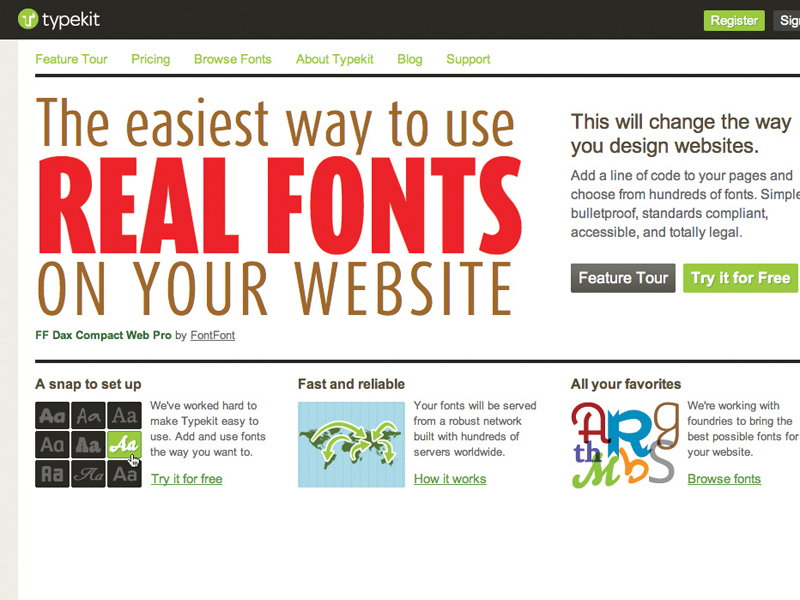
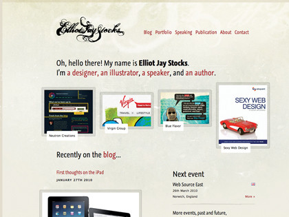
Although few designers currently use font linking for body copy, it's popular for display text. Elliot Jay Stocks uses @font-face for headings, using free fonts that allow linking or those provided by Typekit (a subscription-based service that only requires a line of JavaScript and for you to inform the service of the font you require in order to get a typeface-enriched web page).

@FONT FACE: Stocks uses Graublau Sans Web for his website's headings, but he's "planning a redesign that makes better use of @font-face"
Phase2 Technology senior designer Samantha Warren also advocates Typekit, which she uses on her blog, badassideas.com: "It makes it easy to implement a real font on a site and it's a cinch to change your font choice."
However, Warren also sees value in font services for commercial projects: "They will be great for clients who have a long relationship with a specific typeface in print and want to continue that relationship online. As more fonts become available through web-font services, I expect newspapers and magazines to really take advantage of them."
Warren adds that services also deal with a major challenge when considering real fonts for a website. "The web world and type industry are getting creative and examining how they can do business together, so both parties feel they're getting what they want.
"The web industry wants to be able to embed a wider variety of fonts in web pages, and the type industry wants fair compensation for typeface designs without widespread illegal distribution. Dialogues are developing between people in both industries and a level of mutual respect is spreading."
However, Snook warns that while @fontface is available in the current versions of all major browsers, web designers are suddenly discovering where its implementations fall down: "This is pushing browser developers to establish consistency and fix bugs, and I suspect within a few years the hurdles we face will be solved. As of now, though, @font-face is replete with pitfalls. It's not a smooth and simple process to create a consistent cross-browser or cross-platform experience with custom fonts."
Should you nonetheless decide to use real fonts, Snook explains you have two options: embed type locally or use a third-party service.
"Your decision mostly lies with the font you wish to use and the licensing that goes along with it," he says, mirroring Warren in noting that foundries have been reluctant to allow fonts to be embedded online, due to the potential for copying.
"Third-party services like Typekit provide obfuscation that's helped set the foundries at ease. For commercial fonts, you'll therefore likely have to go through a third-party service, but for free or shareware fonts, you'll need to serve fonts from your own server."

 Become a TechRadar Insider


