Apple’s new Liquid Glass UI design unveiled at WWDC 2025 is nothing new – I can see right through it
This all seems very familiar...

The old saying, “if you wait long enough, everything comes back into style eventually,” is usually attributed to the fashion industry, but it seems to apply to pretty much anything, especially mobile phone interface design.
So, while my younger colleagues are getting all hot and bothered about Apple’s new Liquid Glass design for its operating systems, like iOS, macOS, iPadOS, and tvOS, forgive me if I can’t help but be a little less enthusiastic, because I’ve seen all this before.
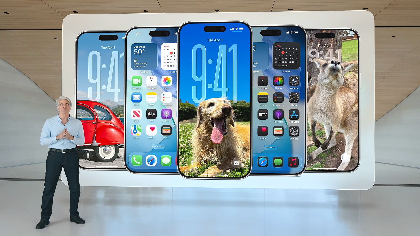
The crux of the new Liquid Glass design is that the “material” (an odd choice of words from Apple to describe something that’s purely digital) used for the background to menus, and out of which icons are “crafted”, behaves like glass would in the real world, if it also flowed like a liquid.
Article continues belowThat obviously means you can see through it, which is what people are getting very excited about.
Those of us who have been using tech for a while now will realize that we’ve been here before. Back in 2007, Microsoft introduced the Aero design in Windows Vista, which contained menu borders that had a level of transparency to them and icons with rounded edges.
This transparent look and feel persisted into Windows 7, which had a transparent taskbar, but it was eventually dropped in favour of the more 2D and square-looking Windows 8 interface.
Microsoft has recently brought back transparency in Windows 11.
Sign up for breaking news, reviews, opinion, top tech deals, and more.

The fundamentals of design
It all comes back to the fundamentals of design and what companies are trying to achieve with a mobile phone interface.
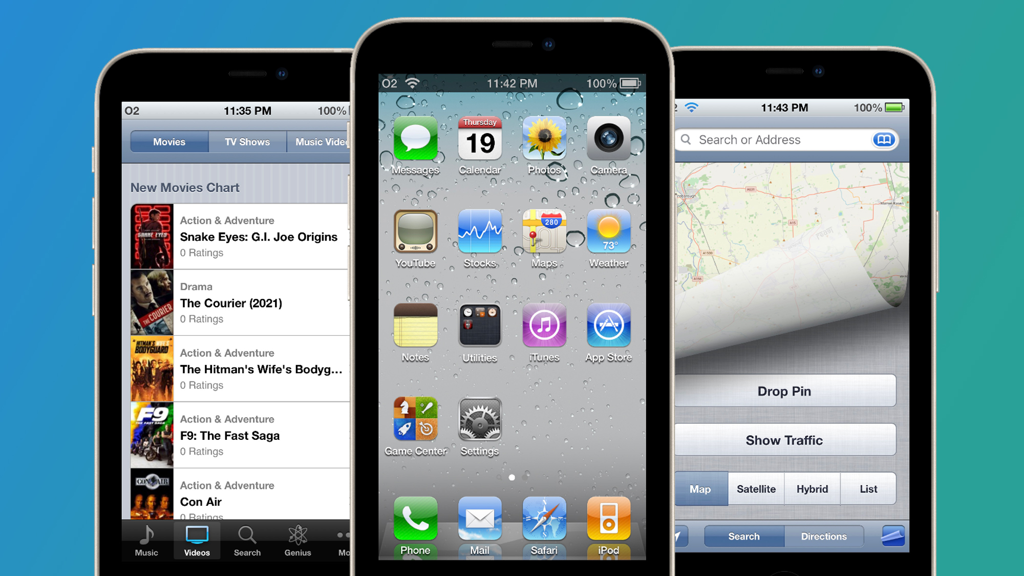
When iOS first came out in 2007, skeuomorphism was the order of the day, which means the icons and interface elements tried to resemble real-world objects as much as possible.
This had the advantage of making them look accessible, but it also felt unnecessarily fussy, especially since we were dealing with digital images, which didn’t need to conform to the same laws as physical objects.
And so a conflict was born. A kind of design war broke out between those who thought that interface design should reflect the real world as closely as possible and those who preferred to think of design as functional first: interface design should be legible, easily accessible, and practical before all else.
Eventually, the latter group won out, but it took a long time and required the death of one of skeuomorphism's strongest advocates.

Farewell Steve Jobs
Apple’s then CEO, Steve Jobs, was a huge fan of the skeuomorphic approach to design. That’s why the icon for the Notes app in iOS looked like actual note paper, for instance. It's also why the Calculator looked like a real calculator, and the Calendar app looked like a real calendar.
On the iPhone, there were rounded, glossy edges to all the icons, with shadowing and a slight 3D effect thrown in.
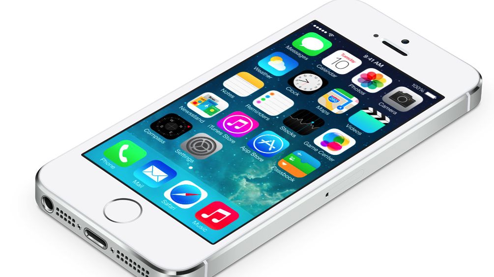
Sadly, Steve Jobs passed away in 2011, and Apple’s other leading design light, Jony Ive, was given free rein to come up with something different for iOS 7 in 2013. What Ive produced perhaps was a little too far in the other direction. It was best described as very, very flat in comparison to what had come before.
In iOS 7, the 3D skeuomorphic elements were banished in favour of, well, not quite 2D, but a very flat-looking design with very bright, colorful icons that stood out a mile from the phone.
Ive, who was responsible for Apple’s increasingly minimalist approach to product design, had a very strong design aesthetic, and it showed.

All clear on the Apple front
You can view Apple's new digital Glass as the final rejection of Ive’s iOS 7 vision for the iPhone.
Being able to see through everything is very futuristic, and I’m sure it works great in sci-fi movies, TV shows, and in AR headsets like Apple Vision Pro, but on a small device in my hand, it doesn’t increase legibility at all. In fact, it makes text harder to read.
As somebody who already has to put on reading glasses to do most things on my iPhone, this isn’t going to help. And what about all the people who have other kinds of visual impairment?
At WWDC 2025, Apple was very keen to show off how the buttons that cover video playback in the new Liquid Glass design are now transparent, so they don’t distract from the video you’re watching. Well, that’s great, but what if you want to actually read the text that’s written on or next to the buttons?
Even worse, the new “all clear” style (shown below), which drains all color from your icons so they all look like they’re made from glass, is very stylish, but is it functional?
Will it make it easier to find the app you’re looking for or just harder? I’ll have to reserve my final judgement until I’ve tried the finished version of iOS 26, but I think I already know my answer - no, it won’t.

Give it another 15 years
Jony Ive, the designer’s designer, knew what he was doing with iOS 7 when he introduced such a bold, confident new look. Perhaps it was a bit too much of a shock to the system for some people, but the fact that Google instantly copied it in Android is a tribute to how it changed mobile phone interface design for the better.
Since then, Apple has been picking away at Ive’s original vision, which has been easier to do since he left the company, and watering it down with each new iOS release, but now it has really thrown it in the trash with the new Liquid Glass.
So, in 2026, we’re back to transparency, darker tints, rounded corners, and 3D effects.
Remember, these things run in cycles. Give it another 15 years and I think we’ll be back to bold, bright colors and flatter icons. Mark my words.
You may also like
- Apple Intelligence was firmly in the background at WWDC 2025 as iPad finally had its chance to shine
- ‘We are past the event horizon’: Sam Altman thinks superintelligence is within our grasp and makes 3 bold predictions for the future of AI and robotics
- The 7 big Apple Intelligence announcements from WWDC 2025

Graham is the Senior Editor for AI at TechRadar. With over 25 years of experience in both online and print journalism, Graham has worked for various market-leading tech brands including Computeractive, PC Pro, iMore, MacFormat, Mac|Life, Maximum PC, and more. He specializes in reporting on everything to do with AI and has appeared on BBC TV shows like BBC One Breakfast and on Radio 4 commenting on the latest trends in tech. Graham has an honors degree in Computer Science and spends his spare time podcasting and blogging.
You must confirm your public display name before commenting
Please logout and then login again, you will then be prompted to enter your display name.

 Become a TechRadar Insider


