
 Become a TechRadar Insider


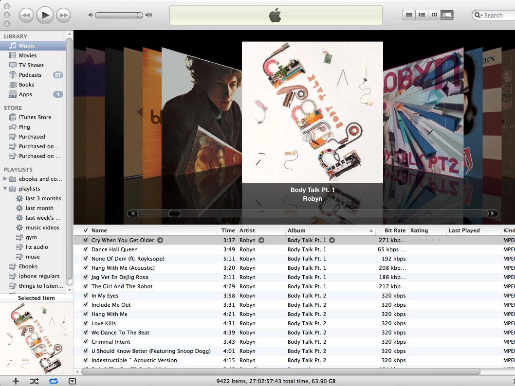
Yup. Apple's decided it's been at least a few months since it screwed with the iTunes UI, and so it's made some changes with iTunes 10.
Some of them actually work. There's a decent 'hybrid' list view, and the main interface pane offers more clarity. However, two changes are mind-boggling:
1. iTunes previously coloured its sidebar items. This enabled you to - without thinking - associate certain items with certain colours; even if you didn't do this, each item was differentiated. Now, you have to think before you click, and the usability of this area of the app has been substantially reduced.
2. The close/minimise/zoom buttons are now aligned vertically in the full window mode. In the mini-player window, this was always the case, but in the full window mode, it's a baffling decision.
Even though Mac OS X's hardly a bastion of total consistency these days, these three important buttons usually stay put, and people's muscle memory enables quick access to them.
Now, iTunes 10 chucks Apple's Human Interface Guidelines (the ones Apple seemingly expects every developer but itself to follow) out the window, in order to save a little horizontal space. However, this again reduces usability - not only are these buttons now in the wrong place, they're also much smaller and harder to hit.
In the past, iTunes has foreshadowed subsequent updates to the look and feel of Mac OS X.
I seriously hope that isn't the case this time, because the iTunes 10 UI is a botch job - a collision of fairly good ideas (which are incremental updates) and the very worst in interface design.
To that end, I wonder where all Apple's best UI designers have gone. They're certainly not on the iTunes team.
UPDATE: In the comments on the original post, mr_phillip writes: "For what it's worth, defaults write com.apple.iTunes full-window -1 restores the default close/minimise buttons". So at least Terminal-savvy Mac users have an option to deal with the second of Apple's UI disasters.
This article was first posted at Revert To Saved.