


There was a reason people started leaving MySpace in droves and it was clutter. Well, that and the fact that there was a new social networking site on the scene that offered a clean, spam-free interface and a more adult networking experience. That site was Facebook.
Then came the apps: vampires (quite literally) sucking the blood from Facebook, cluttering up your profile with Super Walls, More Cowbell, Super 'blinkin' Poke.
It all got too much, and that's why the makers of Facebook have rolled out a re-design, which will happen this week, that's familiar to avid Facebook users, but also goes some way to tidying up the clutter.
Stretch and grow
The first thing you notice is that the homepage has been stretched. Gone are the search bars and application shortcuts from the left-hand side of the screen. Now the main window has been stretched to incorporate two-thirds of the display.
There's a bar at the top that now houses an Applications link. Not much has changed here, but instead of having to click on Profile to see your own page, there's a nice bit of personalisation where you click on your own name.
The news feed is what takes centre stage on the homepage. It's never been easier to check out what your friends have been up to while you've been offline.
On the right-hand side, there's still the ubiquitous links to Requests, Status Updates, who has poked you and the like, but the newfound white space visually makes things a lot cleaner.
Profile page
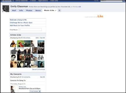
Your profile page is again stretched, but the clutter of wall posts has disappeared. This is thanks to the inclusion of simple tabs.
A Wall Filter allows you to flit between your posts on other people's walls, pictures etc and what people have posted on your wall. This makes for a much nicer and easier-to-use layout.
Things that took a few clicks to do before are now just a click away: want to change your picture? Then highlight your image and click on the Change Picture icon. Simple. The same goes for configuring your personal info and your friends.
There's now four tabs at the top of the screen (more if you so wish) indicating your Wall, Info, Profile and Boxes (apps, pokes etc). Click on these and you go to the corresponding area. What this does mean is that technically you never have to see another app again, as they are hidden in a tab. This is very good news.
The biggest change is the Status Bar. In the top third of the screen it screams at you asking the familiar question: What are you doing right now? It seems that this is a very important piece of the Facebook jigsaw, and will be more prominent when viewed on, say, an iPhone. This will have the likes of Twitter quaking in their boots.
Clicking on wall posts, you also get the added bonus of cleaning things up even more. If you don't want the posts to show a picture, then take it off. If a whole post is too much to look at, then change it to one line. This is easily configurable, just highlight and click what option you want.
Overall
The Facebook re-design is certainly not a dramatic one. The layout will look familiar to most users. But it is more that just a stretched version of the old layout.
New features are intuitive, the customisation factor has been improved and those crazy apps have been locked up forever – unless you want to look in the Boxes tab.
It seems that the makers of Facebook have taken the 'keep it simple, stupid' approach to the new-look and given the site the KISS of life.
Check the new layout at www.new.facebook.com.
