
 Become a TechRadar Insider


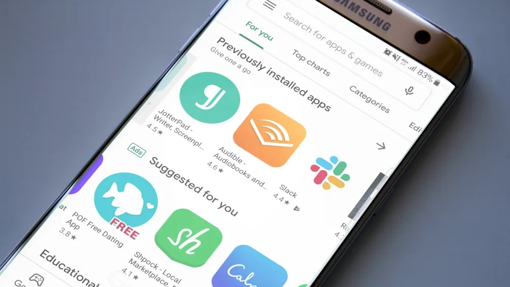
Google has revamped the Play Store ahead of the release of Android Q, and unlike many of its recent redesigns, this time there's no dark mode in sight. In fact, the Google Play Store is now brighter and whiter than ever.
The new design is rolling out now (load up the store to see if it's arrived on your handset) and does away with the old store's colored headers, square corners, and apps grouped together in boxes with drop-shadows.
- Check our our guide to the best apps for Android
- On a budget? We've also rounded up the best free Android apps
- In the mood for fun? Here are the best free games for Android
As Ars Technica notes, the new look is in line with Google's Material Design principles, which are intended to give all its apps and services a unified, streamlined design and use white as the baseline background color.
Material world
Although the new-look Play Store arriving on handsets right now is definitely on the bright side, we anticipate an equally streamlined dark version appearing when Android Q makes its debut in a few weeks' time.
Most of Google's other apps have already received the Material Design treatment, but there are still a few holdouts that might get a new look very soon.
We wouldn't be surprised if Google Play Music is given a fresh lick of paint in the next few days, losing its drop shadows and orange headers. It'll be interesting to see how Google handles its relatively busy design, which makes heavy use of album art and doesn't lend itself too well to Material Design's minimalism.
