Forget the games, Project Scorpio needs to fix the Xbox One's clunky interface
Cluttered interfaces aren't fun

When it comes to consoles, a common maxim is to claim that it’s ‘all about the games’, and while it’s true that exclusive titles are probably a console’s single biggest draw, the overarching user interface is almost as important.
After all, if a machine makes it difficult to access your games, then you’re less likely to use it to play multi-platform games.
This is the position I find myself with my Xbox One S. Hardware-wise it’s fantastic; it’s a small, neat box, it’s powerful enough to give an incremental boost to existing Xbox One games, and its inclusion of an Ultra HD Blu-ray player means that it’s earned an almost permanent place underneath my television.
Yet still when I have the option of playing a multi-platform game, nine times out of ten I’ll opt to play it on my PS4, for the simple reason that its interface is better.
This could end up being a massive problem for the company's upcoming Project Scorpio, even if it is the most powerful console around in terms of its specs.
Get me to my games
The first problem I inevitably end up having with my Xbox One is the updates. It feels like every single time I turn it on it needs another update, and while these are always quick to download, they take an absolute age to actually install.
In contrast, the PS4 installs its updates much more quickly, even if it needs to be updated just as frequently. While researching for this piece I spent upwards of five minutes waiting for my Xbox One to update, but less than a minute for the PS4.
Get daily insight, inspiration and deals in your inbox
Get the hottest deals available in your inbox plus news, reviews, opinion, analysis and more from the TechRadar team.
But away from the updates, the biggest problem with the Xbox One’s ecosystem, as it currently stands, is its interface.
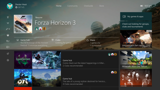
The Xbox One’s main menu feels like it’s been designed by a committee at Microsoft, all of whom have tried to make sure their specific initiative has a place on the home screen.
You’ve got the last game you played at the top (which generally speaking I’d argue is a good thing), but then below this is a combination of links to recent games, and then, confusingly, much bigger icons which act as links to each game’s respective hubs. On the right you’ve then got a number of adverts, ranging from sponsored DLC for games you might now own (in our console’s case, Forza Horizon 3), to Xbox Live Gold, and demos for upcoming games.
Aside from the interface being cluttered, the links to your own content are remarkably small. A link to a complete list of your installed games and apps is a small box at the top right of the home screen, and getting to the store requires you to scroll past both the Community and OneGuide tabs, which take up an entire screen each.
Customisation options are available, but as of the most recent update they're restricted to moving a number of pinned apps around at the bottom of the main home screen.

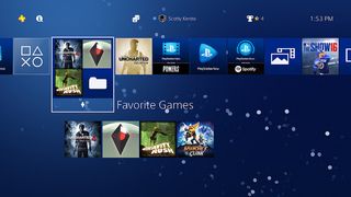
In contrast, the PS4’s home screen presents a clean row of icons which you can quickly select between to get into your games. Secondary options are more or less hidden until you press up or down to access them, and while Sony includes links to secondary services such as PlayStation Now and the media player in the row of applications, they’re small icons rather than entire screens.
Also, as previously mentioned, the console is able to apply updates far faster than the Xbox One, meaning you can actually start using your machine far quicker than the competition.
At the end of the day, Project Scorpio might be the most powerful piece of hardware on the block, but if it’s a chore to boot up and use for, you know, actually playing games, then I’m going to stick with the less powerful, but easier to use, PS4 Pro.
- How is Project Scorpio stacking up against the PS4 Pro? Check out our PS4 Pro vs Project Scorpio guide.
Jon Porter is the ex-Home Technology Writer for TechRadar. He has also previously written for Practical Photoshop, Trusted Reviews, Inside Higher Ed, Al Bawaba, Gizmodo UK, Genetic Literacy Project, Via Satellite, Real Homes and Plant Services Magazine, and you can now find him writing for The Verge.
Most Popular


