


At Google I/O, Android 12 was finally unveiled, with three main focuses - a new user interface, privacy, and, a car key.
All great features in their own way, however the UI was an important part here, from being the butt of the jokes of the operating system, now to an attractive showcase that also allows a multitude of customizations.
Material You is the new name for this reboot of the UI, superseding Material that’s been present ever since Android Lollipop / version 5.0 almost seven years ago.
However, last year Apple released iOS 14, which brought widgets to the forefront of the home screen. But thanks to a certain app and Shortcuts, these allowed themes to be applied to the icons and widgets, making the home screen explicitly unique to you.
Android 12 may finally be here with a fresh coat of paint, but I wonder if it’s already too late, especially with other vendors spinning their own theme on the operating system for years now.
- Here’s our Google I/O 2021 roundup
- Google Maps is trying to save lives with five new features
- Google is trying to redefine video calling with 3D imagery
Living in a Material You World
When Android first arrived in 2008, we were greeted with an appearance that looked like an amalgamation of BlackBerry and iPhone - hurriedly made in order to be a competitor to the recently-launched App Store from Apple.
As the years passed by and the operating system became more plentiful in features, the UI was left by the wayside, with Google leaving it to third-party vendors to create their own twist, whether that was Samsung, Sony, OnePlus and many more.
The appearance started to look dated, old-fashioned, almost bloated in comparison to iOS, regardless of Google’s focus on more animations that were smooth and consistent.
With Material You replacing what came before, everything looks like a breath of fresh air, with pastel-colors and rounded widgets, alongside a focus of customization toward the user, so you can make it your own, to almost make it match with the smart speakers and other electronics you use every day.
I think it’s a very attractive design, and it looks tailor-made for the incoming Pixel 6 and Pixel Fold - two smartphones that are heavily rumored to be landing later this year.
But the Elmer Elephant in the room is how the vendors will use the new design language. With Samsung’s One UI, OnePlus’ OxygenOS and many more third-party interfaces having their own unique looks, seeing these mix with Material You may cause more clashes than it’s worth.
iOS 14 Widgets
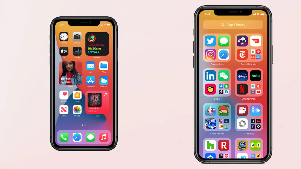
Which is why we now come to iOS and iPadOS. For years, users were clamoring for something new on the home screen for their iPhone or iPad. In past iOS releases, widgets would change in appearance almost every year, from being in the Notification Center, to having its own place where Spotlight used to be, with a swipe to the right.
Finally in 2020, widgets could now be placed anywhere on the home screen of an iPhone - iPad users were still relegated to having their widgets in an exclusive column.
But this showed what could be done for iOS, as a way of displaying short bytes of information without entering an app. You could also resize them, or place them on Smart Stacks and even, customizing your whole home screen thanks to the Shortcuts app and Widgetsmith.
David Smith’s Widgetsmith app went viral soon after the launch of iOS 14, as it was discovered that icons and widgets could be given their own spin, and this app helped send this into the stratosphere. There’s now themes freely available, and some even for a fee.
iOS 15
We aren’t far from Apple announcing the next versions of iOS, iPadOS, macOS and watchOS, with WWDC 2021 starting on June 7.
Rumors of widgets finally being free from the column of the iPad to the home screen are abound, alongside more privacy and notification features, however Apple will not have missed the effect that Widgetsmith made a few months ago.
Customization is something the company must be aware of; you only have to look at the plethora of colors that the new iMac is available in.
With iOS/iPadOS, you have a unified system in appearance, where you know that what you’re using is on an Apple system. With Android 12, its new UI may be more of a detriment, and that’s not even dealing with the issue of having millions of phones able to be updated to the new update.
Once again, it looks like Google’s Pixel phones will be first, followed by Samsung, Oppo and the rest, as soon as they give their own UI twist to the OS. That is going to take a while, so you won’t be seeing Android 12 immediately on release unless you have a Pixel device.
Whereas with Apple’s devices, as far back as the iPhone 6S from 2015, these can be updated with ease, and you will be greeted with the same appearance on whichever Apple device you use.
Android 12 looks great, and its privacy features are very welcome, but it’s going to be a while until we see it appear on the thousands of phones currently available, unless you’re a Google Pixel owner.
- Android 12 is here - everything you need to know
