


Whenever you got into gaming, we're sure you were impressed by it at the time. It can be tough to remember, but over the last 30 years, we've moved from simple shapes floating around black screens pretending to be spaceships, all the way through simple sprites, full-screen cartoons, full-motion video and early experiments in 3D, and into blisteringly detailed virtual worlds that we can explore at will.
Right now, the likes of Crysis and GTA4 are the bleeding edge. Before long, they'll look bleeding awful. Our jaw-dropping first drive through the rebuilt Liberty City will be as quaint as Space Invaders to the gamers of the future as they sit in front of their PCs, munching sci-fi snacks such as Mars bars and Galaxies and Doctor Hula Hoops and wondering how we lived in the days before we could walk our game characters up to our own houses, peek through the virtual curtains and see ourselves sitting at our computers going "Neat".
Part of the problem with these games is that they set out to simulate reality, albeit in a stylised way. This is impressive at the time of release, but as time moves on, so do our techniques and technologies. In the case of 3D games, one particularly noticeable sign of age is that it took years before characters were capable of moving their lips while they talked, instead of just staring and nodding as a line of dialogue played.

STILL GOT IT: The hand-drawn Broken Sword games have grown old gracefully
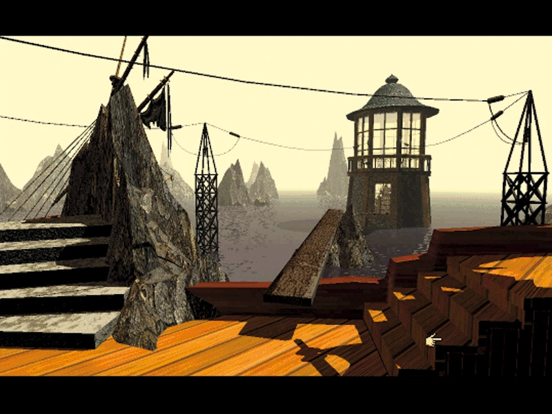
Conversely, games that focus on artistry rather than technology often hold onto their looks surprisingly well decades later. Adventure games from the 1990s are a perfect example. Many look every bit as old and retro as they are, but no low resolutions or old processors can detract from the sheer artistry dripped into games such as Sam and Max Hit The Road, Gabriel Knight, or of course, Broken Sword, which was recently re-released on both Nintendo DS and Wii.
Is it a bird? No, it's a plane
For most of the 1980s, artistic merit of any sort took a distant second place to simply trying to hammer the primitive graphics of the time into something that the player would find vaguely recognisable.
Early PC developers barely bothered at all. It was far easier to draw a map and make a strategy game, throw together something simple such as an Arkanoid clone, or sidestep the thorny issue completely by developing yet another text adventure. The PC was still thought of as primarily a work machine and it would be years before that preconception changed.

NEW ANGLE: Isometric games add a level of depth to early gamers' adventures
What separated this era of gaming from the likes of Crysis (if you ignore roughly 15 quantum leaps in various areas of technology) was that tricks such as these were essential. Elite used wireframe 3D graphics on most platforms because that was as much as they could hope to handle. Most games assumed the player would understand that principle, although some built it into the fiction of the game.
Starglider was one of these, shipping with a novella to explain that the wireframe graphics were actually a tactical aid built into your HUD. Reading it was also your best way of realising that the game wasn't actually set in the depths of space and that the reason you took damage if you flew too far in a downward direction was that the big black bit at the bottom of the pitch black background was in fact 'the ground'.
Games of this era were nothing short of a war between programmers and their machines. The Commodore 64, released in 1982, was a surprisingly powerful system, but games on platforms such as the ZX Spectrum could be instantly identified by their bright, clashing colours – particularly when dealing with conversions from more powerful arcade cabinets.
The art style was mainly a way of compensating for the system and used tricks such as setting translucent characters against coloured backgrounds, or promoting the graphical details by making the active game area a single colour, with objects outlined in black and all other colours saved for the frame.

BACK IN TIME: Space Quest IV used time-travel to let its hero revisit his own prequels
Sprites were simple and often very stylised, Dizzy the adventuring egg being one of the most enduring icons. Most games were happy to throw almost anything into the mix, from remote-controlled heads to a Monty Python stomping foot. The most surprising thing is that some of the creators weren't high.
Pretty and programmed
The PC was largely left out of all this craziness through most of the 80s, thanks to developers focusing on three rather serious genres: adventures, RPGs and simulators.
Technology limitations meant that the early simulations had enough to worry about just drawing the ground and a couple of aeroplanes to shoot at, but the RPGs almost went out of their way to be ugly. Graphics were kept firmly in their place, and that place was frequently a small box framed by the far more important stats and menus. It wasn't until Ultima VII in 1992 that we saw an original PC RPG where the visuals stood up as state of the art against its contemporaries.

PRETTY FACE: Ultima was one of the first RPGs to make an effort to look attractive
Adventure games took a totally different direction, to the point that, until 3D came along, they were the place to see the latest graphical styles. The first major graphic adventure, King's Quest, released in 1984, was designed as a showpiece for the PC. No mean feat, considering how bad our favourite platform's graphics were at the time. The basic colour graphics format was the hideous Color Graphics Adapter. This typically ran at a resolution of 320x200 and resulted in some of the ugliest graphics seen by mortal eyes.

UGLY PALETTE: CGA graphics were barely passable in 1984, and time has not been kind
It had 16 colours to play with, but they were split into two palettes containing six hues (with two blacks each), which developers had to choose from. The first was the 'winter' palette, offering cyan, white, grey/white and magenta. The second offered green, red, brown and yellow.
There were ways of squeezing more power out of CGA, including setting the background colour to blue and thus having the full RGB set to play with, or switching palettes while drawing the screen. Another trick was to abuse the poor quality screens at the time, putting down dithered patterns of dots and letting the display blend them into the required colour. All very clever stuff, but clearly hack territory. Nobody at all shed a tear when CGA was booted aside in favour of EGA and VGA.