
 Become a TechRadar Insider


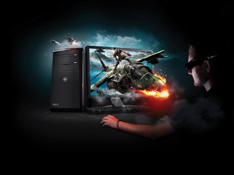
We're living in interesting times. Tech firms want to take over our TVs, our phones are more powerful than some recent PCs, and we can control games consoles through the medium of dance.
New interfaces are all around us, from touch screens to augmented reality, and the way we interact with technology is being transformed. But which interfaces are genuine leaps forward and which are digital dead ends? What makes a good user interface anyway?
Videos of very young children playing with iPads have become an internet cliché, but they demonstrate how intuitive technology is becoming: nobody was filming two-year-olds using IBM's original PC.
The IBM PC's command line interface was streets ahead of 1970s computers' switches, of course, but it wasn't until the arrival of the graphical user interfaces of the 1980s and beyond that personal computing became simple enough for the mainstream. And now the landscape is changing again.
After more than two decades of dominance, WIMP interfaces - windows, icons, menus and pointing devices - face new challengers in the form of multi-touch devices, voice control, gesture input and augmented reality.
This year's Consumer Electronics Show in Las Vegas showed where we're heading. Microsoft demonstrated its Kinect sensor doing a great job of voice recognition - no mean feat in a crowded venue - and gesture control, with users controlling video apps with waves of their hands, while everyone else seemed to be showing off some form of touch-controlled tablet.
Gestures certainly seem more futuristic than Google's vision of a QWERTY keyboard in every remote control, but are these ideas a mere fad? Is multi-touch a credible form of PC input?
"It's credible," says Gord Kurtenbach, Autodesk's Director of Research. "We're just at the start of determining how multi-touch can be used in the context of desktop PC systems. Obviously adding multi-touch to the display monitor makes a cool demo, but when using it over a period of time your arms get tired… Some of the most promising work I've seen uses multi-touch in concert with standard desktop configurations of mouse, keyboard and monitor. After all, the keyboard is a multi-touch device and that has been pretty successful, so I can imagine multi-touch tablets and displays being used horizontally as controller devices."
Everything's an interface
Multi-touch certainly won't be the only way we interact with our gadgets. As James McCarthy, senior windows consumer product manager with Microsoft, points out, the era of natural user interfaces (NUIs) has already begun: Windows' Photo Gallery uses image processing to recognise faces, eight million Xbox 360 owners control their console using Kinect and some two million motorists are talking to Ford Sync-equipped vehicles.

Forget the ropey speech recognition systems of the 1990s: voice control is back, and this time it works. That's partly because modern systems now specialise. Hardware is now much more powerful, and cloud computing allows remote processing and real-time results.
"The way we interact with technology is becoming more natural, allowing our devices to work on our behalf instead of just at our command," McCarthy says. "You can already envision the world we're imagining through Microsoft research projects like a prototype of an automated receptionist; Microsoft LightSpace, a technology prototype showing the potential of using depth-sensing cameras to naturally interact with any surface; and Project Gustav, a realistic painting prototype that lets artists become immersed in the digital painting experience, just as Kinect helps people become the controller in the gaming experience."
The magic touch
Touch control has been around for a long time. What's different about today's touch technology is that touch has become multi-touch: instead of prodding with a stylus we're pinching and pulling with one, two or ten fingers. That means tablets can be typewriters, pianos, canvases, or anything else we fancy playing with.
Done well, multi-touch removes abstraction - instead of moving a device like a mouse to point at something, you just point at it; instead of clicking on piano keys or trying to remember which keyboard key corresponds to each note, you just play the note.

Multi-touch is a good illustration of Fitts's Law, which was proposed by Paul Fitts in 1954. The law states that the time needed to move to a target area is a function of the distance to and the size of the target. In effect, that means big icons are easier to hit than little ones, top-of-screen menus are easier to click on than top-of-window ones and pop-up menus are faster than pull-downs.
There's more to effective UIs than big icons, of course. Good UIs remove complexity and obstacles, so for example, a mouse-and-windows OS is more intuitive than a command line interface and a multi-touch OS can be more intuitive than a mouse-based one.
Designers can do several things to streamline interfaces. They can use metaphors to make things more obvious - for example, we all know what desktops are, what control panels do and what recycle bins are for - and they can use icons and nested menus to reduce visual clutter. They can use context-sensitive menus and hinting, where the interface offers visual clues such as tooltips, and they can add indicators to icons.
However, if you keep adding features to the underlying system, eventually you'll run out of tweaks. As Microsoft program manager Jensen Harris recalls, by Office 2003 the UI was beginning to feel bloated, "like a suitcase stuffed to the gills with vacation clothes".
No wonder - it was essentially the same UI that Office had in 1989. As Harris explains, "There's a point beyond which menus and toolbars cease to scale well. A flat menu with eight well-organised commands on it works just great; a three-level hierarchical menu containing 35 loosely-related commands can be a bit of a disaster."
Microsoft redesigned the Office UI and the result was the Ribbon, which makes Office less intimidating and features easier to find. It annoyed power users though, demonstrating that when it comes to UIs, you can't please everybody.