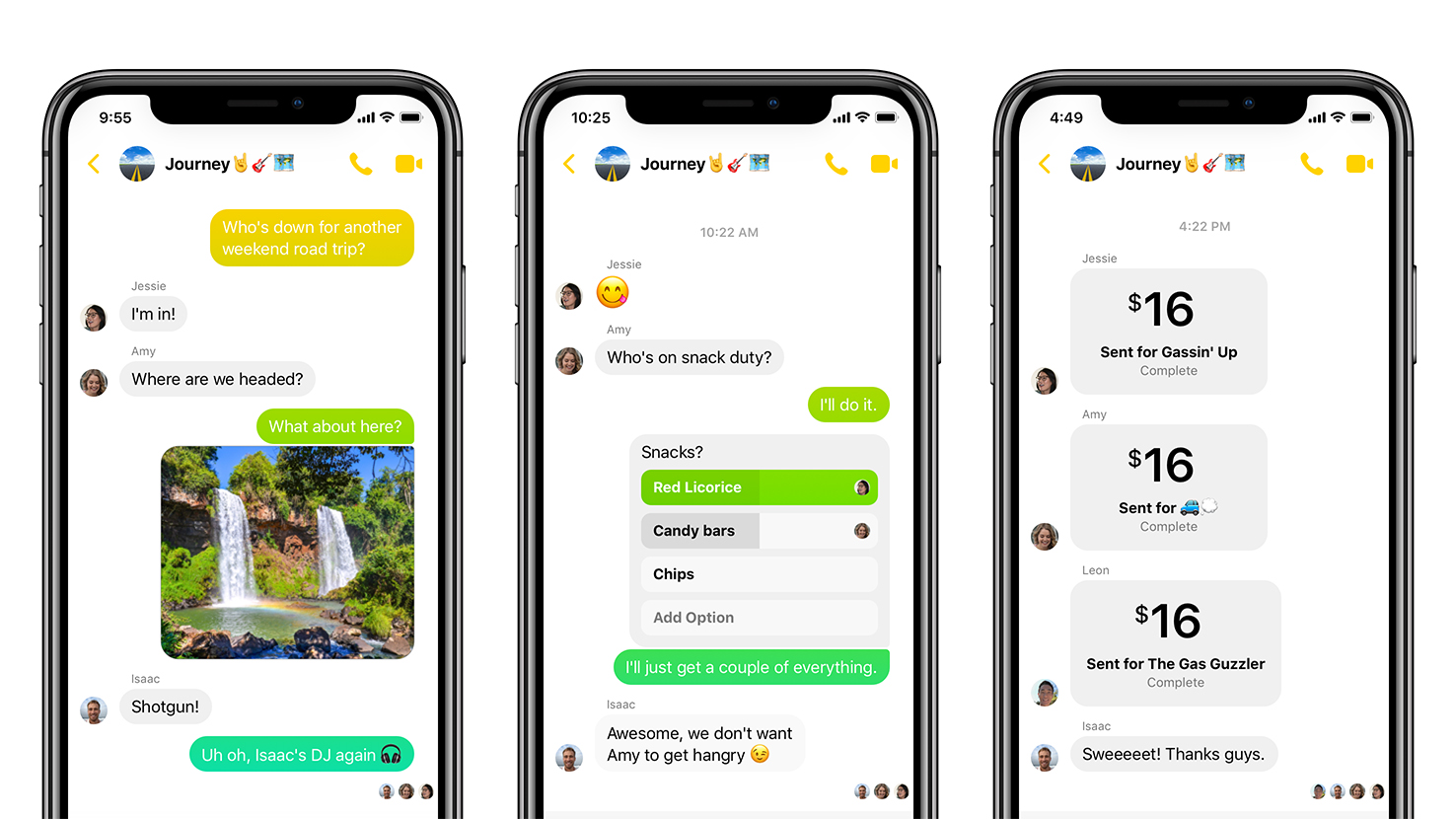
Facebook Messenger app gets minimalistic makeover
Trimming the fat from the chat

Sign up for breaking news, reviews, opinion, top tech deals, and more.
You are now subscribed
Your newsletter sign-up was successful
Following in the footsteps of Spotify, which recently slimmed down its Premium app, Facebook Messenger has begun rolling out a more streamlined version of its mobile app for both iOS and Android.
Announced in a blog post, “Messenger 4” vastly simplifies the user interface of the app, reducing the number of tabs from nine to just three. In doing so, Messenger retains all the previous functionality it once had (whether you like it or not), but organises it in a less overwhelming manner.
The Chats tab now contains both one-to-one and group conversations, as well as a smaller camera icon for you to take photos or video for sharing. The People tab allows you to see who’s currently online and watch your friends’ Stories.
Article continues belowThe third tab, Discover, neatly rounds up all the Messenger functions you’ve been likely avoiding thus far, such as connecting with brands and businesses, playing Instant Games, news, and so on.

Another groovy feature added in the update, also in the aesthetic and cosmetic realm, is the ability to add color gradients to your chat messages and, according to the announcement post, we’ll be seeing the introduction of Dark Mode “in the near future”.
The changes have been brought about in response to a survey conducted by Facebook, which found 71% of respondents state that simplicity was their top priority in a messaging app.
Messenger 4 is rolling out to all users over the next few days, and further updates are expected in the near future. If, however, you’re looking to use the service as it was intended (to chat) and still find the interface overwhelming, we recommend trying out Messenger Lite.
Sign up for breaking news, reviews, opinion, top tech deals, and more.
