Mobile web design tips: mobile should come first
Starting with the desktop is becoming a backwards way to work
On mobile, performance really matters – you can't count on a good connection being present when someone tries to access your site. So it's no surprise that the assets used to develop mobile experiences have to be optimised to perform under less than ideal network connections.
Reducing the number and size of file requests and taking advantage of HTML5 capabilities such as application cache and CSS3 can dramatically improve download speeds. A number of these techniques have been well documented on the Google Code site so you can start using them right now to improve your site's mobile performance.
But speed isn't just important on the go. Testing done by Amazon, Yahoo, Microsoft and others has consistently shown that even small delays on desktop sites can turn users away. In fact long-term studies by Google found that slow performance has lasting effects, reducing people's activity even for weeks after a delay has been repaired.
Designing for mobile first forces teams to put speed front and centre to make up for spotty mobile network performance. The enhancements that make mobile experiences fast go a long way to making desktop experiences fast as well.
Context
While small screens and slow connections may be obvious constraints of the mobile environment, the mobile context is more subtle but no less important. In short, a mobile device is with people all the time and consequently used across many different contexts (locations, times, social settings and so on).
So designing for mobile amounts to designing something that can be used all the time. Research has shown that during a typical day: 84 per cent of people will use their smartphone at home, 80 per cent during miscellaneous times during the day, 74 per cent waiting in lines, and 64 per cent at work. This use comes mostly in short bursts.
Sign up for breaking news, reviews, opinion, top tech deals, and more.
People have a few minutes to kill and want to 'check in' on something they like or want to stave off boredom for a bit. So mobile experiences doing the best job of providing small, quick, time-killing tasks are the ones growing the fastest.
Social check-in apps are perhaps the most popular because their content comes directly from people you know. These continually updating products encourage quick 'check-ins' in between meetings, when in line or when bored.
Because they generally provide small-sized updates such as headlines or short messages, the cost of accessing one of these products to checkin is really low. As a result, people use them a lot: access to Facebook via mobile browser grew 112 per cent in 2009 and access to Twitter via mobile browser grew 347 per cent.
Designing for mobile first forces you to consider how your service can deliver quick yet meaningful information as people go through their day. This kind of engagement aligns well with the mobile context but it also drives reuse on the desktop. Products that are designed to be used many times throughout the day encourage repeat usage, no matter what the platform is.
Web products that are focused, fast and frequently used: that's a pretty good outcome from applying mobile constraints to your design process. But what happens when you take mobile's capabilities into consideration as well?
Mobile capabilities
The web has been built on a foundation of rather simple capabilities (page markup, styling and scripting) determined by what web browsers can support. But mobile browsers and application platforms are introducing exciting capabilities that leave many desktop web browsers behind.
Modern mobile devices are rich with new capabilities that open up different ways of thinking about interactions between people, data and their immediate surroundings. Some of these capabilities include: multitouch input from one or more simultaneous gestures; precise location information from GPS/cell towers/Wi-Fi; user orientation from a digital compass; device positioning from an accelerometer; and integrated audio, video and photo input.
Building for mobile first enables teams to utilise this full palette of capabilities to create rich, context-aware applications instead of limiting themselves to an increasingly dated set of development options.
Perhaps the defining capability of today's devices is multitouch support. In 2009, over one million touchscreen phones were sold per day. As these numbers grow, the number of people interacting with content using their fingers instead of a mouse pointer simply can't be ignored. Web teams need to consider not only how their products will work with touch devices but also how they can use touch to deliver innovative interactions.
Designing for touch often requires larger target sizes and visible content and actions – you can't make use of mouseovers and hover interactions on devices without a pointer device such as a mouse!
Touch also enables new forms of interactions that can make common web activities easier or more enjoyable.

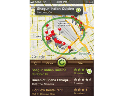
Yahoo's Sketch-a-Search mobile experience is an example of using multitouch capabilities to simplify finding somewhere to eat. Just open the app, draw a circle or line using your finger and local results show up instantly. No typing or complex interactions required – just a few gestures with your finger.
Location awareness
Of course, multitouch isn't the only capability at your disposal when you design for mobile first. To illustrate another compelling capability on mobile, let's look at Yelp, a great source of online reviews about local retailers and services.
Finding a good restaurant near you on Yelp usually requires typing in your location then filtering the set of results you get back in order to get down to the specific area you're looking for. That can take some time.
On mobile, though, it's a different story. You simply open the Yelp application and with a single tap you can see the top restaurants near your immediate location. No typing or manipulating maps and filters – the application just uses your current location to deliver the information you need right to you.
Location awareness can do a lot more than serve up nearby restaurants. Local weather, news, traffic, friends and more can come right to you. It's a powerful capability that's available in most mobile devices and is now slowly making its way to the desktop.
Thinking about mobile first gives you the opportunity to determine how location awareness can enhance your product experience upfront. While knowing a user's current location is powerful, lots of mobile devices can do better through the integration of a digital compass.

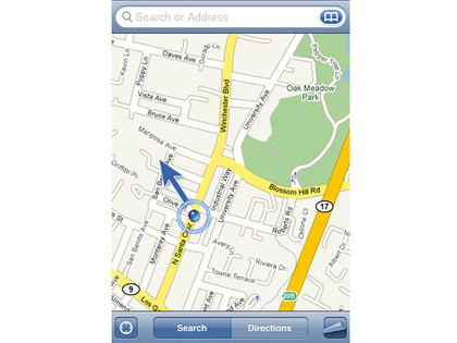
A digital compass enables software on a mobile device to also access a user's current orientation. In other words, applications on these devices now not only know where you are but which way you're facing as well. This may seem like a small detail but it opens up a set of new interface possibilities that are designed from the user's current perspective.
Digital information can be layered on top of people's immediate view of the world and turn the objects and people around them into interactive elements. Products that deliver this kind of experience are in their infancy but the potential for changing how we interact with the world around us is there.
When you design for mobile first, you can take these capabilities (multitouch, location detection, user orientation and many more) into consideration as you envision your web product. Doing so opens up new ways of thinking about the experience you can deliver to your users. If you started in the limited environment of the desktop web, this kind of thinking would be off-limits. The capabilities just aren't there.
Mobile first lets you work with these compelling technologies to create the best experience you can. Once you get there, simply scale back what the desktop browser can't do to create the right desktop experience for your product. You'll no doubt explore more innovative solutions than if you started with the limited capabilities of the desktop and later ported your solution to mobile.
Designing web applications for mobile platforms before the desktop enables you to take advantage of explosive growth, useful constraints and innovative capabilities. Mobile growth provides opportunities to increase engagement and create a better overall experience for your users.
Mobile constraints force you to design web products that are focused, fast and frequently used. Mobile capabilities open up different ways of thinking about interactions between people, data and their immediate surroundings. So what are you waiting for ... go mobile first!
- 1
- 2
Current page: Why performance and context matter
Prev Page Why you should design for mobile first
 Become a TechRadar Insider


