Mobile web design tips: mobile should come first
Starting with the desktop is becoming a backwards way to work
I'll just come out and say it: websites and web applications should be designed for mobile first.
For years, most teams did the opposite. Mobile, if it happened at all, was a port of the desktop version that was conceived of, designed and built before anyone even considered the mobile experience.
And for a long time, this made perfect sense: browsing the web on mobile phones was painful; carriers controlled access to the web on their devices; and mobile network speeds made everything grind to a halt way too often.
Changing times
But things have changed so dramatically over the past few years that starting with the desktop may be an increasingly backwards way of thinking. Designing for mobile first can open up new opportunities for growth and lead to a better overall user experience.
Let's dig into the three key reasons why: mobile is seeing explosive growth; mobile forces you to focus; and mobile extends your capabilities.
First, growth. In case you haven't been keeping up with the latest stats, I'll give you a quick recap: mobile is growing like crazy. While analysts have long heralded mobile as "the next big thing", their prophecies are finally bearing fruit.
Sign up for breaking news, reviews, opinion, top tech deals, and more.
Perhaps the most complete and inspiring set of statistics comes from Morgan Stanley Research's Mobile Internet Report. This treasure trove of data on what's happening in mobile highlights some really shocking figures: mobile internet adoption is outpacing the astounding growth of desktop internet adoption; smartphones are expected to outship the global PC market in 2012; and heavy mobile data users will triple to one billion by 2013. That's a huge audience emerging very fast. So now's the time to seize the mobile opportunity!
But this isn't just an opportunity to create a mobile version of a web product to take advantage of this growth; it's an opportunity to provide a vastly improved experience for your users.
Consider the social networking service Facebook. There are more than 100million active users currently accessing Facebook through their mobile devices. These users are twice as active on Facebook as non-mobile users.
The combination of mobile and desktop experiences results in more engaged users across both sets of devices. That's because Facebook doesn't just think of its mobile experience as a port of the desktop site. It embraces it as a way to make the entire Facebook experience better.
In the words of Joe Hewitt, lead developer of Facebook's iPhone application: "My goal was initially just to make a mobile companion, but I became convinced it was possible to create a version of Facebook that was actually better than the website." That's really the mobile opportunity in a nutshell.
Now ... how do the constraints and capabilities of mobile devices help get you there?
Forced to focus
Designing for the mobile environment comes with a natural set of constraints. While some might argue these constraints limit mobile design, I believe they are inherently good for user experience and, as a result, business overall.
In particular, the small screens, slow connections and context of use of mobile devices are strong catalysts for great web design.
Perhaps the most impactful of these constraints is screen space. When you're working with a 480x320 pixel screen (found on the first three generations of Apple's iPhone, the first generation of Android phones, and the Palm Pre), 80 per cent of the screen space you had at 1024x768 (common for most websites on the desktop) is gone.
That means 80 per cent of the content, navigation, promotions and interactions you could fit on the desktop needs to go. And that's ... great.
Losing that much screen space forces web teams to focus. You have to make sure that what stays on the screen is the most important set of features for your customers and your business. There simply isn't room for any interface debris or content of questionable value. You need to know what matters most.
In order to do that you need to really know your customers and your business. Which is good design 101. Designing for mobile forces you to get there, like it or not. Consider the difference between Expedia's travel itinerary screen on its desktop website and its iPhone experience.

The primary purpose of this page is to let a customer review their travel plans. If you look really closely in the middle of this web page, you may be able to spot this information.
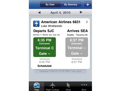
In stark contrast, the Expedia iPhone experience puts the same information front and centre and with better visual hierarchy – enabling the user to quickly check arrival and departure times. Gone are all the interface debris, promotions and cruft present on the desktop site. All that's left is what Expedia's users need to accomplish their task. Why couldn't the desktop site do the same?
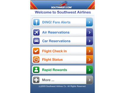
As another example, consider the difference between the Southwest Airlines website on the desktop and its iPhone experience. Since there are lots of pixels available on the desktop web, they've been filled with lots of promotions, features, options and more – because they can be.

The mobile experience, on the other hand, has a laser-like focus on what customers need and what Southwest does: book travel, check in, check flight status, check miles and get alerts. No room for anything else. Only what matters most.
Focusing on what matters most helps address one of the longest standing issues in web design: the 'everything including the kitchen sink' problem. This problem exists because adding things to a website is relatively easy. Lots of things get added – especially when multiple stakeholders are involved.
Different internal departments, feature owners, businesses and individuals have different requirements for websites. So web teams are often left trying to balance many promotions, interactions, content modules, navigation options and more in a single layout. On a 1024x768 screen there are lots of pixels to fill!
If you design for mobile first, you can create agreement first on what matters most. You can then apply the same rationale to the desktop version of your web product. "We agreed that this was the most important set of features and content for our customers and business" – why should that change with more screen space?
There are of course, differences based on the mobile and desktop contexts. But the core value of a web service remains the same across both formats. When a team designs for mobile first, the end result is an experience focused on the key tasks users want to accomplish without the extraneous detours and general interface debris that litter many of today's websites. There simply isn't room in a 320x480 pixel screen for extraneous elements. You have to prioritise.
- 1
- 2
Current page: Why you should design for mobile first
Next Page Why performance and context matter
 Become a TechRadar Insider


