Facebook rolls out streamlined Timeline with cleaner layout
Apps play more prominent role in refreshed design

Sign up for breaking news, reviews, opinion, top tech deals, and more.
You are now subscribed
Your newsletter sign-up was successful
Join the club
Get full access to premium articles, exclusive features and a growing list of member rewards.
If you're a Facebook user who still hasn't adjusted to Timeline view, the social network is introducing several design changes today in response to feedback from its members.
Facebook announced Wednesday that it has started rolling out improvements to Timeline, the profile redesign it first introduced in late 2011.
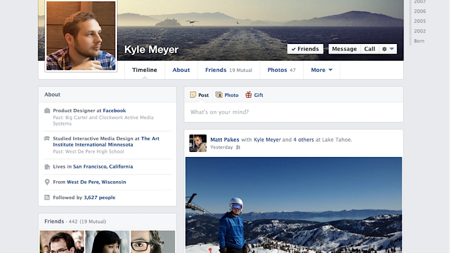
First and foremost, the new Timeline layout is cleaner, a change the social network claims was implemented with the help of feedback from Facebook users.
Article continues belowInstead of posts being spread across two columns, the improved Timeline now keeps everything on the right side of the screen, with photos, music and other activity separated at left.
All about apps
The cleaner Timeline also aims to make it easier for users to organize the interests represented on their About page with redesigned sections for apps.
For example, movie lovers can use Flixster or Netflix to share what they've been watching, while books can be added to their own section with a click of the Add button.
For developers, Timeline now includes a new Open Graph tool to simplify the setup process, while making it easier to preview News Feed stories and configure sections.
Sign up for breaking news, reviews, opinion, top tech deals, and more.
If you don't see the updated Timeline on your own profile yet, don't panic: Facebook claims the change is rolling out gradually to all users in the coming weeks.
 Become a TechRadar Insider


