


A recent update to Fitbit’s official smartphone app has sparked a wave of criticism from users from various corners of the internet. Social media platforms, such as Reddit and Twitter, have been awash with owners complaining about the UI redesign and demanding to be able to revert to older versions.
Fitbit, which has historically released a number of new models each year, has drastically slowed its hardware output of late, with Google (Fitbit’s parent company) opting to instead make subtle changes to the software and, quite unsurprisingly, add greater amounts of Google integration.
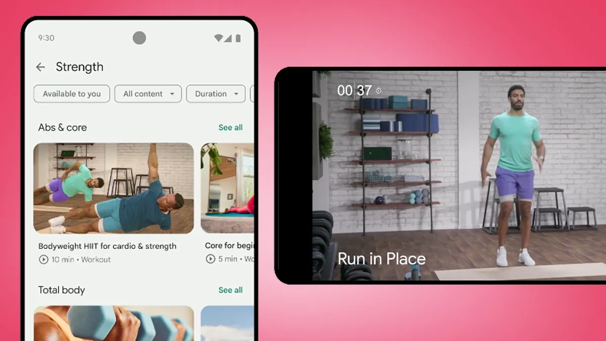
The app redesign was supposed to make things simpler, cleaner and add more personalization to the process, as well as offer new ways to motivate users. But those who have downloaded the update have expressed their distaste at everything from the color schemes used (described as "bile brown, vomit green and light blue" by one Reddit user) to the inconsistency in design throughout.
A cluttered dashboard seems to be one of the most repeated complaints, which is odd considering Google tried to make things cleaner with the update. The original plan was to create a new layout that split all data across three tabs: Today, Coach and You.

The aim of Today was to provide an overview of current health metrics, while Coach would offer a list of suggested workouts based on those health metrics and You would take care of achievements and goal setting. But this new dashboard layout has been accused of being overwhelming and requiring more scrolling and clicks to get to information than ever before.
What’s more, Fitbit has also been accused of removing certain features that worked perfectly well in previous generations of the app. These include food and calorie-tracking functionality, which used to be simpler, while the motivational fireworks that used to appear when reaching a fitness goal have disappeared.
There is also a theme of discontent among disgruntled users surrounding the lack of customization options for the dashboard, namely the lack of a Dark Mode and the removal of key things, such as a battery indicator that now lacks a percentage figure and simply relies on an icon and a wild guess.
What can Fitbit do?
Fitbit and Google are yet to address the online criticism, with some angry users calling for another update to sort out the issues. Other corners of the web are discussing ways to revert back to an older version of the app, although this is complicated and likely won’t be supported by Fitbit.
Worst of all, there is a general consensus that Fitbit has the potential to lose customers to rivals like Garmin and Apple, with an agreement that their user interfaces are now simpler and easier to manipulate.
As smartwatches and fitness trackers gain more sensors and offer increasing amounts of fitness data, this is going to continue be a real issue for any UX designer, but it feels like Google and Fitbit have misjudged this one.
You might also like
