


Spotify has kept a pretty consistent design since its launch in 2008, but today the music service has revealed a darker new look across its desktop, web and mobile apps - and we rather like it.
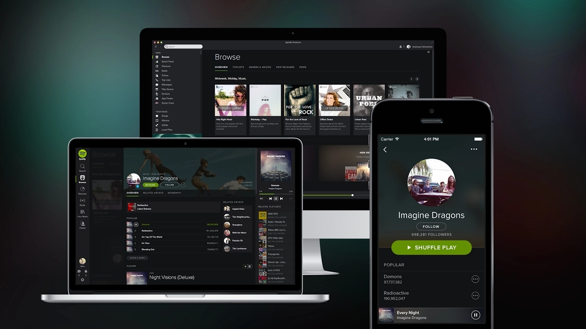
Spotify says its new design took inspiration in the cinema of all places; the dark theme is designed to let album artwork "pop" a lot better than before, while background blurring and a new typeface make everything more enticing.
But it's not all about the cosmetics. A new feature called Your Music lets you save songs and albums to your own personal collection instead of just adding them to playlists, mirroring the feeling of a CD or MP3 collection.
Spotify's also improved the Browse feature, promising that it'll now deliver "more relevant and localised content".
Paint it black
The new look is consistent across devices, with artist photos appearing in circles and album artwork in squares.
The new design will be available for iPhone, desktop and browser users today, with Android following soon.
With Rdio, Pandora, iTunes Radio providing stiff competition, and whispers of other on-demand services coming from Apple and YouTube, Spotify needs to do everything it can to stay top of its game.
YouTube's music streaming service is rumoured to be rolling out later this year and would be Google's second attack on the music market - Google Play being the first.
- So it looks great, but is Spotify worth the subscription?
