Why you can trust TechRadar
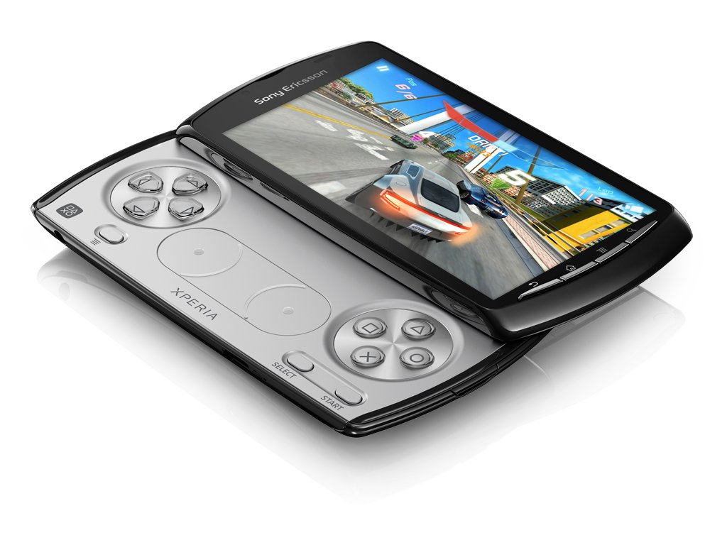
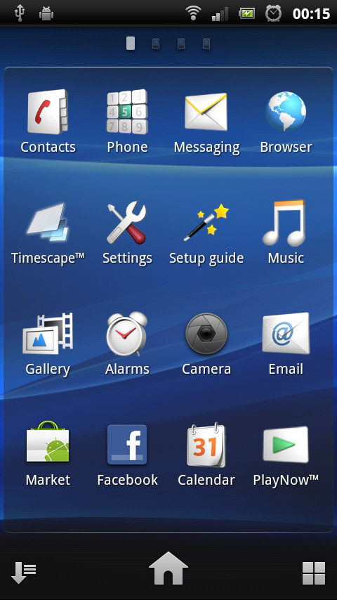
The interface on the Xperia Play looks pretty similar to its cousin, the Xperia Arc. By default, there are five Home screens to populate as you wish, with a persistent dock-like bar along the bottom with space enough for four customisable icons and a static menu launcher.
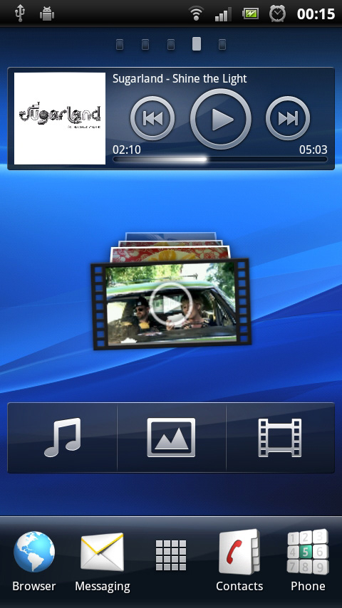
The Contacts and Phone apps take up the right two slots, with the left two given over to the Media folder and Messaging. We fast swapped out the Media file for the Browser, given that one of the five Home screens is already filled with widgets for the Gallery and Music apps, but you can hone this bar as you wish.
Tapping the centre icon on the dock brings up a list of apps to add to your Home screens, and all you need do is press and hold one to drag it into a free slot. Handily, the background lines behind it will turn green when you've found a valid place, so organising is fast and intuitive.
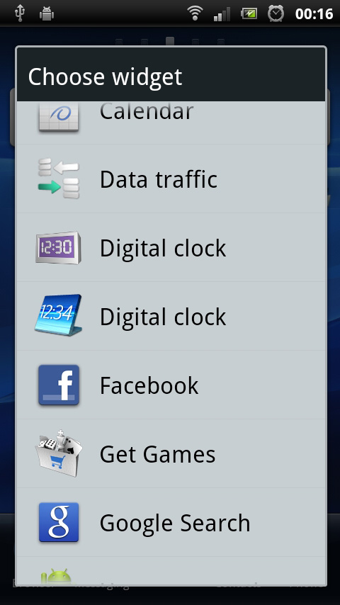
One minor quibble we do have is that you'll have to bypass this system and go via the external menu key to place widgets, folders and shortcuts, which seems a little inconsistent and caused us some early confusion.
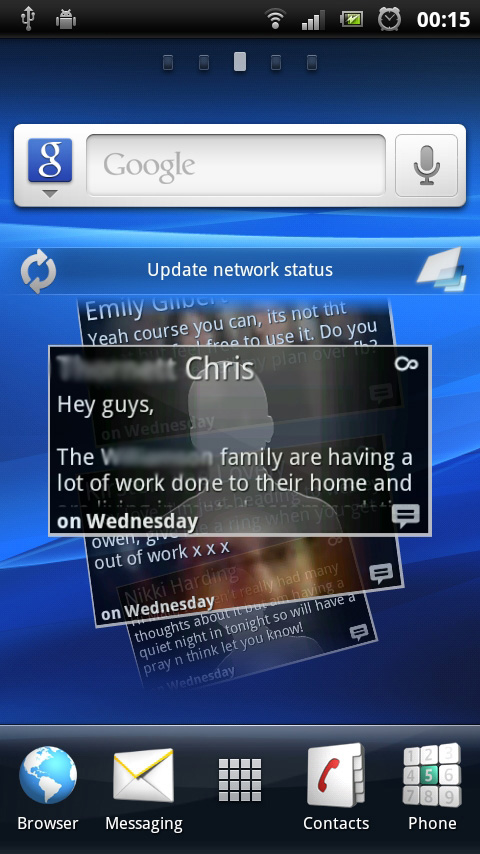
By default, the centre screen is almost entirely given over to the Timescape widget, which acts like a stream of postcards, each presenting Facebook and Twitter updates as well as text messages. Much like the Friend Stream system we've seen on recent HTC models, each of these acts as a slick starting point for finding the content you want.
Other screens tend to be more open, but notably there's one screen dedicated to gaming, with a half-screen widget for the PlayStation Pocket app and a link to the Android Market to buy more games.
All you need do to navigate between screens is swipe left and right, but there's also an exploded view of all your widgets that you can access by pinching. Tap on a widget and you'll be taken to its resident Home screen.
Sign up for breaking news, reviews, opinion, top tech deals, and more.
We're not huge fans of this system, since it neglects to show you apps as well, making it selectively useful, but if you're a widget-fiend then it's perfect.
Scrolling left and right between Home screens is generally quick and fluid, though. However, we've found it can be jerky just after waking the device from its slumber in the mornings. On the flip side, we were impressed by the speed of the scrolling Rolodex-style widgets (as well as the PS Pocket, there's one for the Gallery, too), making them eminently usable.
Taken as a whole, the system doesn't quite gel together as we'd like, but its not hard to learn to work around its quirks.
Current page: Sony Ericsson Xperia Play review: Interface
Prev Page Sony Ericsson Xperia Play review: Overview Next Page Sony Ericsson Xperia Play review: Contacts