AOL offers up sneak peak of re-brand
AoL. is all about fish, rock and, er, lots of squiggles
Sign up for breaking news, reviews, opinion, top tech deals, and more.
You are now subscribed
Your newsletter sign-up was successful
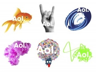
AOL has revealed a glimpse behind its re-brand curtain, releasing a variety of logos which come brandishing its new AoL. moniker.
Using a full-stop seems to be the in vogue thing to do for brands this year, with AOL following Sony's make.believe strategy and adding a dot to the end of its logo.
Oh, and just to annoy the stuffing out of grammar pedants, it's made the 'O' of its name lower case.
Article continues belowAOL will be hoping that its upcoming new look will re-energise the company, which announced recently it is to shed over 4,000 jobs.
Uniquely dynamic
While the new logo isn't going to set the world on fire, AOL is backing up its new look with a number of interesting backgrounds.
The ones we have had a glimpse of include: a fish, the universal hand-sign for rock, and lots of little squiggles.
Sign up for breaking news, reviews, opinion, top tech deals, and more.
This is only a taster of what we are to expect from AOL, as its brand-new branding won't be fully unveiled until 10 December.
Tim Armstrong, Chairman and Chief Executive Officer of AOL, is unsurprisingly upbeat about the company's new look, explaining: "Our new identity is uniquely dynamic. Our business is focused on creating world-class experiences for consumers and AOL is centred on creative and talented people – employees, partners, and advertisers."
And presumably those who like to go angling and listen to Black Sabbath on the weekends.
Via PaidContent

Marc Chacksfield is the Editor In Chief, Shortlist.com at DC Thomson. He started out life as a movie writer for numerous (now defunct) magazines and soon found himself online - editing a gaggle of gadget sites, including TechRadar, Digital Camera World and Tom's Guide UK. At Shortlist you'll find him mostly writing about movies and tech, so no change there then.