


Facebook design manager, Caitlin Winner, just quietly made Facebook icons more relevant to 50% of the world's population by updating key Facebook icons.
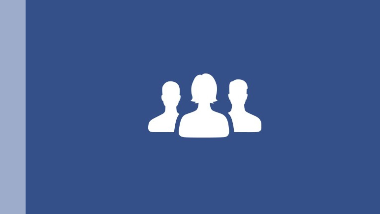
Not only does the female silhouette look less like Darth Vader, she's now been brought forward to take centre stage on group notifications. The female icon was also slightly pushed into the background in the friends notifications icon, but now both the man and woman are of equal size.

Having had to reject the idea of a shoulder-to-shoulder icon, Winner, in her own words "abandoned this approach after failing to make an icon that didn't look like a two headed mythical beast", and a new icon was born.
The final iteration was uploaded to the Facebook servers, and very quietly rolled out without much fanfare.
Rippling out
In a design blog, Winner states that the desire to change the world and make a positive impact to it was the inspiration behind the change. This being the internet, we're sure that some pernickety people will react as if she redesigned them all in pink.
Facebook recently highlighted its diversity efforts in a news blog. However, its ongoing refusal to let people use adopted names continues to draw criticism.
Let's hope that small changes like this ripple out from within. Facebook has much further to go on the diversity front than just changing one or two icons.