Sign up for breaking news, reviews, opinion, top tech deals, and more.
You are now subscribed
Your newsletter sign-up was successful
The human race has been using icons as a form of communication ever since we painted cave walls over 100,000 years ago. We've continued to use them to this day, especially where space is limited, or a meaning needs to be communicated very quickly.
They're not only a way of making a quick, concise statement, but they also overcome language barriers. Anyone who's ever tried to find a toilet in an unfamiliar country will appreciate that.
Unlike a logo, which is intended to be a unique identifier for a particular company or product, the most effective icons are those that are instantly familiar, employing a repeated design pattern. This makes them an excellent tool for websites and apps, aiding understanding, interaction and navigation. There are four main types of icon to consider:
Article continues belowObjects. These are the most common type of icon, such as a clock to represent time. Old-fashioned objects are often the most familiar – traditional Polaroids are no longer commercially available, but they're still a recognisable visual symbol for 'images'.
Symbols representing actions. The best example of this is using a left arrow to mean 'back'.
A combination of the two. Sometimes both an object and an action are needed to demonstrate what the icon represents. For example, to show that a file has been saved, you might use an object (a document icon) with an overlaid action (a tick).
Abstract. Describing neither an object nor an action directly, this type of icon is much less common. It's an arbitrary symbol that has achieved a learned understanding, such as the pause button.
Sign up for breaking news, reviews, opinion, top tech deals, and more.
It's important to remember that icons perform a number of different functions on a website. The following are some of the more common ones.
1. Summarising features: Making it easier for the visitor to quickly scan the page and work out what's going on. This is especially useful for navigation.
For instance, on Ikea's UK site, scanning the list of product categories is made easier by the use of simple, grey icons for 'kitchen', 'bathroom' and so on.
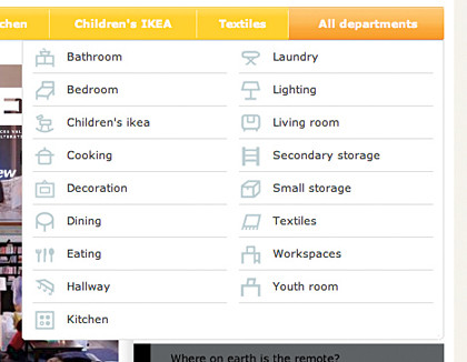
The single-colour, minimal style means the user isn't assaulted with too much detail: just enough to help separate the categories.
2. Explaining actions: Using icons to explain actions and behaviours saves space and speeds things up for the user.
For example, Agile Web Solutions' 1Password site uses two different icons to show that there is not only further information available, but also what type of content it is.
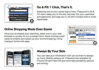
The play and zoom icons are used for video and larger image respectively.
3. Draw attention: Icons can draw attention to a particular area of a page. On a site for an app, for example, there are three main areas you'll want to direct visitors to: 'Download', 'Purchase' and 'Help'.
Using familiar icons will help them find them, as on pixelmator.com, which uses a downward arrow for 'Download', a shopping trolley icon for 'Buy' and a lifebuoy for 'Help'.
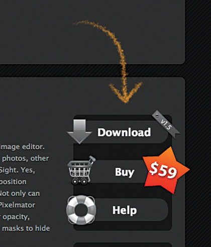
There may be other key focal points, such as a 'donate' button or 'where to find us'.
4. Overcome language barriers: When your site offers a range of different language options, icons are the easiest way to direct users to their language. IP sniffing has the potential to create false positives, but a flag icon, even a small one, is quick and easy to pick up.
5. Make comparisons: When comparing a range of services, particularly within a chart or table, icons can cut down the amount of repetitive text required, as well as making comparison easier.
For instance, US company Jepco Storage uses icons to compare the facilities available at each of its locations, such as a 'P' for parking and a snowflake for climate control.
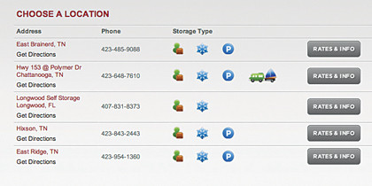
This reduces the amount of text required, as well as making comparisons between locations easier. It also makes use of the title attribute: a simple, cross-browser way of displaying a caption on hover.
6. Describe mood or tone of voice: Love them or hate them, emoticons aren't going away. When you're using only a written medium, where tone of voice is absent, they ensure your meaning is clear.