Why you can trust TechRadar
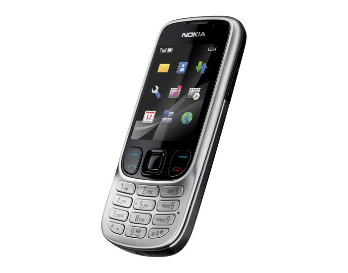
There's no touchscreen or smartphone shenanigans going on here – the Nokia 6303 Classic uses Nokia's tried and trusted Series 40 user interface, the layout and structure of which will be familiar to recent Nokia users and which is generally straightforward to operate.
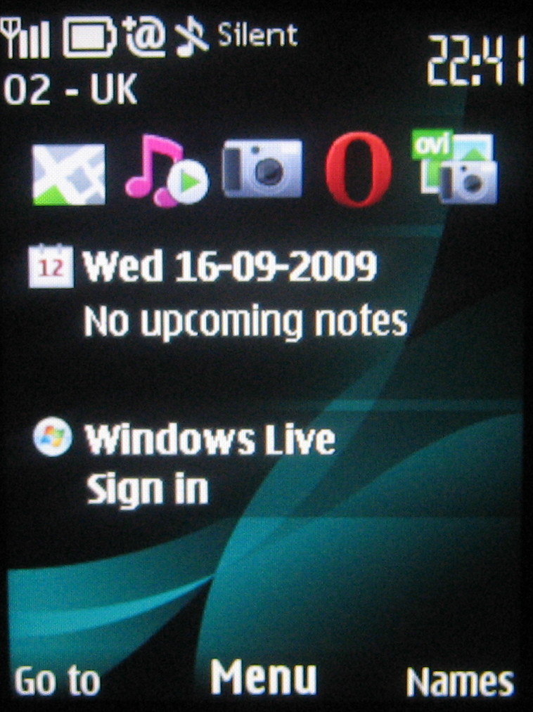
On the standby screen you have the option of getting the out-of-the-box default minimalist look – two softkey options (Go To and Names) plus D-pad shortcuts, or switching to the Home Screen (aka Active Standby on recent Nokia Series 40 phones).
Home Screen mode provides a bunch of five shortcut icons running on the top of the display, plus feature and status information (calendar, music player, connections and so on) running down the screen.
You can scroll between them and select for quick routing around the phone's features.
Whichever setup you choose, you get plenty of shortcut options to choose from, and you can personalise these to how you want to use the handset.
In default standby mode, for instance, the D-pad offers conventional shortcuts to four functions (new message, phonebook, calendar and camera activation) plus the central button selects the main menu – but the directional buttons can be assigned to any one of over 70 functions or bookmarks for websites.

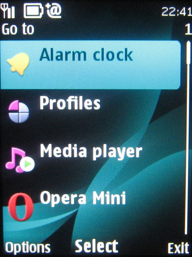
The Go To option also pulls up a list of useful function shortcuts, such as alarms, profile, media player, Bluetooth, Maps and so on.
Sign up for breaking news, reviews, opinion, top tech deals, and more.
In Home Screen mode, settings are again customisable – you can assign whichever apps or functions you want to the shortcuts bar, with the navigation pad switching to directional duties.
It makes for a versatile and easy-to-use feature phone standby set up.
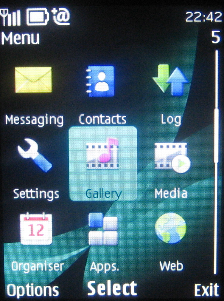
Diving into the menu system by pressing the menu button, you get a grid of icons - although you can easily switch to a list view, if you prefer the old-school look, or alternatively choose a tabbed list of options with sub-menus displayed as lists.

Working through the menus should be simple stuff for most phone users, as Nokia doesn't try anything particularly fancy where it's not necessary. It's conventionally arranged, with sub-menu options ordered in scrollable lists.
The phonebook is simple to use and search through, simply by pressing the appropriate letters you're after.
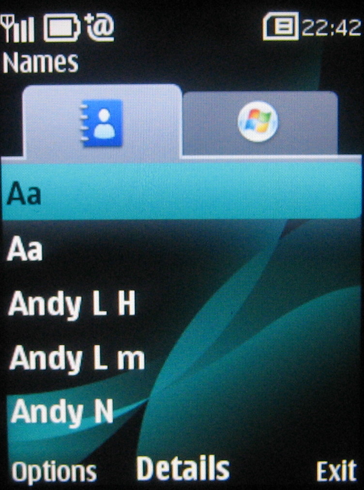
Nokia has provided an extensive set of options in the phonebook, with room to store every manner of contact detail – from phone number, postal address and email details through to birthday, nickname and web addresses. Images and even video clips can be assigned too for caller ID.
Also, in the Contacts menu, if you open up Windows Live Messenger, tabs appear so you can keep an eye on your friends' online status. It's nicely implemented – simple to use, but providing more than just the basics.
Current page: Nokia 6303 Classic: Interface
Prev Page Nokia 6303 Classic: Design Next Page Nokia 6303 Classic: Calls and messaging