TechRadar Verdict
If your needs are more serious than Office can satisfy, you'll find the steep asking price worth paying
Pros
- +
Powerful and versatile
Cons
- -
Quite pricey
Some Office integration issues
Why you can trust TechRadar
There's no point denying it, at first glance, creating an organisational chart doesn't seem to be the greatest of graphical challenges.
Draw one box at the top for the managing director, a row one level down for the other directors, and then just paste everyone else into their relative departments. It's all so straightforward... isn't it?
Of course, when you're tasked with creating a chart and it has hundreds of boxes rather than five or six, and you need to share it with others, and maintain it over time with the minimum of hassle, then you realise this isn't such an easy task after all.
Satisfying all these extra real-life requirements has so far earned OrgPlus over half a million customers, but does that mean version 7 is worthy of your cash? We decided to take a closer look.
Even those who've never used OrgPlus before will immediately feel at home, as the interface bears an uncanny resemblance to Office XP.
There's an Office-like task pane on the right-hand side, where clicking 'Create a new chart' leads you to an appealing selection of templates. Each has the same pattern of 11 boxes, but with different box styles, colours and backgrounds. Several appealed to us, but if you're not keen on what's provided you can always choose the Blank option and start from scratch.
Drawing tools are fairly standard and very easy to use. Want five boxes below the current top level, for instance? There's no laborious click, draw, add lines and repeat here: just click the 'Add Subordinate' button five times, then click the top-level box and OrgPlus will add them for you.
Sign up for breaking news, reviews, opinion, top tech deals, and more.
Click in a box and start typing to enter a name, then press [Tab] to enter a title, [Tab] again to move to the next box, and you can have a basic chart completed in about a minute. But why stop at basic when there's so much more you can do?
Chart customisations
After playing around with the chart for a while you may decide you're not keen on the template you chose initially. But that's fine - OrgPlus makes it easy to apply another whenever you like.
It's also just as straightforward to change the box colour and style for selected parts of your chart on any of the templates provided (or to customise individual boxes for yourself).
Better still, it's possible to create rules that let OrgPlus assign these styles for you. You could tell the program to give one box style to everyone with 'accounts' in their job title, for instance, and another for everyone in sales. Add a few more rules along the same lines and charts mostly format themselves as you type the information into them.
Don't think you're restricted to working with the default Name and Title fields in a box either. OrgPlus will happily create charts from all kinds of data sources (LDAP, SQL Server, ODBC, OLE DB, spreadsheets and text files) and can include pictures, numeric fields... almost anything you like.
Obviously, cramming too much text into one box will make for an unwieldy chart, but the program has effective solutions here too.
OrgPlus allows you to define any area within a box as a hotspot: when the user moves their mouse over the hotspot, a box pops up displaying extra information. This profile can now be edited in the box too, ensuring it's easy to maintain your chart once it's been built.
New features
Once you've produced your chart, OrgPlus lets you print it or publish the document to a Powerpoint, Word, PDF or HTML file.
But this doesn't mean just the usual graphic squashed into the relevant format. The PDF publishing wizard offers control over layout elements such as box sizes, font embedding, image ompression, cover page and index.
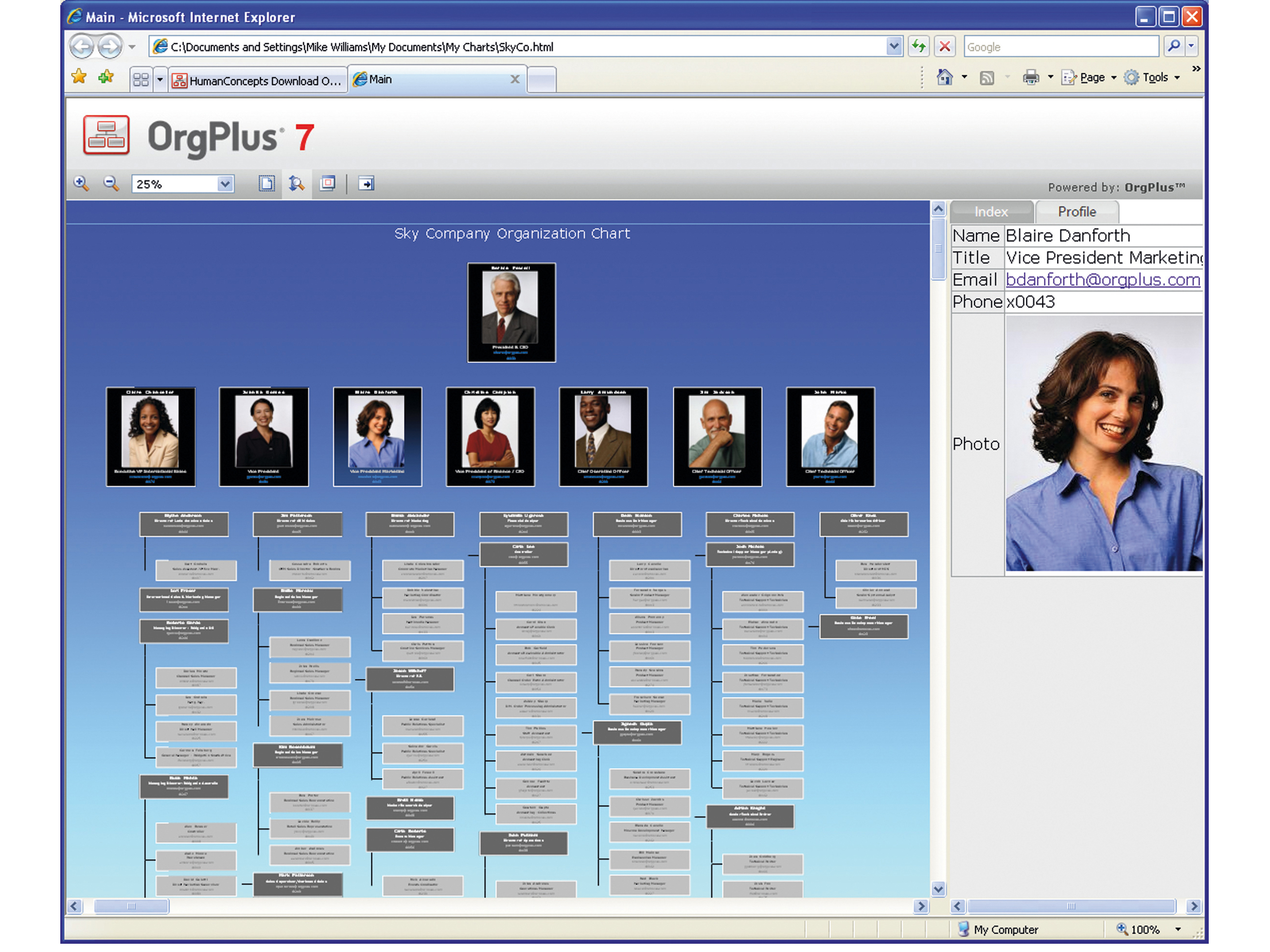
The new HTML charts are excellent: as well as seeing the chart itself, you get various zoom options, panels showing more information on whoever you've selected and an index letting you jump straight to a particular staff member. If you need to share organisational charts online then the HTML publishing capabilities alone could justify purchasing OrgPlus 7.
Of course, there are other new features as well: the ability to add comments to charts, a tree panel that offers a more database-like way to manage records, and a scheduler that can automatically email the latest version of your charts to your choice of recipients. It's now fully compatible with Vista and Office 2007 too.
OrgPlus 7 is a fraction more expensive than we'd like though, and integration with Office 2000 has a few minor issues, but this represents another step forward for an already polished product. If you've got serious organisational needs then it's hard to imagine why you'd choose anything else.
