Sign up for breaking news, reviews, opinion, top tech deals, and more.
You are now subscribed
Your newsletter sign-up was successful
Getting users to view your website is one thing – keeping them there is another. Whether you're running a small blog or a corporate behemoth, your challenge is the same: getting those visitors to interact with your site and explore your content.
This involves a little science, a lot of art and no small amount of luck – but with some help from the experts, we'll show you the best way to get started.
Choosing a layout
Article continues belowYahoo is one of the top destinations on the web. It has seen continual, subtle development of its homepage, with an ever-increasing amount of information having to be dealt with.
What was once a simple web directory became a search engine, email service and finally giant portal. Now it covers nearly every web service you can imagine; yet it remains surprisingly sleek.
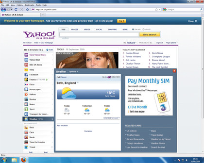
The most recent step towards maintaining this look was a full makeover, with the site now offering a three-column design. A list of 'favourites' that act as categories are on the left, while a central column features the main content display and a right-hand column offers more peripheral information, including a list of the most popular searches and advertising.

The central concept is that the user is in control, and can add and remove the items that are of most interest.
Sign up for breaking news, reviews, opinion, top tech deals, and more.
This strategy of user control, also used by the BBC, is increasingly popular with information-heavy sites, as it allows visitors to prune the available data to match their interests.
"When we were designing the new Yahoo homepage, design and usability were absolutely central to everything we did," explains a Yahoo designer.
"The interesting challenge for us was that our new strategy for the homepage – an open and social space where customers put the best of their web – meant that we were in effect putting them in charge of design and usability. They can add in their favourite applications such as Facebook and Twitter, and choose the news they want to see, for example. We did an enormous amount of testing in the 10 months running up to the beta launch. Everything we added to the page we tested both quantitatively and qualitatively, and either improved, enhanced or dropped."
The first significant design decision is the layout. The most frequently accessed information – navigation – is in an inverted 'L' shape, at the top of the page and running down the left column.
The central column, to which the eyes are naturally drawn, contains the main information – the images and text that users are actually looking for.
Finally, the less important information is in a similarly reversed 'L' shape in the right column and at the bottom of the page.
When you're come up with a layout for your site, the next decision is whether to choose a fixed-width design or a 'liquid' format that changes size according to the size of the browser window.
Fixed-width sites render identically on all systems, but this has a very unpopular side-effect: it forces users with computers that have small screens – like netbooks – to scroll horizontally.
Liquid layouts, on the other hand, expand and contract to fill the available space. The key drawback is that they can create uncomfortably wide columns on larger screens, and images – which are inherently fixed width – can end up floating in an empty expanse.
Getting users to act
When designing a homepage, it's vital to think about why users go there. A homepage is in effect a landing page – visitors arrive at it in order to perform an action, whether that's reading the news, searching for information, watching videos or buying products.
The page must make it obvious how the user can do what he or she wants. Gene Murphy, head of publisher Magazines Online, says that the idea is simple: "The general thing is a call for action. You have to whet people's appetites, and so you need to know your audience: is it imagery [that they respond to best] and, if so, what?"
Patrick Lauke, formerly a web designer and editor at the University of Salford, is now a web evangelist for browser developer Opera Software. Unsurprisingly, he has clear views on web design.
"The main thing, really, is that the homepage should tell the visitor what the site is about," he explains. This need not necessarily be done with an official statement. "I hate welcomes from the vice-chancellor or managing director," said Lauke. "That sort of thing gets in the way of actually doing things."
Instead, Lauke suggests a design strategy based on understanding what users do on a site: "Give clear indications of what you can do, and the calls to action – whether it's buying an item or reading an article – should stand out."
'Calls to action' are ways of enticing users to click through to another part of the site through images, buttons or text links. Simple examples would be 'Add to Basket', 'Apply Now' and so on. Calls to action are often at their most blunt and persuasive on commercial sites – but non-commercial sites also exist to be used, so developing strategies to get users' attention, such as using enticing headline links, is an important part of designing a website.
'Click here' is simply not descriptive enough. Using a picture, explaining the benefits and making sure that the link appears where people are actually looking are all positive steps to encouraging users to click through.
Getting the typography right
Once basic layout and structure has been decided upon, the next area to consider is the styling and presentation of the information on the homepage.
Style isn't a simple issue that can be tacked on once you've developed your content – how a web page looks can make or break a site. The objective is to produce a page that's not only attractive, but is also easy to use.
The ideal balance is typically in the middle of a scale between fine art and functionality. A truly functional page might simply be made up of text-based hyperlinks, while an artistic one could be so divorced from familiar design traditions that the user is left bemused at the sight of it.
Despite the phenomenal growth of multimedia on the web, the internet remains a primarily textual medium. This makes choosing the right typeface all the more important. Whatever you decide on, remember that less is more when it comes to type: the best sites use just three typefaces from no more than three fonts – perhaps an attractive, special typeface rendered as an image for the logo, with a simple web-safe typeface such as Tahoma for main text and Tahoma Bold for sub-headings.
This consistency greatly aids readability, as well as lending a sense of professionalism to the site. Type size is also an issue – and it's not as simple as bigger being better. Larger fonts encourage scanning the text, while smaller fonts encourage detailed reading.
As counterintuitive as it seems, making text large does not necessarily make a page easier to read, so it's really essential to understand what visitors will expect and how they'll interact with a page.
Colour is an even more nebulous area than typography. In most cases, less is more – pages should use fairly neutral colours, with subheadings and links clearly contrasting with them. Naturally, though, there are many cases in which a design might deviate from this, and it's not always easy to hit the right balance.
"With colour, the main issue is the replication across different machines," says Jackman. "You can't guarantee what will appear on someone's screen."
As with type, colour will often be decided by a factor outside the remit of web design: corporate identity. "In an ideal world the corporate identity should consider the issues of usability and accessibility – red and green are bad for colour-blind users, for example," said Patrick Lauke.
"At the University of Salford I influenced a change in the institution's corporate identity because it didn't work in a web context."