Why you can trust TechRadar
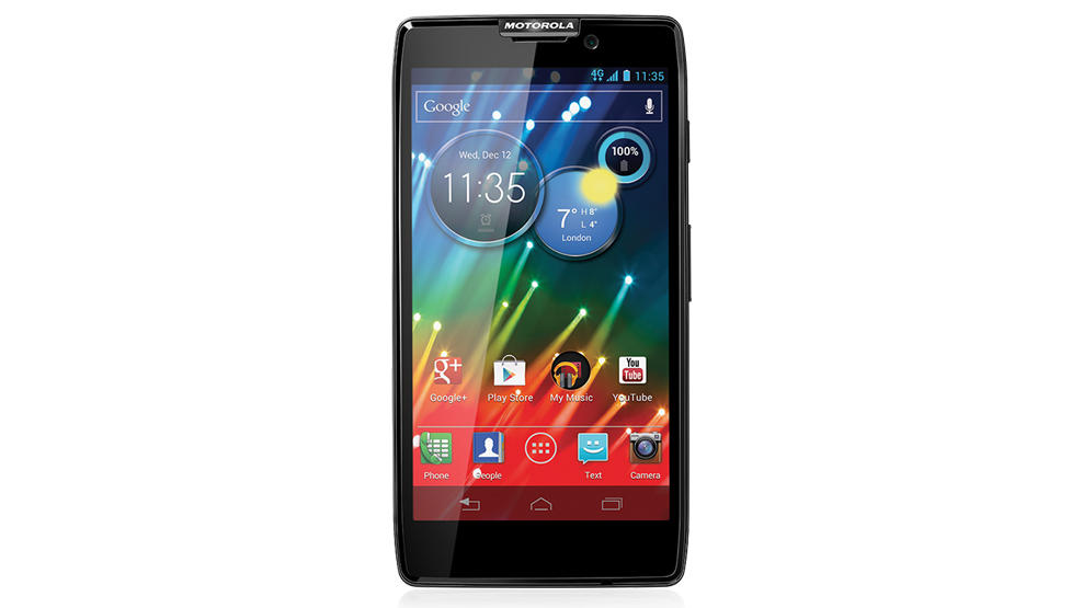
The Motorola Razr HD runs Android 4.1.2 Jelly Bean, and although it's been slightly skinned and tweaked it's not a million miles away from the stock experience.
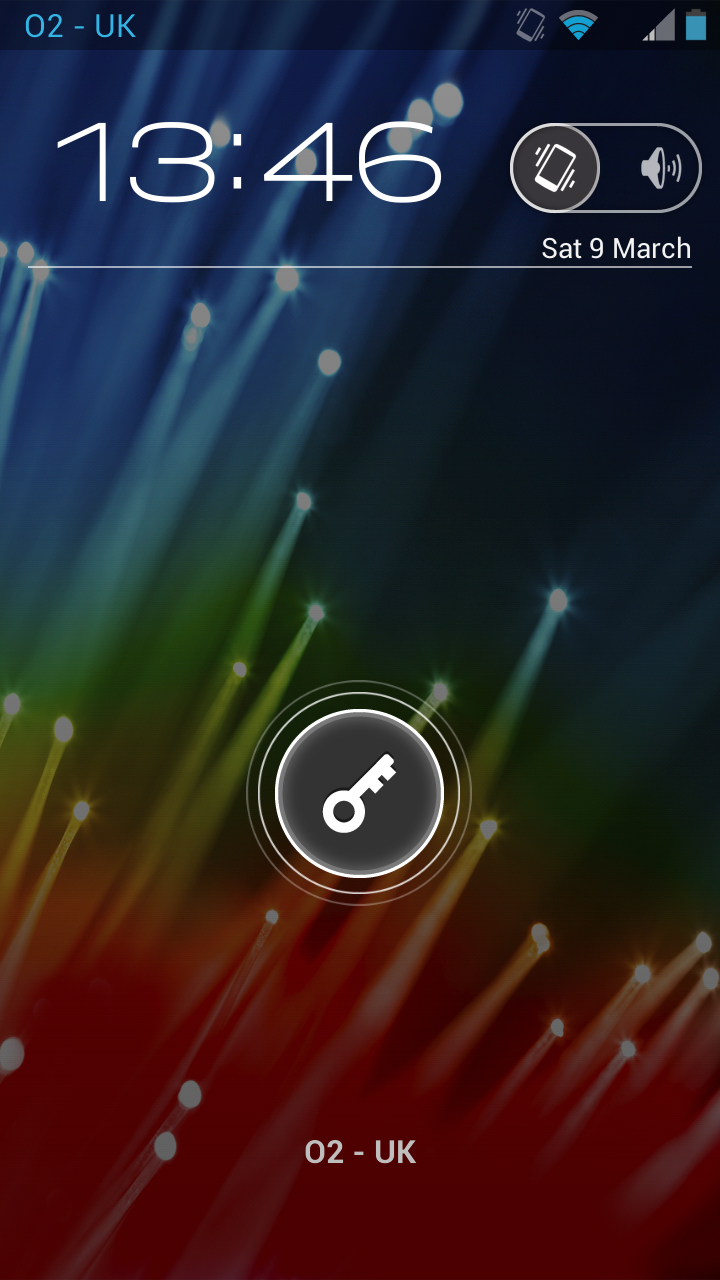
Starting with the lock screen, things will look pretty familiar to anyone who's used a phone running Android 4.0 Ice Cream Sandwich or above before.
At the very top of the screen there's a little bar with your battery level, signal strength and any active connections listed.
Just below it there's a white digital clock, while to the right of that there's a slider that enables you to turn the sound on or off.
This comes in handy, because although there's a volume rocker you have to actually unlock the phone to make use of it, so if all you want to do is put your phone on silent this enables you to achieve that straight from the lock screen.
If you don't have a PIN or any other sort of security set up on your phone, then the focus of the screen will be a key in a white circle right in the centre.
Swiping this to the right will unlock the handset, while swiping upwards will take you to your phonebook, down will take you to your text messages and left will launch the camera. They're handy shortcuts; it's just a shame that you can't customise them.
Sign up for breaking news, reviews, opinion, top tech deals, and more.
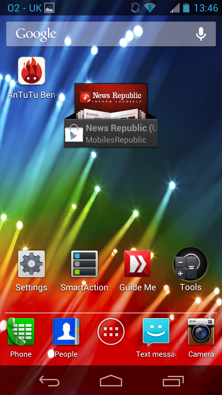
Things are just as close to stock Android on the home screens. You swipe left or right to switch between screens, each of which can house up to 16 apps, or you can use some of the space for widgets.
Long-pressing the screen enables you to change the wallpaper, while long pressing an app enables you to move or remove it. You can also make folders by dragging apps on top of each other.
If you swipe left from the Motorola Razr HD's first home screen you'll reach a quick settings page, which gives you access to commonly used toggles, such as Wi-Fi and Bluetooth, and contains a shortcut to the main settings screen.
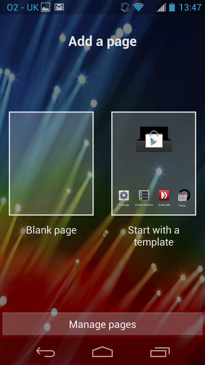
Equally, if you swipe right from the last home screen you'll reach a page that enables you to add new home screens.
You can obviously start with a blank one if you like but the phone also gives you the option of starting with a template, where you can then choose between Media, Mobile Office and more - each of them pre-loaded with relevant apps and folders.
There's a dock near the bottom with a shortcut to your app drawer in the centre and two apps to either side of it.
These default to Phone, People, Text Messaging and Camera but can be changed to anything you like.
Below that there are three software buttons - a back button on the left, which cycles back through previous screens and apps that you've used recently, and a multitask button on the right, which brings up an overview of all your open pages and apps, enabling you to tap one to go back to it or swipe it to close it.
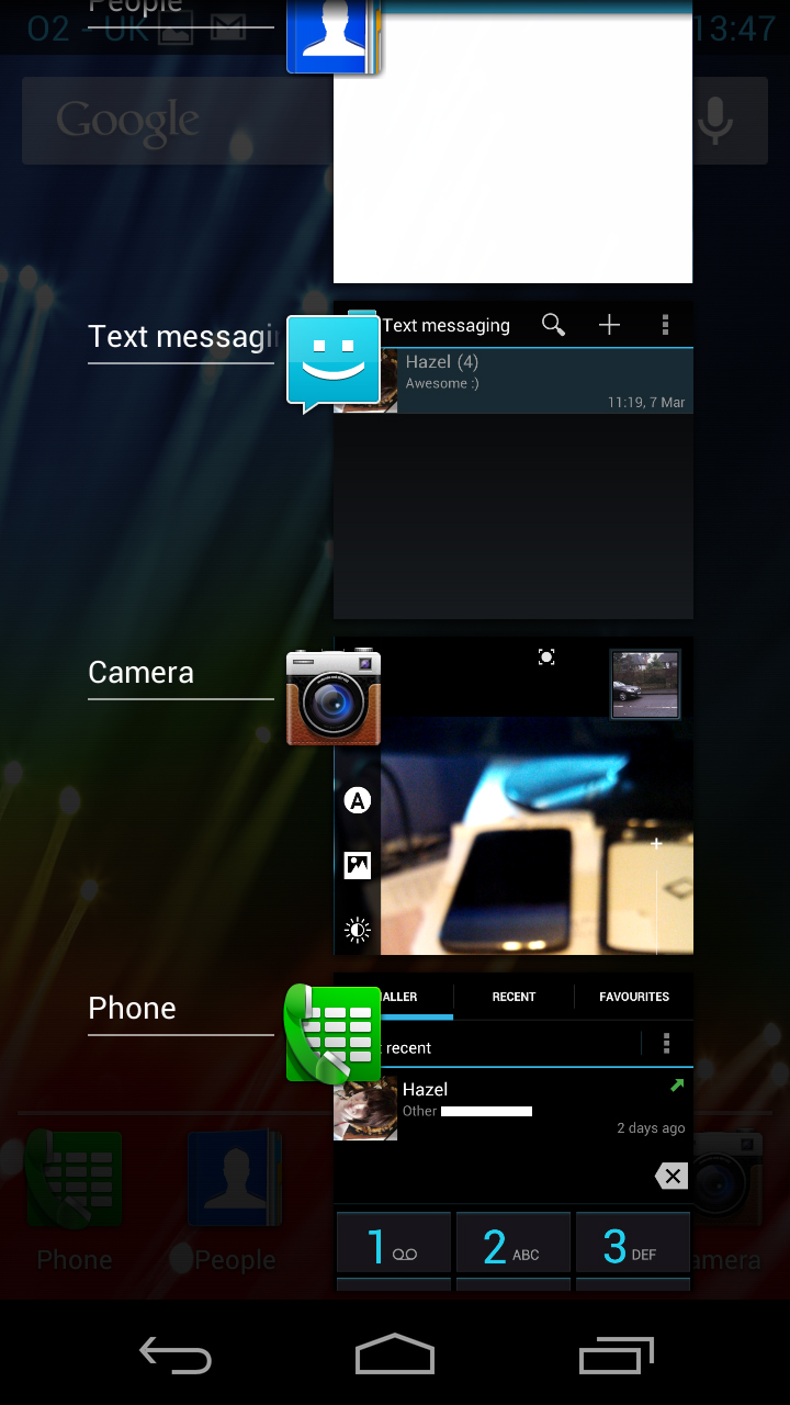
Then there's a home button in the centre, which takes you back to the main home screen if you're anywhere else.
If you're already on the Motorola Razr HD's main home screen it will bring up a zoomed out display of all your home screens, enabling you to tap on one to go to it or touch and drag a screen to reorder or remove it.
Wherever you are, if you swipe up from the home button it will launch Google Now.
We won't talk too in depth about that because we've covered it plenty of times before - not least in our Android Jelly Bean review, but essentially it's a visual PA, which aims to give you the information that you need when you need it.
So for example in the morning it might check the traffic for you and estimate how long it will take you to get to work, as well as giving you a weather forecast.
Then during the day if you have any meetings or appointments it will remind you about them and bring up a map to lead you there.
You can customise it in various ways to make the information as relevant as possible to your needs, and while we're still left wishing there was more to it, it can be a genuinely useful feature.
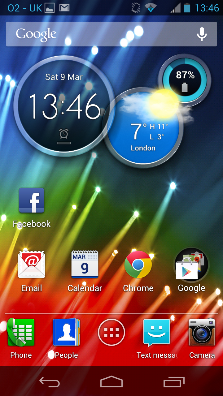
Going back to the home screens, the Motorola Razr HD comes with quite a nifty pre-installed widget.
It puts three circles on your home screen, the first of which shows the time, date and any alarms, the second shows the weather and the third shows your battery level.
What makes it so handy, though, is that if you swipe across them you can see different information.
So for example swiping across the clock circle will change it to an analogue clock and swiping across the weather circle will cycle through the weather in any other places you've asked it to show. Of course being a widget you can always just remove it if you don't find it so useful.
Near the top of each home screen there's a Google Now search bar, which you can type or speak queries or commands into and it will use both the internet and the contents of your phone to come up with the best answer.
At the very top of the screen there's the same bar as on the lock screen, which tells you your battery level, signal strength and more.
Swiping down from that will reveal the notifications screen, which lists emails, texts, reminders and other events. Tapping on one will open it, while tapping the 'x' at the top of the screen will clear them all. You can also access the main settings screen from here.
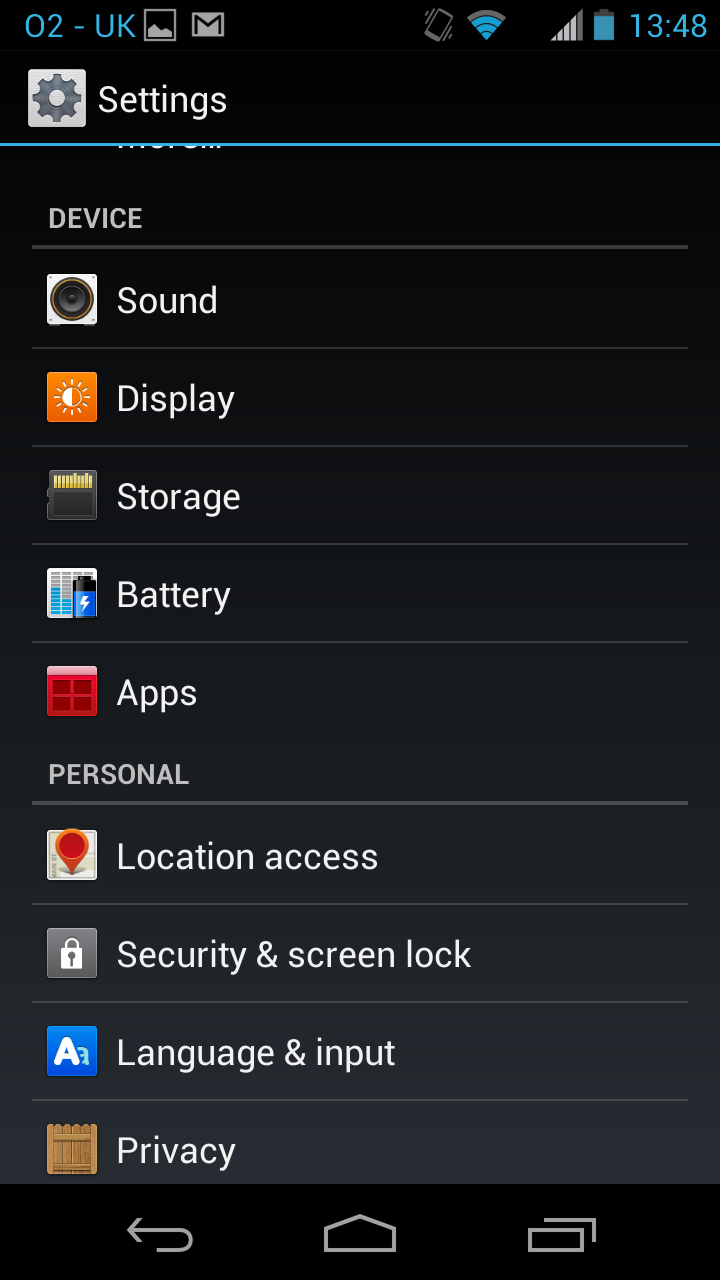
The settings screen itself is just standard Android, with all the options you'd expect but nothing that you wouldn't - there are network settings, sound and display options and more, but nothing unusual.
Finally we come to the Motorola Razr HD's app drawer, and that's mostly been left alone too.
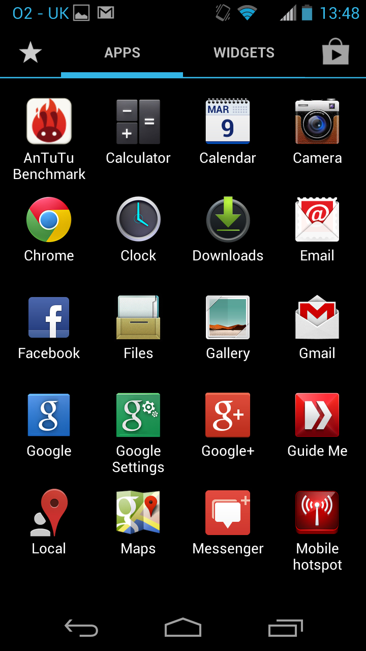
There are toggles at the top to switch between apps and widgets, and whichever list you're viewing you can simply see a picture and name for everything, while tapping on something will open it and long-pressing it will enable you to place it on a home screen.
The only addition that Motorola has made is adding a Favourites option, which just lists apps that you've added to your favourites, giving you quick access to them.
We're not sure how useful this really is, since presumably any apps that you use a lot you would have put front and centre on your home screens anyway, but it's there if you want it.
Being so close to stock Android it's a very clean, well laid out and mostly very intuitive interface. The only things that maybe aren't quite so intuitive are things that Motorola has added, such as swiping left from your first home screen to access quick settings, but even that is very easy to learn. It will also be immediately familiar to most people who've used Android before.
Performance was solid but not faultless, with occasional judders even when just navigating the home screens. We're inclined to put that down to the dual-core processor, but whatever the reason it's a little disappointing.
James is a freelance phones, tablets and wearables writer and sub-editor at TechRadar. He has a love for everything ‘smart’, from watches to lights, and can often be found arguing with AI assistants or drowning in the latest apps. James also contributes to 3G.co.uk, 4G.co.uk and 5G.co.uk and has written for T3, Digital Camera World, Clarity Media and others, with work on the web, in print and on TV.
