How to make a logo: Simple tips to create eye-catching logos
An easy step-by-step guide on how to make a logo to brand your business

Want to know how to make a logo? Our easy step-by-step guide explores why you need a good logo, and how to create one that honors your brand and engages your target market.
You don’t need to be a skilled graphic designer or artist to make a logo. The best logo makers (and even the best free logo makers) turn complex graphic design into a stunningly simple process. And logo generators make it even easier. These services take your core business details to create templated logos.
For experienced professionals, digital art tools and graphic design software is preferred - they offer a lot more control over designs, but there tends to be a learning curve. So online logo makers are the ideal choice when learning how to make a logo.
- Best freelance websites: Top sites for finding a professional freelancer to design your logo for you
How to make a logo: Getting started
Before you commit to the canvas, you’ll want to do some groundwork. When it comes to designing a logo for your business, these should be your first steps.
1. Understand the brand
Start by exploring and understanding your brand, from identity and values to your customer-base. What do you want to say and who needs to hear it?
Whether you’re a beginner or a pro, in-house or freelance, a good logo designer will always research the competition. It gives you an idea of what works (and what doesn’t), and areas of differentiation. Customer feedback may also be useful now - but it’s absolutely invaluable later, so if you can set up the channels early in the design process, you’ll be ahead of the game.
Consider your wider industry, too. For example, legal professions are expected to be professional, a safe pair of hands. So logos for lawyers tend to be traditional, using recognizable symbols of law, like the scales of justice and the gavel. In these instances, the trick is to use these visual shorthands in a way that’s unique to your business.
Sign up to the TechRadar Pro newsletter to get all the top news, opinion, features and guidance your business needs to succeed!
2. Brainstorm and sketch-out
At this stage, you can take all that market research to sketch out possible ideas. This is the fun, creative part. Don’t limit yourself at this point. You can refine your ideas later, so for now, try to get everything down on the page.
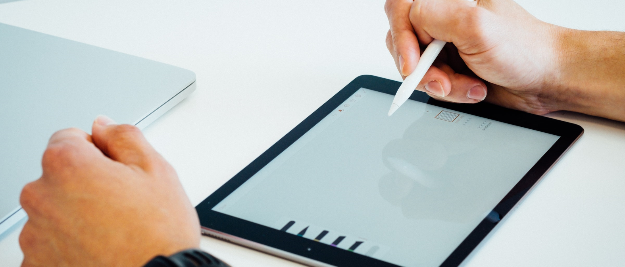
Pad and pen will do fine, but for best results, use a tablet - there’s plenty of free drawing apps available. More advanced designers can brainstorm ideas on a dedicated drawing tablet. These put you firmly in control of every brush stroke, making it easier to access your designs throughout the process and sharing with your client or colleagues.
As part of the ideation phase, make use of mood boards to help share the right tone and coloring, too. Whittle down all your ideas to around three or four core designs to take forward.
3. Choose your platform
When it comes time to make your logo, choose the best platform based on your design experience, budget, and what you want to create.
If you’re a skilled designer, Adobe Illustrator and Photoshop are bursting with pro art tools. The learning curve is steeper than a logo, but it’s hard to fault the level of detail you can add with industry-standard tools like this. A subscription is required, though - for more information, see our guide How to try Adobe Illustrator for free or with Creative Cloud.
Canva has proved a remarkably popular free logo maker, and it’s particularly beloved by marketers. Packed with stock images and elements, the platform uses an incredibly simple drag-and-drop interface, with templates for making logos, posters, social media assets, and more. It’s also equipped with one of the best free PDF editors we've tested, and free video editing software for the all-round creative or marketeer.
The Wix logo maker and Adobe Express both offer a largely similar service to Canva, alongside a logo generator, letting you create a unique, templated logo to be further edited to meet specification. As a side-note, the website builder service has a host of small business design and marketing tools - useful if you’re an existing customer.
There are lots of logo makers on the market - after testing, we recommend also checking out Turbologo, Vistacreate, and Hatchful. Play around with different platforms to find the one that best fits your creative workflow.
4. Start your logo design
It’s now time to work up a prototype of your logo. It doesn’t have to be perfect, but it needs to be an accurate representation of what the finished product will look like.
Choose your overall style and core visual icons (ideally, no more than three to keep things visually simple and distinct). Work on each element separately, building up the logo as you go. Save easily modified components like color and typeface until nearer the end of production.
A good rule of thumb is to start with what draws the eye, and that’s usually your primary icon - for instance, a house if you’re in real estate, a pig if you’re a butcher, and so on. But you can be more abstract, in line with the three lines on Adidas-branded products or even more literal, like Google’s omnipresent letter G.
At every stage of your logo design process, ask yourself: What does this design choice say about this company?
5. Solicit feedback
Designing is redesigning - your logo may look perfect in your eyes, but what do others think? This can be a complex path to navigate - art is subjective, after all.
Once you have one or two mockups, solicit feedback from other stakeholders and even trusted clients and customers. Through sit-downs and surveys, explore which designs they prefer, and why, and how each design makes them feel.
Ensure criticism is constructed when conducting sessions by asking questions that can’t be answered with ‘I don’t like it.’ That’s simply not enough data to inform a redesign. And don’t take criticism personally. It’s better to find out which areas need work now, before the logo is uploaded to social media sites, your YouTube channel, and every webpage.
6. Finalize your logo
Equipped with feedback, go back and make any changes. You can repeat the feedback process as many times as you like, but be mindful of getting caught in an endless back-and-forth that prevents sign-off. With your logo rendered, export is in the correct dimensions and resolution - the higher the better, so it can be resized for different platforms.
How to make a logo: Tips for best logo design
Why a logo matters
Having an eye-catching logo has never mattered more. The online space is competitive. It’s essential to stand out from the crowd, but it’s also a challenge. So, a good logo goes a long way to visually distinguish you from other organizations.
It’s also an opportunity to tell potential customers and clients more about your brand. And not just whether you’re a bricklayer or a lawyer. Are you playful or professional? Sporty or sedate? Premium or budget or somewhere in-between?
With so much consumer choice, being able to cut through the noise with a logo that simply, visually gives you an identity goes a long way to attracting the right client-base.
What makes a good logo?
+ Simplicity
Good logos are simple. Customers should be able to ‘parse the data’ in a single glance. Even more complex designs can be scanned by having, for example, an elegant silhouette. The trick is to keep it simple without stripping out every inch of personality.
+ Color
One to three striking, bold complementary colors work well in logos. That doesn’t necessarily mean you need bright colors. Think of Apple's gray-silver branding, or the earthy tones of a brand like Fossil. It’s about choosing colors that fit your firm. Color psychology should also play its part here. For example, blues are typically considered safe, secure, and reliable colors - which is why so many banks and professional services use it. Yellow elicits fun emotions, so they're more common in playful brands.
+ Typography
A logo’s font - whether it’s a brand name or a message - needs to be legible. Cursive scripts tend to be difficult to read, which is why you won’t see many in the best logos (though there are exceptions). Sans-serif fonts are easier to read, especially on the screen. As with colors, the typography should reflect the brand identity. You'll find plenty of online font resources, and we've rounded up the best 40 fonts for websites.
+ Memorability
A logo you can’t remember is a bad logo. But the best ones get stuck in your head. You know exactly who the company is and what it stands for. McDonald's golden arches, Apple’s apple and the Nike tick are instantly recognisable and highly memorable examples - even before they became massive global brands.
+ Multi-purpose
Modern logos should be multi-purpose - a single, unifying visual identifier that can be deployed across office stationery, social media channels, and incorporated into your website design. Different platforms will have different requirements and resolutions, so check for these when you make a logo.
+ Timelessness
Bad logo design jumps on a trend and rides it to the bitter end. A good logo stands the test of time. It may be tweaked here, refined there, updated for modern sensibilities and expectations. But, at its heart, it remains recognizable throughout the ages.
- Best graphic design laptops: Stay creative on the go

Steve is B2B Editor for Creative & Hardware at TechRadar Pro, helping business professionals equip their workspace with the right tools. He tests and reviews the software, hardware, and office furniture that modern workspaces depend on, cutting through the hype to zero in on the real-world performance you won't find on a spec sheet. He is a relentless champion of the Oxford comma.

 Become a TechRadar Insider


