Microsoft pinches one of the best macOS features for Windows 11 – here are three other ideas it should steal from Apple
Microsoft could copy one of Apple’s best macOS features for Windows 11
Sign up for breaking news, reviews, opinion, top tech deals, and more.
You are now subscribed
Your newsletter sign-up was successful
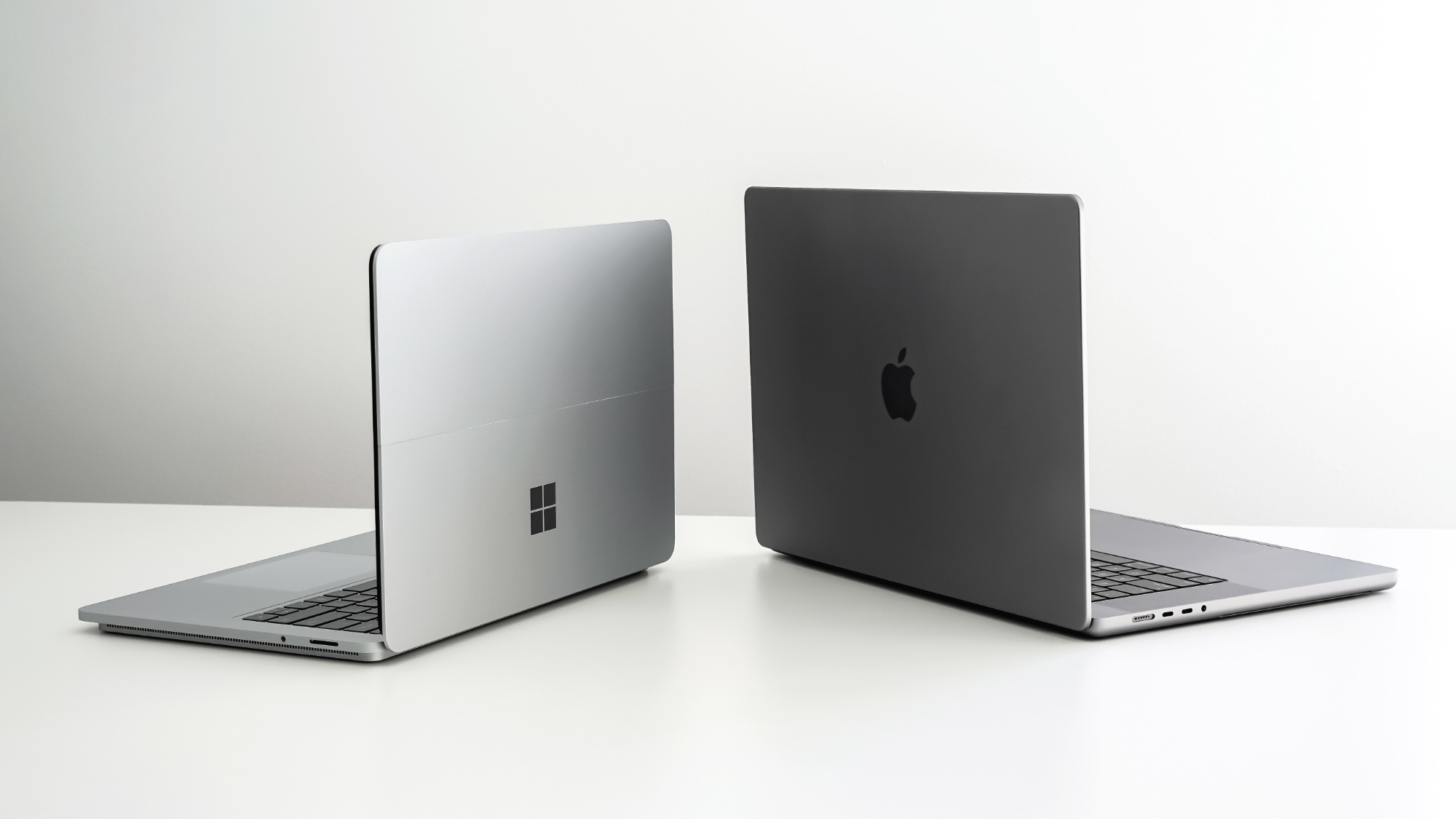
It looks like Windows 11 could be getting a new device management feature that will seem a bit familiar to anyone who has ever used Apple’s rival macOS Sonoma operating system for Macs and MacBooks.
As MSPoweruser reports, an early build of an upcoming Windows 11 update adds a new ‘Linked devices’ window within the Settings app, giving users an overview of all the devices, such as laptops and Xbox consoles, that are signed into their Microsoft account.
From that window, it looks like users will then be able to manage each device from a single screen.
Article continues belowApple-like convenience
You may be surprised how many devices you’ve linked to your Microsoft account, especially if you have several laptops. Signing in to your smartphone and connecting it to your Windows 11 device via the handy Phone Link app and using your Microsoft account to sign up to other services could also mean your ‘Linked devices’ list is actually longer than you might have expected.
It's always important to keep track of the devices you sign into – especially if you are planning on selling or giving away a device. Currently, there’s no easy way to see all the devices signed into your Microsoft account in Windows 11 – instead you need to go to the Microsoft account website. It’s not the most intuitive website, and having this information displayed in a much clearer way within Windows 11 is a good move in my view. However, as MSPoweruser points out, at the moment some tasks you want to perform with the devices will still need to be done through the website.
It's (very) early days with this feature, however, as it is currently only available with the beta build 22635.3495, which is only available to people signed up to the Windows 11 Insiders program. By the time this feature rolls out to all Windows 11 users, more tasks should hopefully be integrated directly into Windows, rather than having to go to the website.
This addition adds a level of Apple-like convenience to Windows 11 – something the operating system often lacks. As I’ve said many times before, Windows 11 can sometimes feel like a jumbled mess of new and legacy operating systems – and that means it fails to offer a coherent experience.
Sign up for breaking news, reviews, opinion, top tech deals, and more.
Meanwhile, Apple’s macOS certainly isn’t perfect, but it does integrate your various devices much better than Windows 11. Of course, Apple being Apple, this works best if all your other devices are Apple products as well, and due to the huge range of manufacturers who make Windows 11 products, Microsoft hasn’t got this luxury.
This new feature, however, is certainly welcome and brings Windows 11 a step closer to the kind of easy device management that Apple is known for. If Microsoft has indeed taken inspiration from its archnemesis, then I’m certainly not complaining. In fact, here are some other Apple features I wouldn’t mind Microsoft copying:
1. Make the Start menu more like the Launchpad
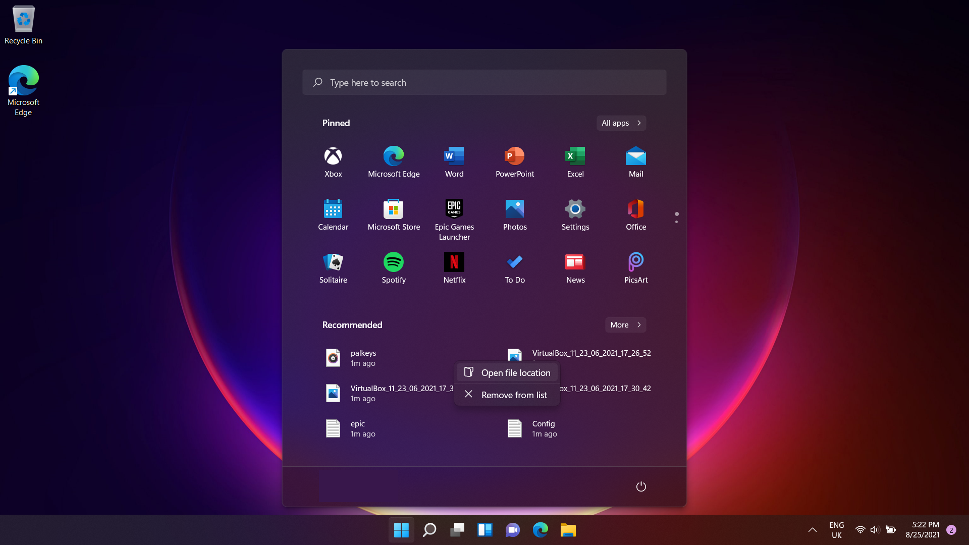
Now, a few years ago the idea that I might one day suggest that Microsoft change the iconic Windows Start menu to be more like the Launchpad of macOS would have been laughable. Since its debut in Windows 95, I’ve always preferred the start menu – it was easy to find the app you wanted to launch, and it confined to the bottom-left-hand corner of the screen, it didn’t feel intrusive, unlike the full-screen Launchpad.
In fact, when Microsoft dropped the Start menu in Windows 8 for a much more Launchpad-like fullscreen Start screen, I – like many other Windows users – was horrified.
However, while the Start menu has returned in Windows 10 and Windows 11, Microsoft has seemingly done its hardest to make me avoid the once-essential part of the operating system.
Stuffing apps and widgets that I don’t want or use into the Start menu makes it harder to find what I actually want – and it looks like it’s set to get worse as Microsoft is apparently considering putting adverts for suggested Microsoft Store apps into the ‘Recommended’ section of the Start menu.
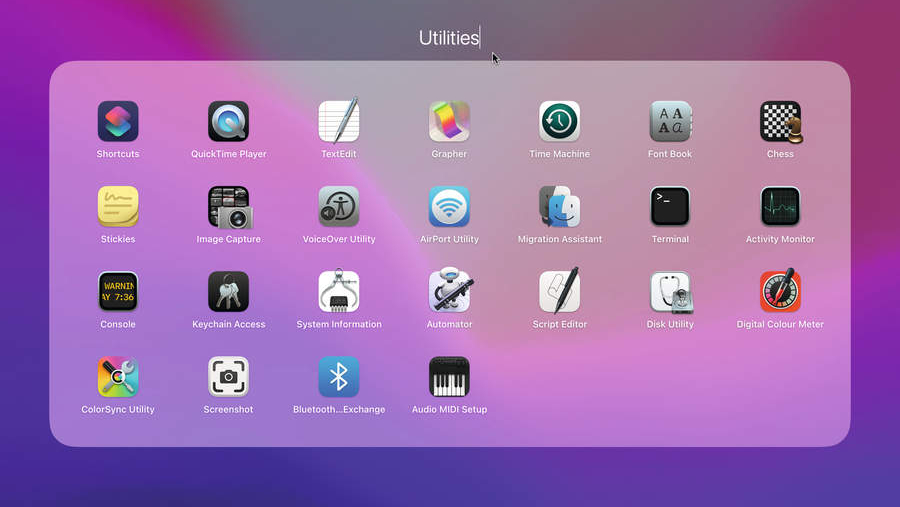
More unnecessary bloat means it’s harder to find the apps I actually want to use, and ironically it means I open up the Start menu less and less these days. The fact that in Windows 11 the Start menu now pops up right in the middle of my desktop means it can feel just as obnoxious as Launchpad (unless I change the settings to put the Start menu back in the left-hand corner).
It’s got to the point where I prefer using Launchpad. Sure, I still don’t like that it takes over my entire screen, but there are no adverts, notifications to try more services, and few pre-installed apps in there. Instead, it just shows me the apps I have installed, letting me find and open them up quickly.
2. Make the Taskbar more like the Dock
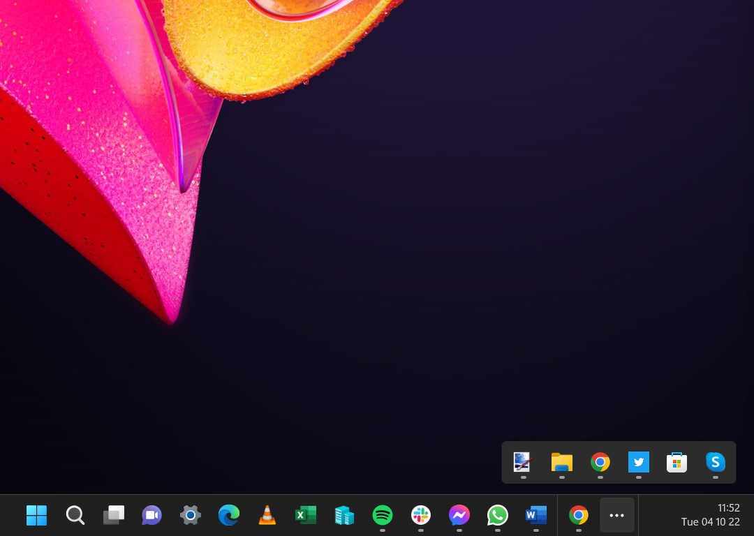
This is another suggestion I can hardly believe I’m making in 2024, but the sad fact is that despite the macOS Dock coming after the Windows Taskbar set the… er… bar… Microsoft’s tinkering has ended up making Windows 11’s version of the Taskbar a lot less useful.
At first glance, the centering of the app icons suggests that Microsoft has already taken inspiration from the macOS Dock – but if that’s the case, then it’s learned the wrong lesson.
The macOS Dock is a more elegant solution to quickly opening up your favorite apps, while also switching between open windows – but not because it sits at the centre of your screen. As with the Launchpad, the Dock is mercifully free from clutter, while the Taskbar can look cluttered by comparison.
By default, as well as icons for your apps, the Windows 11 Taskbar also shows the Search bar (which often features graphics), weather warning, notifications, and the new Copilot icon, many of which I never use.
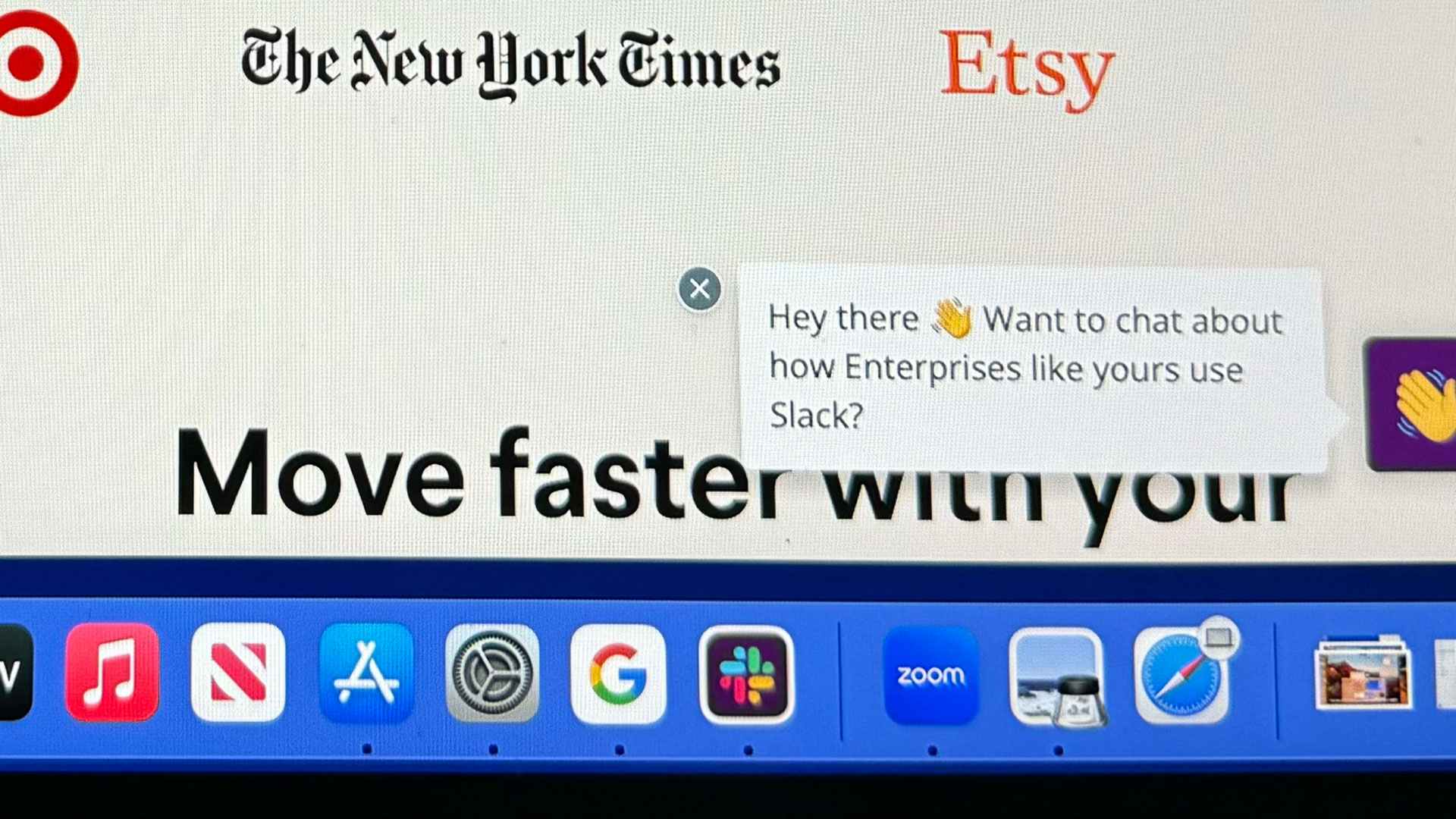
Also, while the Dock sits in the center of the screen, the Taskbar stretches across the entire screen, and while the app icons and Start menu appear in the center, the weather icons appear on the far left, while notifications, time and date, Copilot and volume controls are shoved to opposite side. This means the Taskbar in Windows 11 feels cluttered, whilst also having lots of wasted space.
Worst of all, Microsoft has dropped a lot of functionality from the Windows 11 Taskbar compared to previous versions of Windows – including the ability to drag and drop apps onto the Taskbar to pin them so they always appear there, or to drag and drop files onto an app’s Taskbar icon to open up the file in the app.
It’s a curious move that has perplexed a lot of Windows 11 users, and I would like Microsoft to take inspiration from both macOS and past versions of Windows to create a modern Taskbar that’s elegant, powerful, and simple to use.
3. Make Microsoft Store more like the App Store (that is, make it more useful)
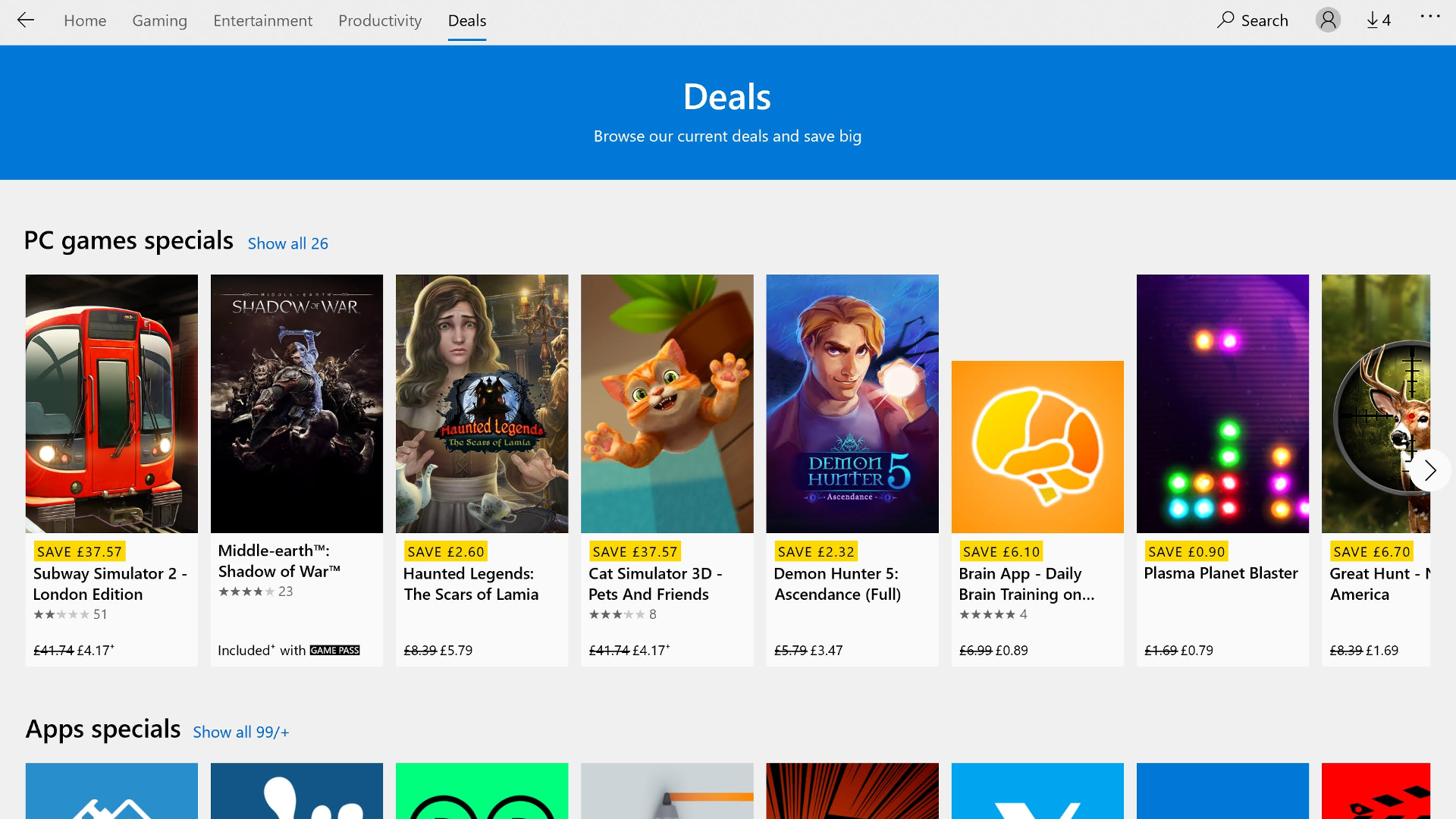
This last point is probably one that Microsoft would love, but ever since the introduction of the Windows Store with Windows 8, the company has struggled to make a case for what is now called the Microsoft Store.
Much like the App Store in macOS, the Microsoft Store offers a way to find and install apps. It should be easy and safe (as all apps in the store are tested to ensure they don’t include malware) – yet while the App Store in macOS feels like a useful, maybe even essential, part of the operating system, the Microsoft Store is easily ignored.
Microsoft must look at the money Apple rakes in through the App Store with seething jealousy. So what can Microsoft learn from Apple’s implementation?
For a start, the App Store looks cleaner and feels more curated. The Microsoft Store certainly looks better than in the past, but it’s still not the easiest when it comes to finding things you want (there’s a bit of a theme developing here). It also feels slow and laggy compared to the App Store.
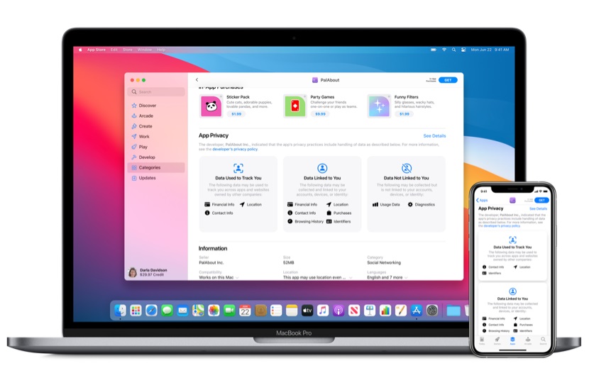
Microsoft has also struggled to get developers to make bespoke versions of their applications for the Microsoft Store, which means it feels a bit sparser than the App Store. It also means that some versions of apps downloaded from the Microsoft Store lack the features of the same app downloaded from a website. It also leads to strange inconsistencies, such as the Paint.net app being a paid-for app in the Microsoft Store – but it’s free to download from the official website.
Probably the biggest problem for Microsoft when it comes to this is that the App Store has been such an integral part of macOS for so long that users think nothing of using it to install new apps. They will also trust Apple’s recommendations for new apps.
Microsoft doesn’t have that kind of reverence from its users, and Windows users have mainly grown up with using the internet to find and download applications, preferring the freedom of picking where to download the app from, and where to install it – even if it brings certain risks.
It’s hard to see how Microsoft can change a lot of that, but by making the Microsoft Store more useful, easier to navigate and with a much wider app selection, it could help make it more popular with its customers.
Apple – and macOS – is far from perfect, and there are lots of things that Windows 11 does better than macOS, but if Microsoft is in the mood for taking tips from its fruit-themed competitor, the above suggestions would be very welcome indeed.
You might also like

Matt is TechRadar's Managing Editor for Core Tech, looking after computing and mobile technology. Having written for a number of publications such as PC Plus, PC Format, T3 and Linux Format, there's no aspect of technology that Matt isn't passionate about, especially computing and PC gaming. He’s personally reviewed and used most of the laptops in our best laptops guide - and since joining TechRadar in 2014, he's reviewed over 250 laptops and computing accessories personally.