Why you can trust TechRadar
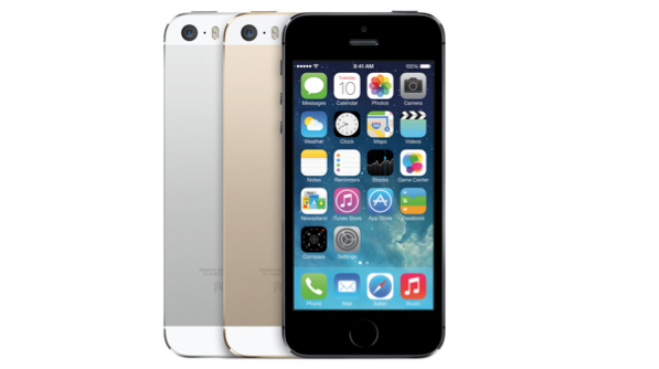
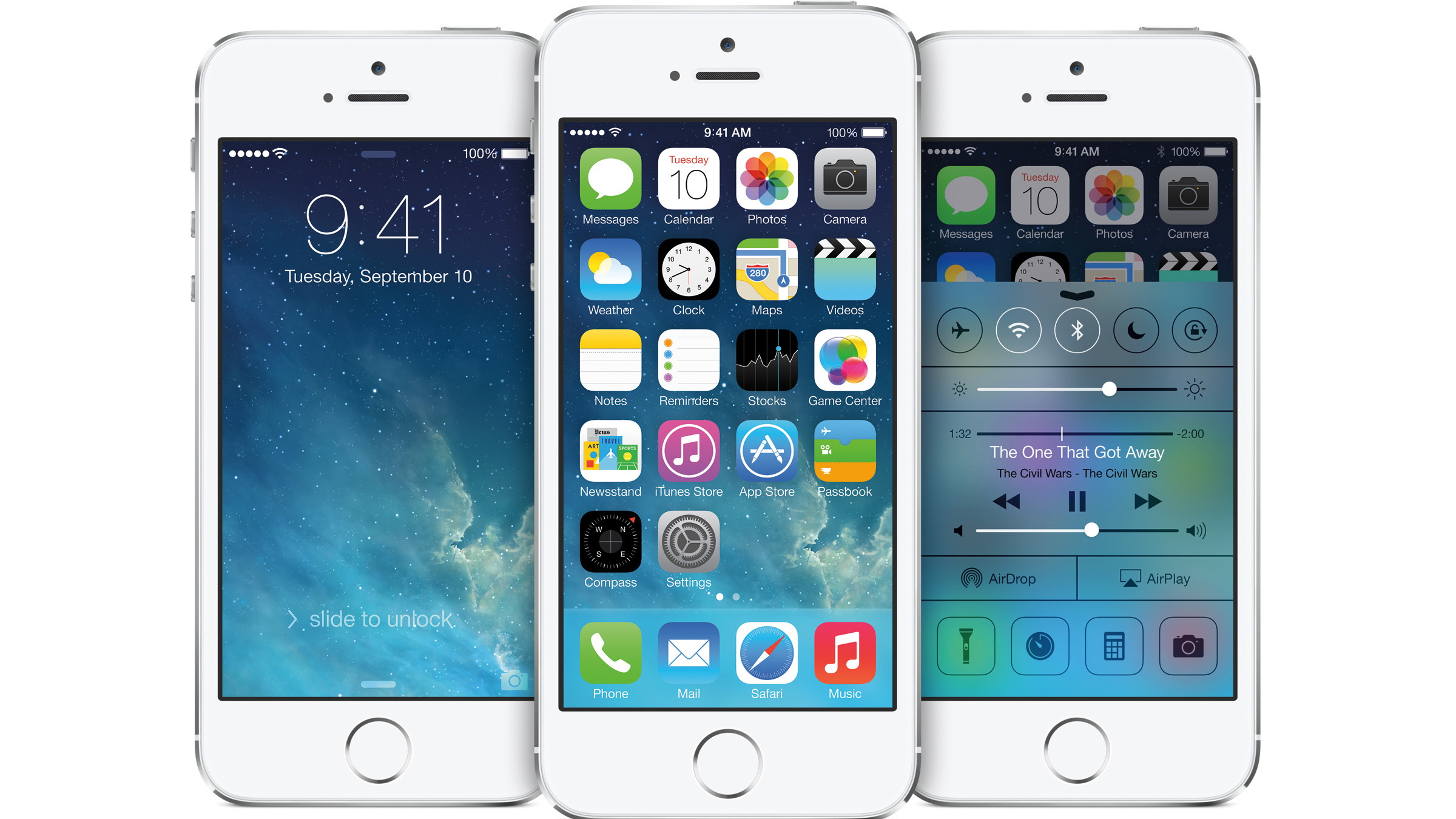
One of the big changes on the iPhone 5S is one that will come to a number of other devices: iOS 7. However this is clearly the flagship device for the new operating system, and it shows off the UI redesign superbly.
The Retina display is clearly calibrated to make best use of the explosion of colour on offer, and the flatter icons look painted onto the screen.
And now that we've seen this for a whole year, it's time for a new upgrade -iOS 8 has been announced, and while it hasn't changed much aesthetically, there are many more things to be aware of.
The new update is going to bring the chance to track your health (and even your caffeine intake) as well as connect to more devices within the home.
It will also finally open up things like the keyboard, which means you'll be able to customise your phone in ways you wouldn't before - and the good news is most of it will be coming to the iPhone 5S.
For those that missed the iOS update, you'd best gird your loins if you're not a fan of colour all over the place. iOS 7 is a lot brighter, cleaner and sleeker than its bloated predecessor, but it does look like Jony Ive has dipped into his crayon pot a few times.
But don't think this is a negative: we're fans.
Sign up for breaking news, reviews, opinion, top tech deals, and more.
The colours on offer are fun, fresh and most importantly distinctive, giving a real unique feel to iOS 7 that other platforms might not have. Photos, Safari and Music are all changed, as well as a host of other apps too, and while some have labelled them 'childish', they're clearly indicative of the new style Apple is looking to create.
And now that iOS 7.1 has landed, things are tidied up a bit and may help appease some Apple fans looking to not feel like they've fallen into a big bag of rainbows.
What we do find frustrating in iOS 7 and its previous iterations is the dependence it has on the settings menu, with various app controls all housed here instead of within the apps themselves.
It's annoying if you're in the Facebook app for example and want to adjust the notification settings, you have to exit the app and navigate to the settings menu instead.
Look beyond the UI though and you'll see that the iPhone 5S is much easier to use, which is impressive for a phone that was already market-leading in its simplicity.
Dragging upwards from pretty much anywhere on the phone will open the Control Center, giving access to the music player, brightness, quick apps such as a timer, torch and calculator as well as allowing you to switch on and off elements like the Wi-Fi and Bluetooth.
Yes, it's a notion that's been part of Android for a number of years, but it's been done in a way that feels a lot more solid and intuitive, never changing with notifications so you can easily trust that when you need a torch you can get to it easily.
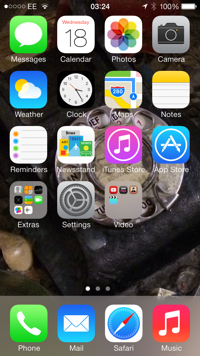
That said, the torch was an odd area of the Control Center. Whenever lifting up the tab to access said function, you'd always need to wait a second or two before being able to hit any of the app quick icons. Not a huge problem but one that quickly got tiring. It's like the whole drawer needs a second to boot up.
There's also a new notification area that can be accessed by dragging downwards. Thankfully unlike the Control Center, this can be customised: you don't need to have to look at stocks or your upcoming meetings or lack of social engagements if you don't want to, but there's always information on the weather there, which is nice when you realise you'll need a coat.
There's also a new notification area that can be accessed by dragging downwards. Thankfully unlike the Control Center, this can be customised: you don't need to have to look at stocks or your upcoming meetings or lack of social engagements if you don't want to, but there's always information on the weather there, which is nice when you realise you'll need a coat.
This is also the place where you'll get any missed notifications, be it a call, message or that jacket on eBay you were looking to buy when someone's outbid you on it.
It's still a bit of a wasteland though, and Apple has clearly thought about changing that with the new iOS 8 update, as it will come with more intuitive interactions, and live widgets that will update with key information - plus the ability to directly reply to messages there too.
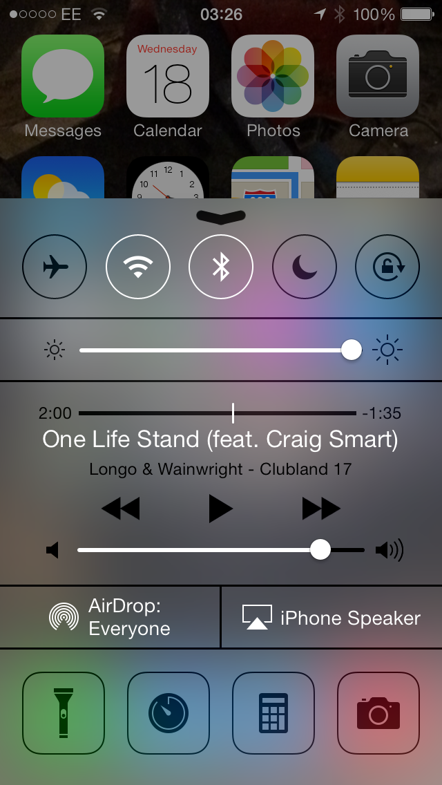
Both of these areas are nicely designed too - with translucency that allows you to see very vaguely through to the rest of the phone, giving the whole handset an air of completeness, a phone that's able to connect within itself and not fall apart when a new app rolls into town.
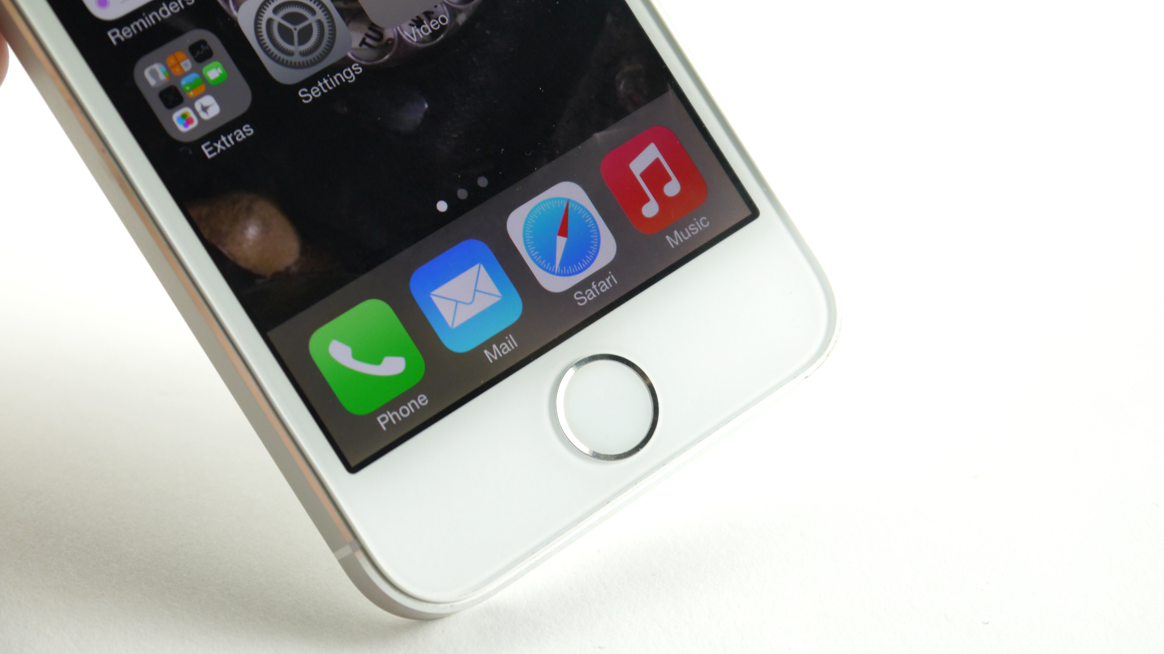
With iOS 7.1 the phone and messaging buttons have been toned down in colour somewhat, meaning less neon green and a more pleasing look to the eye.
Multi-tasking has been given an overhaul with iOS 7, and gone is the bar which appeared at the bottom of the display when you double tap the home button.
The double tap action now sees the screen you're viewing minimised to a thumbnail in the centre of the screen, and a horizontal list to the right of it made up of small panels of all the other apps running in the background.
The layout reminds us of the multitasking menu on HTC's Sense UI, and you can scrolling through the various applications, swiping up over thumbnails to close certain applications.
We're not overly keen on the new design as the interface does break things up when flicking between apps, where on the iPad you've got the great four finger swipe to move between open apps – could this have not been repeated on the iPhone?
There's obviously some other new features, as well as some old favourites.
For instance, a long press on any app will engage the editing mode for the home screen, meaning you can uninstall anything you fancy (as long as it's not hardcoded by Apple) and drag and drop it onto another icon to make a folder.
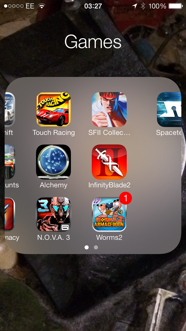
The folder system was a great idea from Apple, and it's been improved with iOS 7, allowing users to dump more in one folder and just swipe through it to see more apps.
It's not a big thing, but show it to any iPhone user now and they'll smile at such an important fix. Who wants 'Games 4' anyway?
The rest of the phone is mostly a cosmetic upgrade - there are some important performance tweaks, such as on the internet browser and camera UI, but iOS is really a lick of exceptionally powerful and much-needed paint, keeping the raw power and integration that Apple prides itself on while taking some of the clever ideas from other smartphones on the market and making them its own.
iOS 7.1 Update
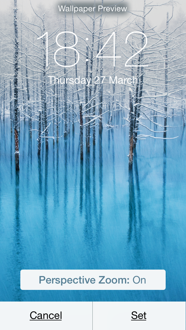
There are a few extra features that we need to mention here to show that Apple has been through and had a think about how things work with the new iteration of iOS 7.1
First, the parallax effect has been given a little bit more respect within the OS, with the ability to turn it off when your first turn on the wallpaper making things a lot more fluid and understandable to people.
It's not locked down in the Accessibility menu any more either, rather when you set the wallpaper instead.
The menus themselves have been given something of an overhaul too, thanks to the ability to mark out where the buttons are.
This is a weird one, as it's not a problem we'd come across really. Apparently swathes of you were worried about not being able to tell what's text and what's a button thanks to the large white expanses being thrown around the screen where usually things used to look like buttons.
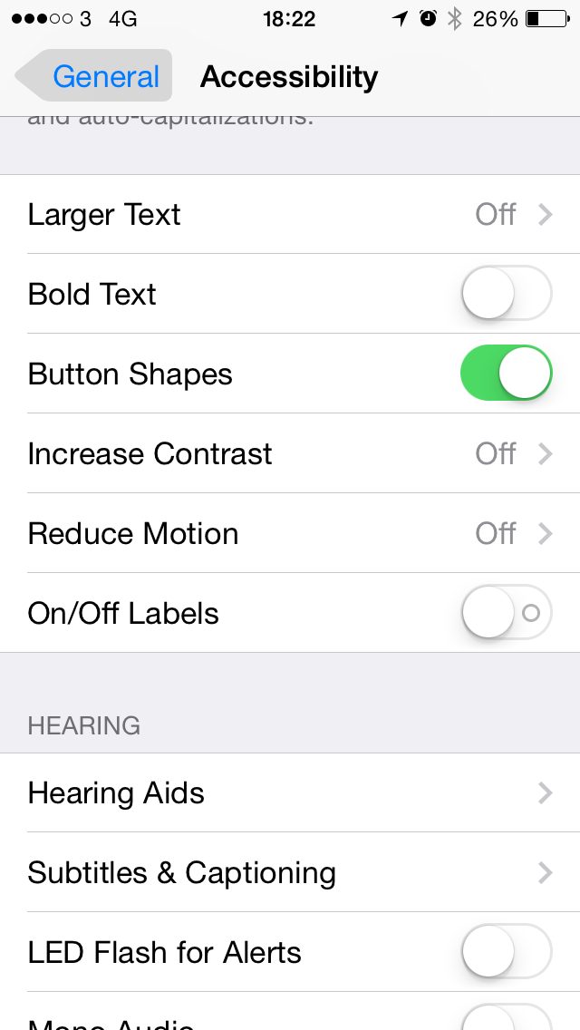
Well, now you can do just that once more, as a setting in the Accessibility menu will let you swoop in and make every button look a little bit more uglier thanks to a tab sitting around it, or words in a list will be underlined if you can tap them.
The extra navigation in iOS 7.1 also includes a nifty feature that lets you choose to be able to select menu items and move around the screen using a tilt of the head.
Some have likened this to the Smart Scroll feature in Samsung's Galaxy S4, but in reality it's designed for those unable to interact with an iPhone using their hands, allowing them to control the interface using head gestures and pre-determined times to wait to select menu items.
And finally: a hurrah for the fact that the calendar has been re-enabled with a split screen view thanks to a toggle at the top. Apple dropped this for the iOS 7 update to its devices, but now you can be in the month view and still see what appointments exist on any given day you tap.
You know, like every other smartphone ever.

Gareth has been part of the consumer technology world in a career spanning three decades. He started life as a staff writer on the fledgling TechRadar, and has grew with the site (primarily as phones, tablets and wearables editor) until becoming Global Editor in Chief in 2018. Gareth has written over 4,000 articles for TechRadar, has contributed expert insight to a number of other publications, chaired panels on zeitgeist technologies, presented at the Gadget Show Live as well as representing the brand on TV and radio for multiple channels including Sky, BBC, ITV and Al-Jazeera. Passionate about fitness, he can bore anyone rigid about stress management, sleep tracking, heart rate variance as well as bemoaning something about the latest iPhone, Galaxy or OLED TV.
