


iOS 10 public beta is out now and - brace yourself - it's the most jolting, but logical refresh of Apple's iPhone and iPad mobile operating system that I've tested in several years.
As soon as I downloaded iOS 10 and booted it up for the first time, I noticed the changes right away. These aren't minor tweaks and background enhancements like we saw in iOS 8 and iOS 9.
It didn't even present me with the "swipe to unlock" screen that has greeted everyone since iPhone OS 1. It's gone, and in its place it asks me to press down on the home button. It makes sense eventually.
Overall, iOS 10 remains a familiar, yet better laid out ecosystem for long-time Apple users. It's filled with more menu shortcuts to get used to and a lot of messaging features to explore.
Here's our first look at iOS 10 public beta, the unfinished update that's going to dramatically change your iPhone and iPad this autumn.
Getting started with iOS 10
Apple's iOS 10 public beta launched this week, just 23 days after the company announced the update at WWDC 2016. That's lightning (port) fast, and comes with a major caveat.

You're going to experience app bugs, crashes and random restarts between now and the final build. It's inevitable, as smoothly as the public beta runs overall. I recommend backing up your files first.
That said, it's easy to update to iOS 10. Signing up for the public beta through Apple's website lets you download and install the big changes over the air (OTA). That part is simple.
Raise to wake
As soon as I picked up my iOS 10-loaded iPhone 6S Plus, Apple's changes were immediately apparent. Thanks to the new "raise to unlock" feature, the screen lit up as soon as the phone was moved.

It's is an incredibly useful way to glance at my lockscreen notifications without pressing a single button. I think of it as being akin to the Apple Watch "raise your wrist to wake" feature. It's a daily game changer.
Here's what it solves more than anything: Before, I'd often hover my finger over the Touch ID button and it'd whisk away all of my notifications. How rude. Now the screen lights up automatically.
You'll only be able to experience "raise to wake" on newer iPhones: iPhone 6S, iPhone 6S Plus and iPhone SE. Surely iPhone 7 and iPhone 7 Plus will support this feature, too.
Press in on that home button, brain
Vanishing notifications are also no longer problem with iOS 10 on new iPhones thanks to the fact that the Touch ID fingerprint sensor requires you to press the button in to bypass the lockscreen.

It took a while for my brain to adjust to pressing in on the Touch ID button to unlock the iPhone instead of simply placing my finger on top of it.
However, I got used to the new iPhone iOS 10 unlock method after a day and appreciate my lockscreen notifications remaining visible. There's a lot more to do with them now.
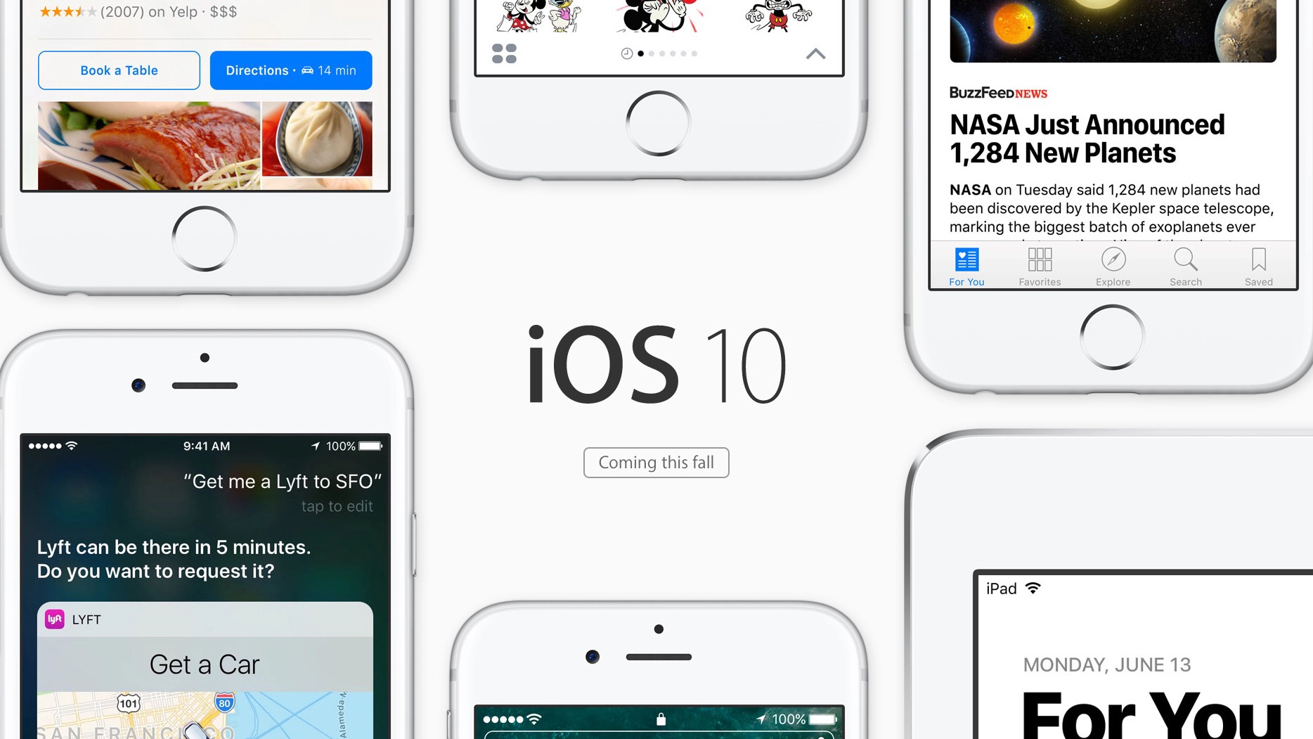
Notifications with lots of richness
iOS 10 lockscreen notifications not only stay put, they look different with a new bubble outline and tell me more about the on-screen alert thanks to the use of 3D Touch (again on newer iPhones).

Hard pressing on a Mail notification, for example, causes it to pop up and reveal more text. Buttons to archive and trash the item give me quick access to moving the email to the right place.
There's really going to be little reason to needlessly wake, unlock and lock your phone for quick tasks like this. Again, it's jolting at first, but makes sense. More 3D Touch shortcuts are coming too.

iMessages on the lockscreen are even more interactive. 3D Touch on any text message and it'll expand into a small chat history and provide a mini window in which you can respond inline. Close out the message and you're right back on the lockscreen.
Uber is another example that's supposed to show you where your driver is at on a map once the app pings you with a notification of "Your driver is on the way." Like a lot of third-party apps, however, Uber needs to update its app for iOS 10, and it isn't ready for the public beta. At least not on day one.
Lockscreen notifications become a clean slate when I unlock my phone or tablet (unlike on Android), but I can still access my notifications log anytime by swiping down from the top on the screen.

There are two changes I like about this pulldown menu: notifications are on their own (no more "Today" menu tab. Not here at least) and there's a new clear all button. Just hard press on the X icon and "Clear All Notifications" pops up. That's long overdue among OCD types.
Control Center
Swipe up from the bottom and you'll be greeted with one of the best iOS 10 changes: a revamped and decluttered Control Center. It's a lot easier to use.
With iOS 9.3 and the addition of Night Shift, it became obvious that there was too much happening in the Control Center pane. Apple has simplified it by adding multiple menus with a right swipe.

The main Control Center menu still has toggles for Airplane mode, Wi-Fi, Bluetooth, Do Not Disturb and Portrait Orientation, but now they have unique colors.
It's followed by the brightness slide, AirPlay and AirDrop controls and an unnecessarily big Night Shift button. This, however, moves it out of the previously crowded bottom row of shortcuts that flashlight, stopwatch, calculator and camera.
Where are the music playback controls at? Swipe one Control Center menu to the right and it's contained in its own menu along with a shortcut button to Apple Music.

Swipe one more menu to the right and Apple Home has its own Control Center home. Here, you're able to toggle lights and other household smart home electronics without ever opening up the default app.
This is a big deal if I'm falling asleep next to my iPhone (sounds normal) and want to quickly shut off the Philips Hue lights without getting up to press a switch or opening the Philips app. Like a lot of iOS 10, it's all about minimal effort.
'Widgets' in iOS 10
Available as both the leftmost menu and to the left of the lockscreen is an enhanced "Today" menu. It's where Apple says you can add "widgets." Finally, right?

I really like the way in which you can add widgets - better than I've experience on Android Nougat. Simply 3D Touch on an app icon and, if there's a graphical menu, look for an "Add widget" button at the top.
I like that better than digging into any overcrowded and separate widgets list that's sioled from the app that's in front of me. Here's the problem after adding one: they're not really customizable widgets.
You can't resize them and they display a set amount of information. Widget for boarding passes from a specific airline app or reservations from OpenTable display there (good), but when you don't have passes or reservations, the box still displays there (bad).
"You have no upcoming bookings" it says. Thanks. Now I have a half dozen of boxes, all the same size, that say this. It's not nearly as dynamic as Google Now, though it's progress.
